IBM System Photography
Posted by Shelby White
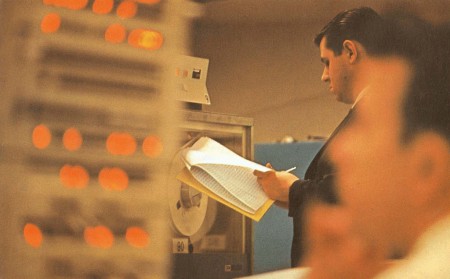
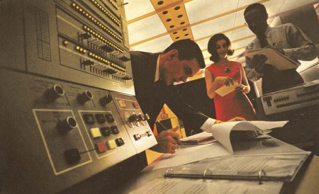
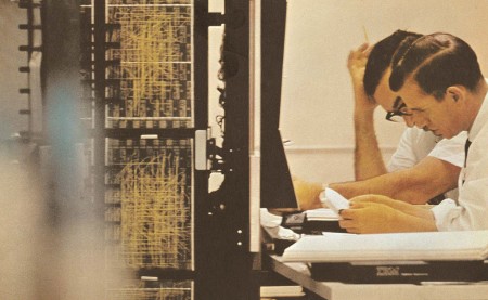
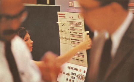
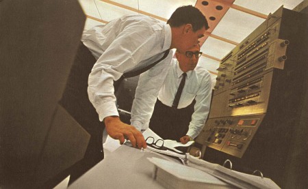
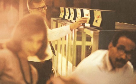
Came across these really great shots via Colorcubic’s Flickr. The images were taken for an IBM catalog in 1964. Take note of the great compositions and use of bokeh in the first image. Not sure that IBM would let that fly nowadays. Also, the super warmth and contrast of the film really make those panel interfaces look stunning.
Seeing these images in spread form would be interesting. Rather curious whether or not the designer overlaid the type on them or if the images stood alone. In some IBM ads, it appears that type was both on and off the images.

18 Comments Leave A Comment
Alex Burner says:
August 26, 2010 at 12:35 amI completely agree, IBM wouldn’t run with these AWESOME shots these days. It’s too bad, because they’re so cozy and warm…
I guess it’s fair though; IBM is all about accuracy and cold hard numbers. Computer chips aren’t big on the touchy-feely side of things.
However, any company that wants to relate with human beings should definitely take notes from this set you’ve pulled together. They’re personal, nostalgiac, dynamic… freakin artsy.
Back when pure computer science where fun!
Alex Burner says:
August 26, 2010 at 12:36 amI love the new number labels for the posts, but I wasn’t counting for it while I was typing! So many orphans..
For-w-art says:
August 26, 2010 at 1:30 amTruly and fine example of how great things can be. Also makes me think of how great the photography in Zodiac actually was.
Dan Matutina says:
August 26, 2010 at 1:48 amEspecially love the last photo.
Emanuel says:
August 26, 2010 at 3:14 amNothing like the good old times, eh? Amazing set of photographs, I especially like no.3, there’s something about the clean cut looks and sleek hair contrasting the complexity of that circuit thing on the left side that does it for me. The switchboards remind me a bit of Dieter Rams Braun design; simple, elegant and functional.
Matthew Lyons says:
August 26, 2010 at 8:09 amwow great find. I love the blurred foregrounds and colours. The compositions are so interesting, great for reference. Thanks so much for posting these Shelby!
Damion Schweizer says:
August 26, 2010 at 8:48 amMan what a great find. All these photos you posted are amazing. Thanks Shelby.
Asif Ahmed says:
August 26, 2010 at 8:55 amGiven that this is a photo shoot, but corporate attire hardly looks this dapper these days. Great compositions, for sure.
Doug says:
August 26, 2010 at 9:33 amDecent find.
The latter half of the post is interesting. I like how magazine ads these days (especially computer ones) really eschew the text explanation, and totally drive towards a more visual approach that’s usually action oriented. Such a contrast to those 80s & 90s computer ads, where it’s basically a simple picture with an explanation of why you should buy product “x,” or why product “x” is so damn great. The times really have changed.
Jeff Finley says:
August 26, 2010 at 10:13 amOh these are wonderful. I love the voyeuristic feel of looking past the subject in front to see the subject in back.
Bryce Wilner says:
August 26, 2010 at 11:03 amwow! what an advanced and productive, yet warm and welcoming place of business!
thanks, shelby.
Ludovic says:
August 26, 2010 at 4:47 pmIncredible photos!
Jag says:
August 28, 2010 at 3:56 pmThese shots are incredible. This sort of composition and warmth is something I strive for and try to achieve in my own photography. These are so inspiring!
Ohh, what I would give to step into the 60’s!
patrick says:
August 28, 2010 at 11:35 pmKiller photos. Looks like a NASA control room.
thehalvo says:
August 29, 2010 at 1:23 pmgreat shots
greg says:
September 3, 2010 at 8:07 amThese are fucking great. The last one is my favorite.