Vintage Ski Ads Pt.1: Racing
Posted by Scott
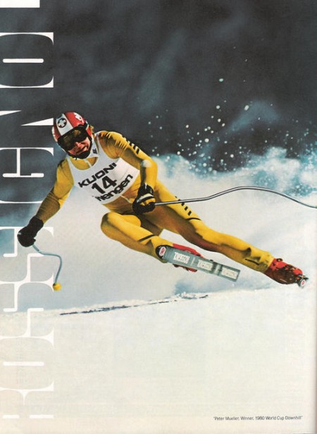
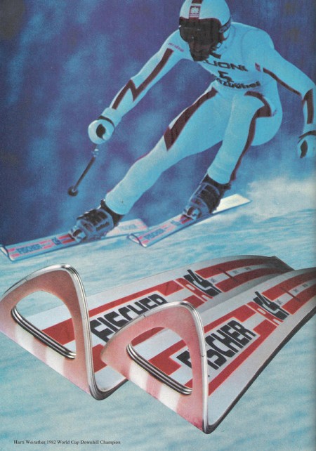
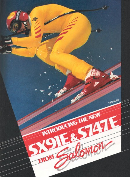
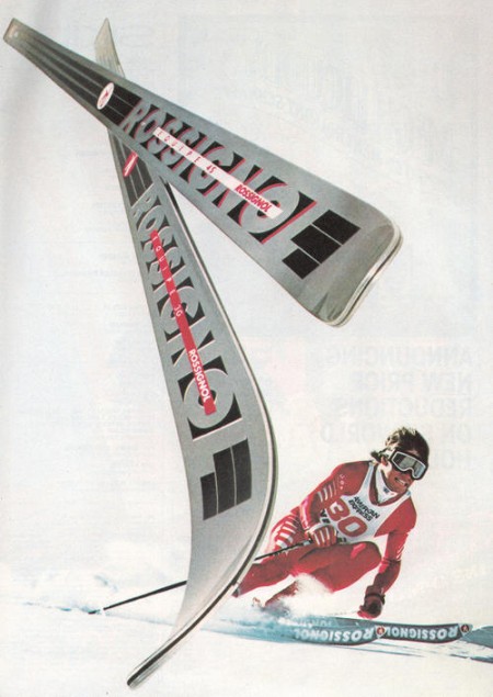
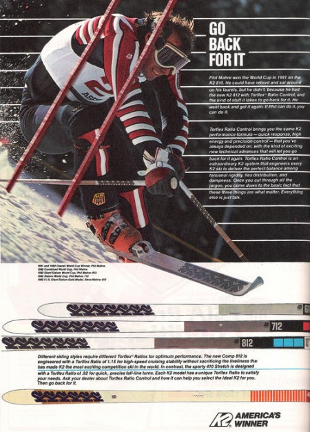
I got my first couple days of skiing for the season in last week right after some nice snow up at Heavenly. Skiing always reminds me of being really young and going up with my parents, Sacramento is only an hour from the Sierras so we’d get up a few times a year. I loved all the design associated with ski equipment and I found that when I first started out in design I was always trying to emulate that style in my work.
My latest trip got me thinking about vintage ski graphics so I set out to track down some good examples. Most of what I found were from magazine ads, this first set focuses on racing imagery. I’ll be posting some more in the days to come, hope you enjoy this first batch.

20 Comments Leave A Comment
shauna says:
January 6, 2010 at 1:03 pmI love vintage ski posters. You should check out Alta if you ever make it to Salt Lake… it’s like a 70s time warp of vintage imagery and decor. My sister-in-law got me a book called The Art of Skiing last year for Christmas and I think you would really enjoy it. Pretty sure she found it at Mammoth for much cheaper than Amazon.
KevinSanSalvador says:
January 6, 2010 at 1:13 pmOne of my favorite things in the world – 70s ski ads, and the voice of Warren Miller. Nice post amigo.
drew kora says:
January 6, 2010 at 2:11 pmyep, something absolutely magical about classic ski graphic design. top notch and full of nostalgia for me, too. these days, i feel lots of skis and snowboards are either gross, way too busy, or way too generic.
my next board will be just a plain glossy white board (from prior). the simpler the better.
Michael Corry says:
January 6, 2010 at 2:22 pmHah, and I would have taking you (Scott) as a snowboarder. I’ve always loved the designs on skis/snowboards.
I have always loved the designs found on boards. Part of what got me into design was looking through CSS catalogues (skateboard/snowboard catalogue). Thank god skis/snowboards veered away from the EXTREME!!! designs that were popular in the 90’s (think mountain dew logo). Take a look at Burton’s boards and you’ll see some awesome designs in my opinion.
rburch says:
January 6, 2010 at 2:43 pmGreat post. I wish they brought some of old ski designs back on the new stuff that’s out today. A lot of ski graphics are just too over the top with ripped paper effects and that type of stuff.
joshua talbot says:
January 6, 2010 at 3:20 pmClassic stuff Scott. Having grown up in a resort town their almost too nostalgic :) The gray rossis bring back a lot of memories. looking forward to more!
Moe says:
January 6, 2010 at 3:25 pmHey guys Im an old follower os this blog, since 2006 and I never post anything.. but i really find disgusting the Tag cloud. makes look ugly the blog.
j graves says:
January 6, 2010 at 7:02 pmyeah! the best style, something ISO50 has always reminded me of. i get the childhood associations too. thanks for this.
Refidnas says:
January 7, 2010 at 7:26 amHey! Those ads aren’t that old, are they? They’re from the ’80s, right?
Or maybe I’m old too . . .
. . . but I can still ski.
Kyle says:
January 7, 2010 at 8:37 amThose look great. I actually just tried skiing for the first time this winter and prefer it over snowboarding, and now it’s all i think about. I’ve been searching for a ski company with really simple and classic graphics on them. I can’t stand the graphic direction snowboard and ski companies have gone in recently.
Then out of the blue I found a pair of Kneissl skis being thrown out in my neighborhood. I can’t use them since they’re waaay too long, but it made me check their website to check out their current designs. Holy shit, they are beautiful. The logo, which i love, has stayed the same and i love their minimalistic approach to the over all feel. I’m seriously considering going for these: http://www.kneisslnorthamerica.com/allmountainproducts.asp?id=4
Matt Stanley says:
January 9, 2010 at 10:31 pmOh my, keeping my fingers crossed you have some Ingemar Stenmark — I think he skied mostly Elan — ads waiting in the wings! Stenmark had the most sublime GS style. And maybe Bobby Burns’s “The Ski”? Great 70s minimalist color blocks on those topskins.
BP Design Lab says:
January 11, 2010 at 4:01 pmI found some really cool vintage ski posters here as well: http://www.vintageadbrowser.com/search?q=ski. Great illustrations…
Laura says:
January 18, 2010 at 5:56 pmGreat stuff…! come skiing to Northstar, I’ll give you some free lift tickets! we are having some great powder days this week…
Eric says:
January 20, 2010 at 7:44 amThese are awesome.
Eric Wicks says:
February 3, 2010 at 6:40 pmMan, skiing used to be REALLY cool.
Chevratik says:
February 17, 2010 at 3:25 amHey! Those ads aren’t that old, are they?
Virtuk says:
May 25, 2010 at 12:51 amClassic stuff Scott. Having grown up in a resort town their almost too nostalgic
адвокат says:
May 31, 2010 at 2:15 pmIt’s cool! Thank you from Russia!