Tokyo Signs Two
Posted by Scott
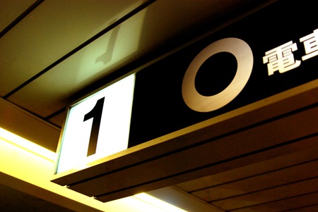
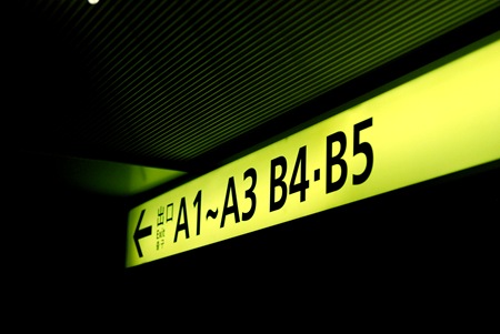
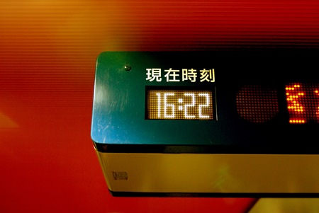
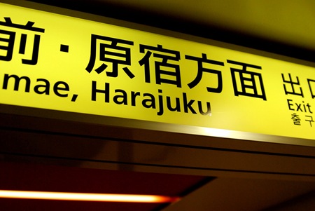
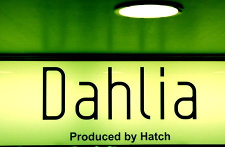
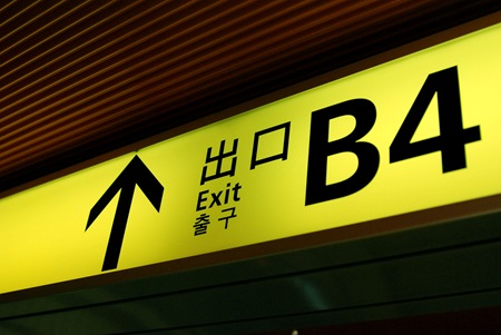
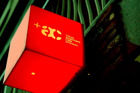
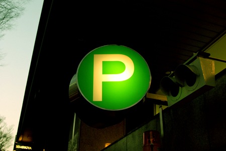
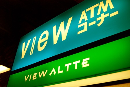
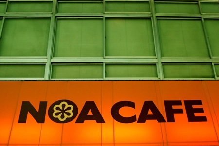



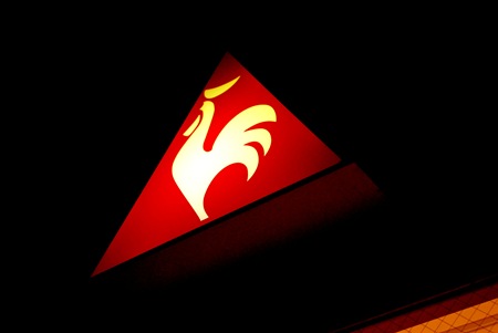

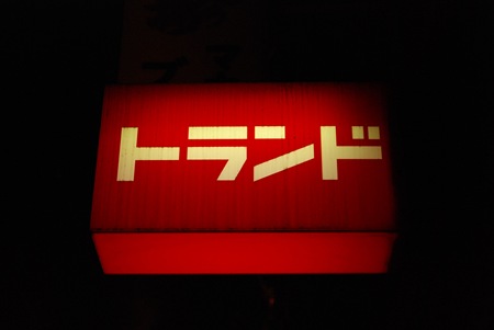
Some more wonderfully designed signage from Tokyo. Most of these were taken in the Harojuku area, a few are from Shibuya. The type and design of the subway system is incredible, so well thought out. More to come….

27 Comments Leave A Comment
Joaquim Marquès Nielsen says:
January 5, 2008 at 8:37 pmWow, that “HP*annex” looks amazing! And the last image here (the red sign) – perfectly balanced. It’s unbelievable…
mike says:
January 6, 2008 at 1:57 amthe “1 O” one is my fav
NN_Bob says:
January 6, 2008 at 2:46 amreally nice photos, great colors.
I like “Bukta” , its so retro.
HP*annex looks like photoshop work , not like photography :)
Leggoz says:
January 6, 2008 at 5:46 amThat red square, Tokyo apartment cafe, is really nice.
Daniel says:
January 6, 2008 at 6:13 amI would say Japanese design is pretty amazing! :)
Sarah S. says:
January 6, 2008 at 7:39 ami am pretty much amazed by the pictures you took. they want me to see tokio more than ever before. can’t wait to read/see more of your stories/pictures. :))))
Jon says:
January 6, 2008 at 11:57 amHow much photoshop manipulation went into these? They all look incredible. You have a great eye, Scott!
Amman says:
January 6, 2008 at 1:31 pmtokyo is far beyond. did you get to go there? you should check out http://www.wddg.com if you havent arleady.
Amman
Bas says:
January 6, 2008 at 2:11 pmNice, have a nice trip!
I’ve been in japan last september, shot some series;
http://photo.basdeboer.com
Jug says:
January 6, 2008 at 2:46 pmSo…I’m pretty sure this is my favorite set so far!
Mc Caffrey says:
January 6, 2008 at 3:56 pmHere mate what camera did you use for this? The colours are very strong and dark, was it a lomo of some sort?
Jason says:
January 7, 2008 at 1:47 amInspiring pics… Any plans on selling prints?
Roger Gordon says:
January 7, 2008 at 3:48 amHi!
I just discovered your blog through http://ilovetypography.com, and I’ll definitely be adding you to my RSS reader!
Thanks for posting these signs. They certainly are an inspiration to visit Tokyo! The last sign posted is absolutely amazing as an example of simple beauty.
Also, your music is really great. I’m listening to the streaming versions of the tracks on http://tychomusic.com right now.
Kemp says:
January 7, 2008 at 2:15 pmSo very nice!
Ben Blood says:
January 7, 2008 at 3:02 pmScott, I know you get a lot of comments to read, but I just wanted to say THANK YOU for sharing these shots – I’m very very inspired by the minimal design and colors in this airport. If you find more design like this in Japan, please share it!
Thanks,
Ben Blood
Luis Serrano says:
January 7, 2008 at 5:44 pmWhat amazing colours!! thanks for sharing!!
Play'O says:
January 8, 2008 at 2:53 amThx for those amazing shots. Wich camera do you use ? Nikon colorpix ?
Have a great travel…
viva b. says:
January 13, 2008 at 10:39 amwow…gorgeous shots. can’t wait to get to japan someday.
anon says:
January 17, 2008 at 12:33 amNice. Can I ask what camera you used? The colors look like it came from a Lomo but I’m not really a photographer.
j03 says:
January 28, 2008 at 8:41 amScott,
Have you seen this article about a guy in the Tokyo subway that creates beautiful typography with colored sticky tape?
http://www.pinktentacle.com/2007/07/shinjuku-station-signage-made-with-adhesive-tape/
-Joe
thao says:
January 28, 2008 at 10:21 ammessy tokyo sign to add to your collection:
http://flickr.com/photos/middle-child/453791485/in/set-72157600060962771/
Alice says:
May 4, 2008 at 10:50 pmGreat! I’ve just started a map of cool places to visit in Tokyo:
http://www.mapme.com/map/tokyoneighbourhoods
Maybe you’d like to add some of your own spots and photos to the map?
Anonymous says:
November 30, 2008 at 8:26 amZashkaser says:
August 5, 2009 at 9:36 amI love her blog too!!! She has amazing clothes!! And I want her hair !!!