Tim Navis Photography
Posted by Scott


Navis has been a long time commenter on this blog but I just recently stumbled onto his photography and was very impressed. The colors are just perfect; such a nice tone, feels modern yet still authentic. From the Flickr EXIF data it looks like he’s using a Canon EOS 30D. Tim, perhaps you’d like to elaborate on your equipment (lenses etc.) and methods in the comments?
You can find more of Navis’ work at his Flickr and his portfolio.

35 Comments Leave A Comment
alex says:
March 11, 2009 at 12:05 amYeah Tim, wow, very well done. I agree; fantastic use of color, and I especially like how the way you use light in your photos. Everything feels very calm and serene. I think my favorite might be the one of the flying machine (hang glider?), or maybe the shot of the canal.
Definitely would love to hear more about your process..
5050box says:
March 11, 2009 at 12:36 amBrilliant! Love it.
koneyn says:
March 11, 2009 at 2:20 amI really think Boards of Canada should hire Navis for their artwork :) The photos have this feeling as if someone opened up his memories to you, it’s dream-like and warm, emotional. Great work!
David says:
March 11, 2009 at 2:46 amI agree with koneyn, though my first thought was Ulrich Schnauss, especially the handgliding one.
Kike Besada says:
March 11, 2009 at 3:13 amAmazing colors :) and very emotional photos. Congratulations from Spain
Antonio says:
March 11, 2009 at 5:37 amGorgeous. I love photography with this kind of color tone. Perfect. Tim, I’d love to read about your process.
Chris Stevens says:
March 11, 2009 at 5:47 amI would really get a kick out of seeing more information about how to achieve this effect, either through post proc or lens work!
sean patrick says:
March 11, 2009 at 5:57 ami would love to give this guy a hasselblad and see what he would do with a few rolls!
Jeff says:
March 11, 2009 at 6:08 amBeautiful tones. So warm and inviting. Great work.
Mason says:
March 11, 2009 at 6:23 amAs a photographer myself, it was nice to see an inspiring portfolio. Thanks for sharing!
Brian says:
March 11, 2009 at 6:43 amHe does have nice work. But I actually think his black and whites are the best. Personally, I’m getting burnt out on everyone with a digital camera making their photos look cross processed or vintage. And that is why black and white will never get old in my book. To me, when you make good black and white images, that is when you are a good photographer. When you don’t need to tweak the colors in order to support the image.
Rent says:
March 11, 2009 at 6:52 amamazing photos Navis…the colors are just perfect…fantastic.
Adam says:
March 11, 2009 at 7:11 amI find I can get nice colours with Film … but I can rarely get nice colours and a perfect composition. I find like 1 or 2 good shots out of a roll, that’s why I like digital, but I can never get the same colours without post-proc.
Love your pics Tim!
http://www.flickr.com/photos/you-are-here (still relatively new to photography!)
Hardleers says:
March 11, 2009 at 7:25 amAwesome photo’s! And who’s the girl?
Horacio says:
March 11, 2009 at 7:26 amVery nice photos, really.
NAVIS says:
March 11, 2009 at 10:53 amWow. Seriously. Wow. This is the coolest thing I have woken up to ever (except maybe Christmas morning between the ages of 3-10 haha). I had to rub my eyes to make sure I was seeing my RSS feed right. Thank you everyone for the warm and supportive comments! And thank you Scott for posting my work! I am completely flattered. Next time you’re in LA, drinks are on me. (side note: Loved your new songs at the show on Sunday)
I do use a 30D which I’m trying to upgrade to a 5D. For landscapes I use a 17-85mm EFS zoom lens and for portraits I use a 50mm fixed lens. And to explain how I achieve the coloring… too bad we all can’t have a Being John Malkovitch moment and enter my mind haha. I use Photoshop obviously to tweak the colors. I used to use the selective colors a lot but for some reason using that messes up the colors when I go to print. So I just stick to curves and occasionally levels for B&W images. My way of doing things is pretty haphazard and primitive. I like the keep things really simple. Wherever the light is coming from I’ll use the elliptical marquee, feather it to death, and fill it in a few times with a color and do some fancy layering stuff.
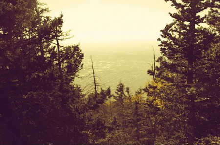
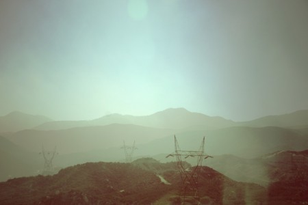
One of my all time favorite photos is the last one with the power lines. That was on my way back from a Vegas excursion and we were coming down the Cajon Pass near Victorville, CA. I got my camera out and just started snapping from inside the car. I love nature and natural elements so those play a big role in my work. The hang glider picture was such a cool spot to shoot. I was at the top of Sandia Peak,NM and I looked up and suddenly there’s this dude chillin’ in a hang glider at 10k feet. Such a cool thing to see.
koneyn – I’d love to have my work on the next Boards of Canada album. If anyone knows how to make that happen that would amazing!
Thanks again everyone. This is a pretty epic day in my books! If you any questions, hit me up! tim at navisphotography.com
yann+ says:
March 11, 2009 at 11:07 amGreat ! All about feelings, true +
Shelby White says:
March 11, 2009 at 12:58 pmAwesome job Tim, was just on your blog yesterday.
zenzanon says:
March 11, 2009 at 1:24 pmI agree with Sean Patrick, this guy would do wonders with film.
susan yee says:
March 11, 2009 at 2:50 pmlovely.
WH says:
March 11, 2009 at 5:10 pmIs that Kiera Knightley?
No. But it looks like her
Beautiful work.
Pete Lasko says:
March 12, 2009 at 7:30 amThis proves to me that everything isn’t so systematic as we want to think. You (Tim) don’t seem to have a step 1, step 2, step 3 process to get your look, but you’ve obviously got a style. We need to spend more time playing around and getting the feel we’re after, and less time analyzing and deconstructing. The images are beautiful Tim. And thanks, Scott for creating a venue to promote this kind of work.
Mbithi says:
March 14, 2009 at 11:57 amWow, Tim great work. Mad props to you from Kenya!
The technique you described is amazing!Why?Because it’s just like mine(not with the same kind of stunning results though), BUT in terms of just tinkering around with stuff until you find what works for you, i think that’s just brilliant.
We need more of this.
Hope the Boards of Canada thing pulls through!
Alissa says:
March 14, 2009 at 12:18 pmAmazingly gorgeous. I’m going to check out his Flickr. Thanks for sharing.
andrea says:
March 15, 2009 at 4:11 amlove th composition, but most of all the colors…they make me feel somethig good
Michiel Reuvecamp says:
March 15, 2009 at 1:34 pmYeah totally stunning work. Especially your photos of Nikki are timeless, have a very good dreamlike quality to them that is just calming.
I would have to say without a doubt though that my favorite picture is the one of the canal in Arizona. Stunning and so peaceful.
Awesome work.
r says:
March 16, 2009 at 7:33 amThis is really great, color use is fabulous and creates such warmth!
willy says:
May 6, 2009 at 6:31 amhey tim,
just to let you know, your site doesn’t load properly in firefox 3.0.1 on a mac
Rida says:
October 30, 2009 at 2:43 amPhotos are excellent. They are bright, expressive and emotional! Thank you!
how to have high eq says:
September 22, 2010 at 3:21 amIntimately, the post is in reality the greatest on that notable topic. I agree with your conclusions and also will certainly thirstily look forward to your upcoming updates. Simply just saying thanks will not simply just be enough, for the wonderful lucidity in your writing. I definitely will at once grab your rss feed to stay abreast of any kind of updates. Pleasant work and also much success in your business enterprize!
Anonymous says:
January 24, 2011 at 6:08 amJUST SO WARM PHOTOGRAPHY…