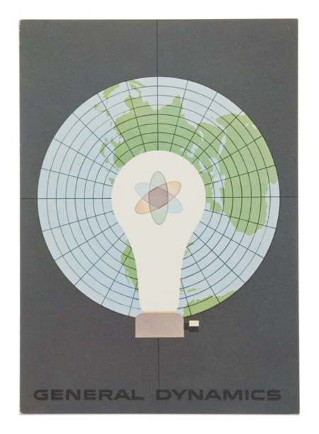
Nitsche

John Coulter sent me a bunch of wonderful Erik Nitsche images. This is the first of many to come, so amazing. I think this sort of illustrative design style is something that our generation has lost. You rarely see anything quite like this anymore. Most of the true illustrators these days stick to the sort of fanciful, handmade-looking things that you would expect and most pure designers stick with the computer producing things that sometimes feel a little too perfect. This is an example of how great things can be when you create graphic design by hand, in the real world. I know it’s not really practical in most commercial settings, you would hardly be competitive with other designers if you were trying to make everything by hand. But still, it would be nice to see a little bit more of this around. What’s really amazing is that this work of art was commissioned by a defense contractor, my how times have changed. I wonder if companies are just placing less emphasis on the printed form as they migrate to newer media, or if people simply don’t see the value in quality design like this anymore. Either way, it’s images like this that make me lament the passing of the golden age of design and the fact that I was born too late to be a part of it. I suppose that’s why I’ve always put so much emphasis on selling my work directly, by circumventing the world of client-driven design it’s still possible to create images with these ethics intact.

4 Comments Leave A Comment
Alex / HeadUp says:
November 28, 2007 at 7:56 am“I wonder if companies are just placing less emphasis on the printed form as they migrate to newer media, or if people simply don’t see the value in quality design like this anymore.”
I think it’s a little bit of both…especially when it comes to the military and defense industry– much of their design is a Black Hawk Down re-hash (a la Blackwater, Conor, Magpul, etc.), while on the other hand, I doubt companies like that would want to align their brand identity with dated styles and conflicts, regardless of how aesthetically pleasing they are.
rafael says:
November 28, 2007 at 9:12 ammore on nitsche;
http://www.typotheque.com/articles/erik_nitsche:_the_reluctant_modernist/
excellent article by steven heller.
images:
http://www.flickr.com/photos/eriknitsche/
Shud says:
November 28, 2007 at 1:29 pmto me it seems that alot of the nostalgic design posted here has a healthy dose of avant garde spirit that i just don’t think flies much these days, either from industry, but also the populace. conformity seems to have tightened it’s grip everywhere you look, in many industries, and indeed, the culture. but it’s funny how it works, because in my own experience, and even as can be seen in the popularity of scott’s work, there’s that tangible avant garde spirit that people can identify with and get excited about. i think alot of people are thirsting for this type of style/spirit/aesthetic. things are just generally bland and not much seems to be making an effort to really stand out. i’m realize i’m generalising bigtime, but…
zsegzawfkh says:
April 23, 2008 at 6:46 pmWow, cool man, big thanks! http://dmchruhewnbn.com