Tom Kundig: The Nature of Design
Posted by Scott


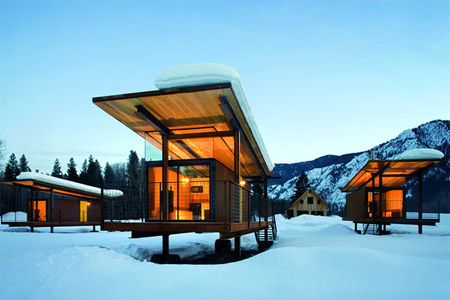
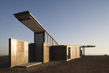
I stumbled across this great article about architect Tom Kundig’s work on WSJ today. That first house is off the charts amazing, I’d move in tomorrow despite the fact that it’s in the middle of nowhere (at least I’d get a lot of work done). Kundig’s goal is to find balance between the structure and the landscape and from the looks of things he’s doing just that. Once again though, after browsing his portfolio I am realizing if I ever want an amazing house like this I’ll probably have to move to a more rural setting (and find a bag full of money on the way out there). It must be so amazing to be in, for example, Mazama, Wash., and come across structures like these in the wilderness.

8 Comments Leave A Comment
Bas says:
January 6, 2009 at 3:56 am‘Kundig’ means ‘capable’ in Dutch :)
Justin Meyers says:
January 6, 2009 at 7:16 amYeah, the first one for sure. They almost look like timeshares or something.
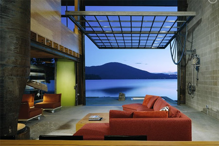
My friend just opened a coffee shop and it has a window just like the one in the third picture which he’ll leave open in spring or fall or if a band is playing.
Scott – did you ever check further into those prefab homes? I think they’re called “Nifty Homes” or something real basic like that.
Sean says:
January 6, 2009 at 9:36 amI’m having trouble deciding which one I like best. That third one overlooking the lake might be my favorite. Imagine working with a view like that staring you in the face. You’d either produce some of the most inspired works of your lifetime, or you’d be so lost in thought you’d never get anything done.
Fred says:
January 6, 2009 at 9:40 amthere’s an articled in this month’s Dwell magazine about prefab i think you’ll probably like.
Darin says:
January 6, 2009 at 5:25 pmI was just skate-skiing through Mazama two weeks ago and passed the rolling huts, wondering where they came from. Thanks for the info.
SeattleJC says:
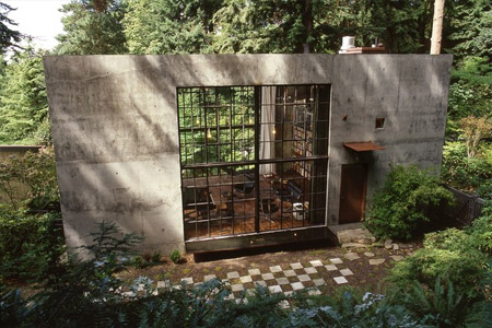
January 6, 2009 at 6:01 pmI recognize that house from the bottom photo. I discovered it while jogging in my neighborhood in North Seattle. It looks even more cool now since the concrete is more than half covered with red leafed ivy.
Here are some more photos and views of the inside, too.
http://seattletimes.nwsource.com/pacificnw/2005/0522/cover_nseattle.html
greg says:
January 7, 2009 at 8:09 amI’d choose the sweet pad in the bottom photo (if I had such a choice). I love me some forest, I do!
Marius says:
January 9, 2009 at 2:05 amA wonderful find. Thank you very much for sharing these Scott.
The first one is the kind of home I would build, If I ever have the chance to.