Swiss Air Lines Rebrand
Posted by Scott


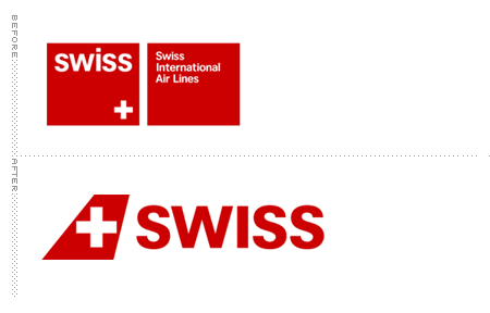
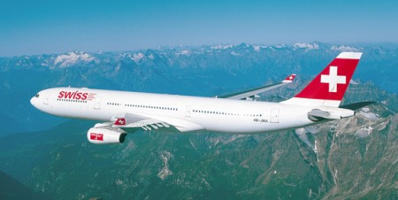
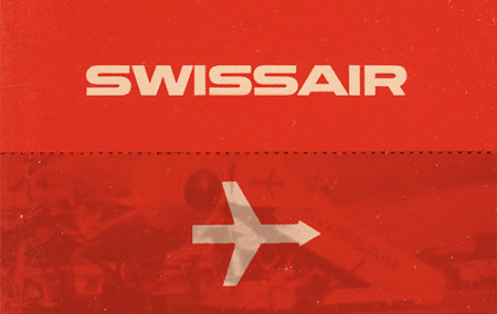
Switzerland’s current national airline (no, not that old one with the best branding possible) has undergone a rebrand and Brand New has all the details. A lot of people have been grumbling that the original “cube” logo was better — and I certainly agree — but judging this at face value, I have to say I’m into into it.
Brand New via Sam Valenti
Further reading: Be sure to check out Shelby’s post on Swissair’s (the now defunct Swiss national airline) branding.


2 Comments Leave A Comment
Ashley says:
August 25, 2011 at 11:28 amNot really sure how I feel about this one. Now I have to swap my take on Swiss Air
http://shlee1.tumblr.com/post/3016939400/typography-random-and-busy-o-layout-for-swiss
Gisela says:
September 5, 2011 at 4:57 pmme parece que el pleno rojo del fondo de la cruz se puede leer como un atáud. Le puede jugar encontra la polisemia del mensaje.
Saludos, es una simple apreciación. Quiero saber si lo pensaste al menos?. Gisela.