IBM Smarter Planet Posters
Posted by Scott

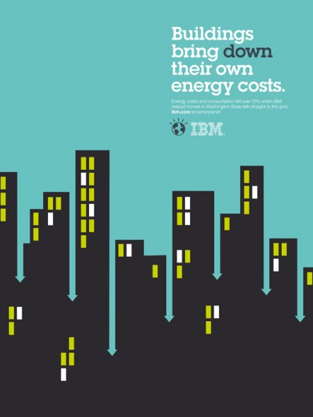
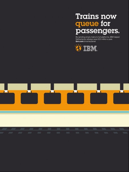

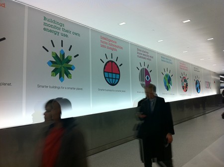
Ogilvy Paris turned out some nice looking posters for IBM’s Smarter Planet campaign. Some dicussion of the fonts and more posters over at Fonts In Use.


Ogilvy Paris turned out some nice looking posters for IBM’s Smarter Planet campaign. Some dicussion of the fonts and more posters over at Fonts In Use.

9 Comments Leave A Comment
mike says:
May 17, 2011 at 1:36 pmthose are the titties.
Victor says:
May 17, 2011 at 2:24 pmI wonder if they hired this kid – http://tangyauhoong.com/negative-space/
Kevin E says:
May 17, 2011 at 6:32 pmAll I can say is wow. These images get it right.
Leah @ Freutcake says:
May 18, 2011 at 8:24 amLovely examples of positive/negative space and clean design!
Syscrusher says:
May 18, 2011 at 8:12 pmThe fourth one down reminds me of Porter Airlines in Canada:
http://www.flyporter.com/
Lady says:
May 30, 2011 at 10:06 amClear and simple! Loving the play on positive-negative space.
Rashid says:
May 31, 2011 at 1:34 pmVery good work!
Jonny says:
June 7, 2011 at 5:39 amVery nice.
Looks remarkably like Noma Bar though.
Oh well, all’s fair in love, war and design.
Charles Forster says:
June 7, 2011 at 7:21 amOoo. I like these. It’s cool to see a big company supporting causes like this. Added them to my blog with links back :)