Marius Roosendaal
Posted by Shelby White
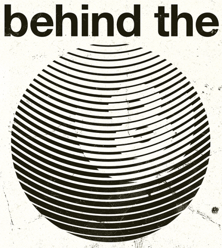
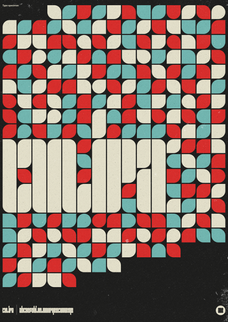
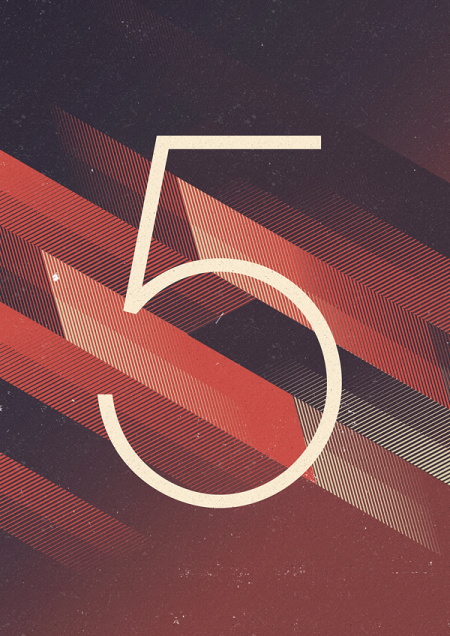
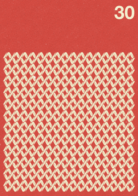
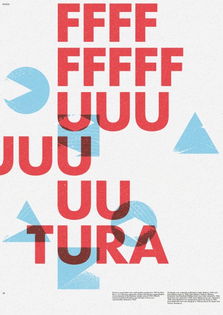
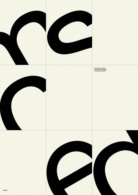
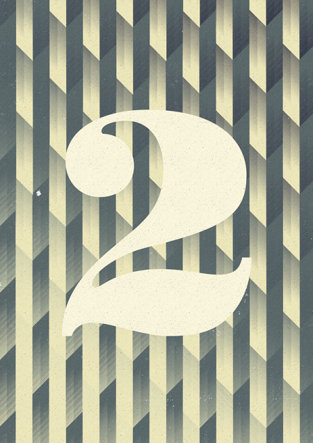
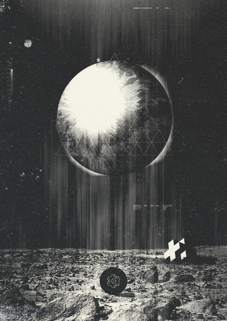
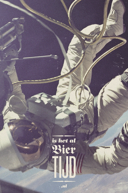
Marius Roosendaal from the Netherlands is making these cool typographic design studies on a daily basis and has formed a larger collection here. It’s worth checking out.
Via BtgLondon


Marius Roosendaal from the Netherlands is making these cool typographic design studies on a daily basis and has formed a larger collection here. It’s worth checking out.
Via BtgLondon

13 Comments Leave A Comment
Fairylight says:
April 7, 2011 at 1:43 amLol! That last one(spacedude) is saying: Is it time for beer yet?
Nice collection.
NAVIS says:
April 7, 2011 at 3:09 amNot gonna lie but I laughed a lot when I saw the FFFUUUUUUUUUUUU in the Futura poster and instantly thought of Jakub.
Jefta says:
April 7, 2011 at 6:45 amholy crap. this guy is good. and from Holland too. I got some catching-up to do, or we’ll ALL out of a job soon here.
awesome work.
Nani Marco Mirko says:
April 7, 2011 at 7:08 amIncredibile. Le emozioni che danno questi manifesti è davvero incredibili, ma si mischiano bene nel caos della città?
Nani Marco Mirko says:
April 7, 2011 at 7:18 amahhh ok, avevo capito male :D
Pablo Sotomayor says:
April 7, 2011 at 12:57 pmI’ll never be able to look at futura without giggling again.
mg33 says:
April 7, 2011 at 2:21 pmI wish some of these were in landscape format – they would make for some great wallpapers. Love the textures across all of them.
DavevsDave says:
April 7, 2011 at 2:31 pmI’ve been looking for some new inspiration, and this is it. I am definitely going to spend some time studying this guys work. Totally stellar, thanks for sharing.
Anonymous says:
April 7, 2011 at 2:45 pmintelligent, but not too polished.
the textures give it just the right look.
schilderstape says:
April 7, 2011 at 3:27 pmi don’t understand why this is going around on the blogs that much. i mean, some works might look okay, but it does’nt make sense. i think he loses himself too much in minimalism and crouwelism, it’s easy to copy and say it’s your own, without having a concept or idea behind the work.
Will says:
April 7, 2011 at 8:19 pmJust entered the typography from that last one with the astronaut into my translator app, and it means, roughly, “is it beer time already?”. Pretty funny.
Alex / HeadUp says:
April 7, 2011 at 11:20 pmVery cool! I am loving the use of texture, the color palette, the type choice.
AlexDelarge655321 says:
April 8, 2011 at 6:49 amThese are amazing!