Graphis Packaging 3
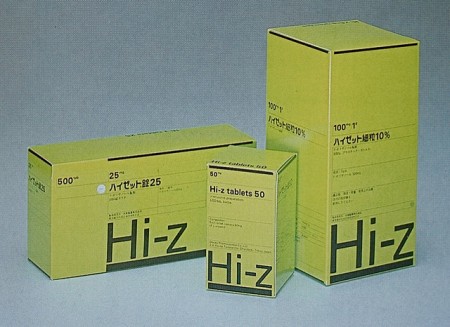
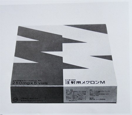
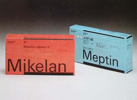
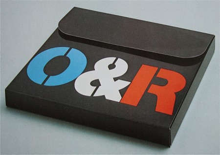
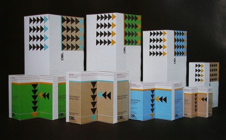
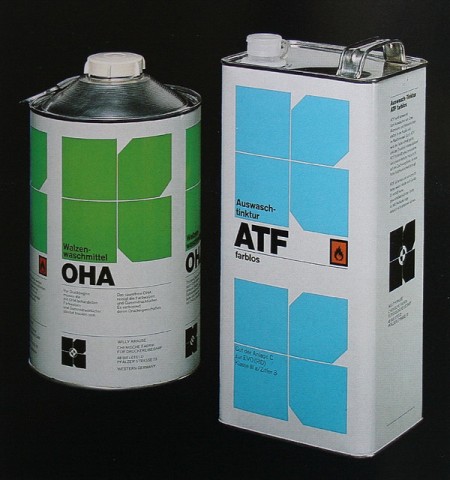
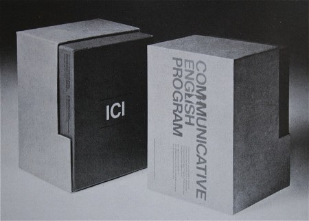
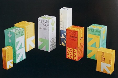
Some excellent examples from Graphis Packaging 3. I can say without any doubt in my mind, that packaging design has declined significantly over the past 20 years. Take a look at the more recent Graphis Packaging 9. Nothing in there even remotely piques my interest. I would love to hear a reasonable explanation of this phenomenon. Is it that marketing departments have slowly wrested control from true designers? Or is it just that I personally appreciate the style of a specific era to the current one? Or maybe I’m just so used to the style of things today that I am intrigued by the rarefied forms of the past. I’d like to think I’m being objective about the whole thing and that the above examples really are superior, but perhaps I’m not.
Anyone in the know care to shed some light on this? Have studies been done? I need answers!! I’ll tell you one thing, you could fill those boxes with whatever you wanted; if I saw them on the shelf I would buy them. Check out some more examples here.
Images via Crabstick

22 Comments Leave A Comment
Michael Corry says:
January 20, 2011 at 9:05 amI think it could be a mix of all three things. But when looking at the aesthetic from back in the 70’s, I think it’s easy to get infatuated with the stuff, it really is beautiful. Meanwhile, all the design in Graphic Packaging 9 is very common place to someone living in this era. Not to say that I think the design in Graphic Packaging 9 isn’t good, but like any artifact of a bygone era, it will spark human interest.
Also, Scott, I think your aesthetic also has do to with your partiality to that era. It really shows in your work.
Troy says:
January 20, 2011 at 10:16 amI was going to say the same thing as Michael. It’s clear that the 70’s never die at ISO50.
One comment I would make regarding the packaging design of the 60s and 70s is that it is not very friendly-looking. It’s loaded with geometry, in contrast to today’s, and I think that might be a detriment to its function (that is, to sell the product).
90% of consumers do not care about the packaging design of the product they buy, especially since it’s almost always disposable. Subconsciously, though, they might not buy a product that looks like it’s been on the shelf since 1974.
Katie B says:
January 20, 2011 at 11:37 amPerhaps the best explanation is also the most simple: the abundance of technology, and the freedom it brings. However, freedom can be wonderful only if the user knows restraint. With limitless options and no restraint, there is only pandemonium. Pure design vanishes.
How this relates to package design is an easy connection: with the advent of Photoshop (and newer, more sophisticated versions) designers have been given enormous freedom, but many have still not grasped the concept of restraint. Like a kid in a candy shop, just because a button, effect, or filter is there doesn’t mean you should use it.
This is not to place the onus on the designer alone: sometimes the struggle lies in convincing the client of the same thing.
Remember: white space is our friend.
Matt Davis says:
January 20, 2011 at 12:37 pmI think design has become more personalized today. Although the older Graphis package designs are awesome to look at, there’s really no diversity there.
I’ll agree, it is refreshing to see older pieces of design where color and grid structure are more predominate, but at the same time I enjoy seeing new ideas explored with varying type treatments and textures showcased.
Sunil Sarwal says:
January 20, 2011 at 12:43 pmFrom my experience, grabbing attention almost always trumps aesthetics. Unless you have a big ad budget to go with your product launch, no one wants to run the risk of having a package that won’t get noticed.
Today’s packaging is the culmination of 20 years of adding “one more thing to make it stand out”.
Now that the shelves are so cluttered, the pendulum will hopefully swing the other way, as packaging uses one less thing to stand out.
Daniel Lindenkreuz says:
January 20, 2011 at 12:51 pmLooking at the first two examples of the more recent Graphis 9, I can understand your point of view very well. Yet, our opinions are biased by our proclivity for outstandingly minimalist designs – be it packaging or web design. Most products we find in a supermarket unfortunately don’t tend towards this style; to address the average customer packaging needs to be eye-catching in the way of blurting out an excessive amount of colours (and in some cases even typographical diversity).
Yet, I agree with Troy who posted a comment above: The packaging featured in this post might be attractive to people like me and you but objectively seen, the geometrical style featured above is not very appealing. This doesn’t apply to the Macintosh packaging in Graphis 9, though.
Josh says:
January 20, 2011 at 12:53 pmThat last photo makes it clear that Target “heavily borrowed” this idea for their Up and Up brand packaging.
DavevsDave says:
January 20, 2011 at 1:08 pmI agree with what others have said, it’s mostly just a reflection of your personal preference.
However, Graphis 9 has some particularly uninspiring packaging examples which is probably a result of designers trying to do to take advantage of new technology just because it’s there. For example: The Apple G5 computer packaging seems like the designer was more interested in creating lettering that looked metallic than they were about the overall form of the type and how it interacted with the side of the box.
Paul Anthony Webb says:
January 20, 2011 at 1:49 pmI agree with Michael here. That said, I don’t think packaging design is actually *dead* in today’s society … it is more like, package design is on life support.
Grant says:
January 20, 2011 at 3:13 pmI think there is definitely room for todays packaging to learn from the awesome examples in Graphis 3. I found a copy of it in my local op shop (thrift store) for $3. So good.
This packaging http://www.stockholmdesignlab.se/#/1112/projects/clients/askul/askul/ is a great example of a current packaging system thats similar to the minimal 70’s design but works really well today.
johnee says:
January 20, 2011 at 5:07 pmbeautiful packaging as always.
@josh … i noticed the target thing too http://rebeccagbailey.com/wp-content/uploads/2009/12/Up-and-Up.jpg
Anonymous says:
January 20, 2011 at 5:32 pmi would say it has to do peoples bad taste and the evolution of ungraceful change.
Kevin A... says:
January 20, 2011 at 7:11 pmPackaging has changed over time in part because style changed, but more importantly because marketers have become significantly more sophisticated. I studied packaging/branding/logos as an MBA student and those courses were taught by guys with PHDs in Psychology.
Yes, there have been studies, it’s easily one of the most studied areas of marketing. Design is merely a tool now, used to push psychological principals, mostly subliminal, to a marketer’s end.
Norik says:
January 20, 2011 at 8:32 pmEven though i find this “Giegy” aesthetic personally pleasing, one thing that has developed significantly since that era is marketing and branding. The need to chisel a unique identity has garnered more importance since then.
Technological advances have also allowed us to make our work more complex.
Everything wanes and waxes, these minimalist principles will become more prevalent again as a backlash against the maximalist consequences of our advanced tools.
fr says:
January 21, 2011 at 10:26 amThere’s some good packaging out there these days but as a whole I think contemporary packaging is dreadful, particularly on the low end. It seems like there used to be at least some bottom baseline of quality and now anything goes.
I think it may partly have to do with the fact that packaging may not be very sexy for young designers. Think of all of the people going into motion graphics or the web who maybe would have gone into packaging design 30 years ago instead.
Kyle says:
January 25, 2011 at 2:23 amI think the idea of design as something timeless clearly plays into the difference between Graphics 3 and 9. Many of the ideas in 3, specifically the ideas of grids and geometry, don’t date the objects they sell (Up&Up, anyone)?
9, however, clearly looks “in the moment”. I can clearly tell that the Tazo packaging is influenced by trends in modern consumerism, as does the “brushed G5” look in the apple products.
It has nothing to do with personal preference, in my opinion. Good design is timeless.
Bobestes says:
January 30, 2011 at 11:41 amI work for a fairly large package design firm, and can say that there is nothing we love more than to explore the type of work you’ve shown.
Sadly, the main obstacle: it just doesn’t sell (in many cases).
Fault says:
January 31, 2011 at 5:16 pmOnce I heard somebody say (it may have even been on this blog I think), these days design is “have photoshop, will travel”. I think that phrase really reveals something about why good design is on the decline, in yesteryear everybody who was a graphic designer needed the skill, patience and dedication to create something by hand. I think the hand created process brings a different final result both conceptually and aesthetically. Partially because of this design is going through a “maximalism” stage where more is more rather than less is more, and some of the fine detail and craft found in the simplicity of older designs has become a lot more rare. I’m not saying thats the only reason, you can see that by looking at some of the other points people have brought up, I just think it contributes.
Mat says:
February 7, 2011 at 6:41 pmDoes anybody still go to Graphis or use it?
Swade says:
February 10, 2011 at 12:01 amIt all costs money. Hiring a designer. Buying the equipment to mass produce such designs. Buying the ink. Buying the paper. Etc. It’s too much money for something that may not work, especially with the consumption of goods over the internet. Many things you don’t need packaging anymore. Look at CD’s, or even more recently books and the introduction of the eReader (Kindle, NOOK). More and more we want instant gratification. All people want is what is in the box. I don’t think packaging is worth the cost to most companies in this day and age. Just my thoughts.
jonathan says:
February 11, 2011 at 12:50 pmSwade, unless you plan on downloading your gallon of milk, or bag of romanian salad mix through iTunes, there will always be a need for package design. It’s a forgotten art today, that is ruined 85% of the time by “know-it-all” marketers, who just want to do what everyone else is doing, “but better.” It’s just a trend. If you get a chance to work on a package, aim to create new trends that are as aesthetically pleasing as the past.
Bought the book, btw, 100% badass. Thanks!
Karl says:
May 19, 2011 at 6:37 amEssentially I think people have fallen out of touch with that kind of geometric look. Say you put some of Graphis 3 packaging next to 9, people might look at 3 just because its “different”, but I guess you could say its brand recognition is almost nil. Brand recognition creates revenue, and that’s what every company wants today. Analysts are devoted to squeezing every strategy they can into a business plan, streamlining every department just to sell more to the consumer.
Whether or not business has become more “greedy”, I don’t know, but its definitely feels like the death of good design sometimes.