Vintage Magazine Scans
Posted by Scott
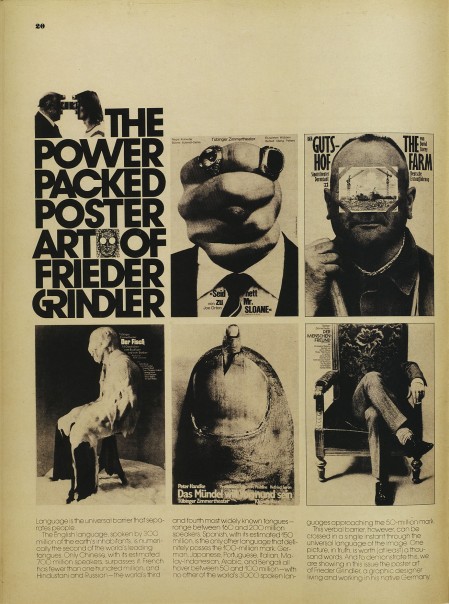
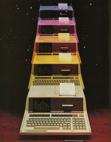
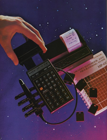
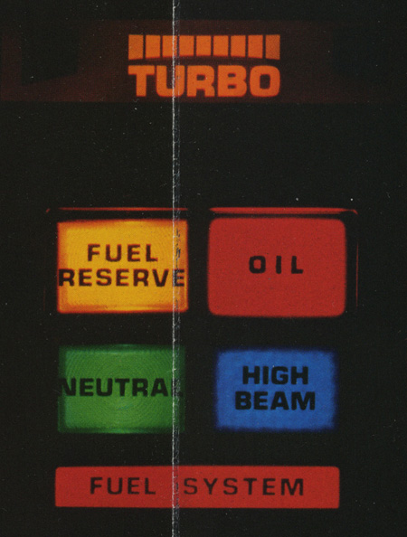
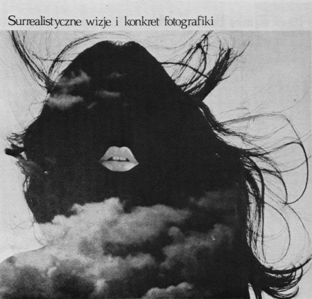
Eric Carl (who also brought us these vintage sci-fi book covers and these classic logos) has a beautifully scanned set of vintage ads from magazines up. They’re all high res so it’s a goldmine for textures and overlays. I love how magazine print breaks up at high resolution. The moire patterns are very useful when blown up in compositions; I use them a lot for posters.
Vintage Ads on Flickr by Eric Carl

15 Comments Leave A Comment
tobias says:
May 17, 2010 at 1:59 amif u like that style, i recommend a magazin called “twen”, designed by the genius willy fleckhaus in the 70ies. and if u like fleckhaus, u should take a look at the edition suhrkamp. don’t know why i recommend that now, but it’s also awesome.
lanena says:
May 17, 2010 at 5:21 amwow!
i love them!!!! Really nice!
koneyn says:
May 17, 2010 at 7:49 amNice one Scott, and since you’ve mentioned it, any chance of elaborating on overlaying/texturing tricks of the trade? Not really like a tutorial, simply more detailed insight of what you’ve already said here, in another blog post? :)
Kris says:
May 17, 2010 at 10:05 amLooks like the IBM 5100, John Titor would be proud.
Lancaster says:
May 17, 2010 at 1:54 pmNot an IBM 5100 – but a very similar form factor. It’s an HP-85. You can see the HP logo in the lower left.
http://www.old-computers.com/museum/computer.asp?st=1&c=353
Mark C. says:
May 17, 2010 at 3:27 pmI collect old TV Guides from the 1970’s so I’m really loving these–good post!!
Kevin says:
May 17, 2010 at 4:03 pmluvin it! interesting “GR” ligature in THE POWER PACKED…part.
Eric says:
May 17, 2010 at 7:08 pmThanks for the link Scott, was wondering why Flickr activity shot up today. ;)
thehalvo says:
May 19, 2010 at 10:31 pmhot
Jockey says:
May 20, 2010 at 1:19 amWoW… The last one is in polish :D
Anonymous says:
May 21, 2010 at 5:00 pmyou mentioned using these pictures in new work..are there any restrictions on using these in a new design? Is in this case Eric Carl who one should contact about rights?
just curious;)
Mike says:
May 21, 2010 at 5:01 pmyou mentioned using these pictures in new work..are there any restrictions on using these in a new design? Is in this case Eric Carl who one should contact about rights?
just curious;)
T▼g▲mm▲ says:
May 24, 2010 at 1:24 pmWhat is the font in the first picture?