Rebranding Playboy: Book Production
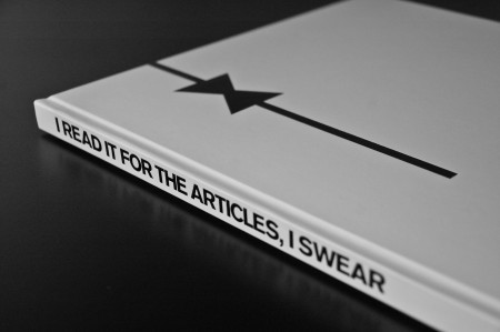
My rebranding Playboy project came to a close last week with the end of our fall semester. If you read the last article, you are familiar with the first part of this project, which was the new logo for Playboy. While it is absolutely the flag bearer of the entire project, the logo development represented a small amount of the work we were required to do for the overall project. The final deliverable for the class was a book in which we the explain history of the brand, walk through our rationale for the new identity, explore the process of the logo development, present brand standards and guidelines, and show example brand implementations and extensions. Other than this required content, there was no specific criteria for the book. Each student also gave a short final presentation explaining their rebranding and the choices they made along the way. Everything was created for the Nature of Identity class at the Academy of Art, as part of the graduate graphic design program.
I really enjoyed the conversation the first post on this project generated. I was excited to see that the new logo was as polarizing as it was — I feel like these types of solutions are the most exciting and rewarding for me. I noticed that many people were up in arms about the idea of Playboy removing nudity and becoming an all article magazine. While I would like to note that the new strategy was purely a conceptual exploration constructed in an educational environment, I actually do think they might be well served to switch things up this drastically. Playboy was once irreverent and boundary shattering. They are no longer. I can think of no better way to recapture this audacious spirit than by doing something this extreme…
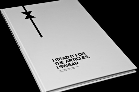
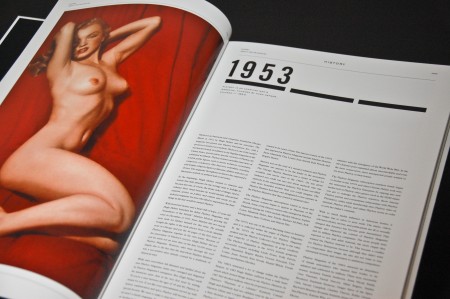
Speaking of the articles, you’ll notice the title of the book is “I Read it for the Articles I Swear”, the expression I based much of the rebranding off. As I mentioned in the last post, most people these days do not read it for the articles, they read it for what you see below, which is the first spread of the book.
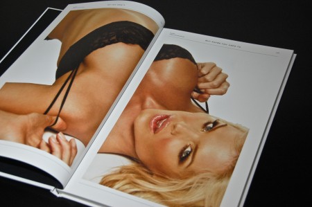
First Spread
The goal of the book was the tell the story of the Playboy brand; how it started, what happened along the way, and why I had to come along and rebrand it. To do this effectively I knew I would need a lot of imagery. Thankfully, the internet is a great resource for finding images related to Playboy (though I often had some explaining to do when roommates found print outs of my “project research”). I started the book with a substantial exploration of the history of the brand. The story of Playboy is a fascinating one and I left a lot of room to portray how the brand begun and show exactly what it was like when it started. I included articles about the company, Hugh Hefner, and the original logo development. I also left a lot of room to show scans from old issues that really summed up the vibe of the magazine in its early days.
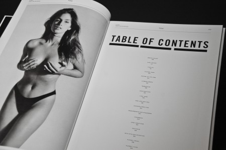
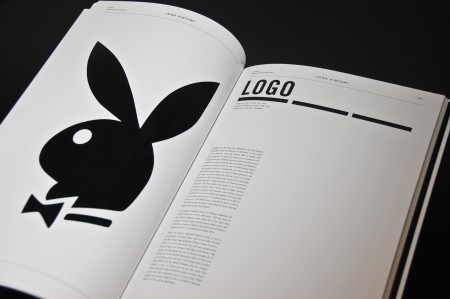
After you’ve read through the first 20-25 pages of the book, you get a pretty good idea of what the old image was like. As you continue through, more recent spreads of the magazine start to appear and things get…less refined. I included some example images that I felt conveyed what the magazine has become; just another trashy men’s magazine, at home in a frat house, next to a Maxim. Once you reach the halfway point of the book, it is stated that it is time for a repositioning, and everything stops with a spread of grey pages. The original plan was to include a centerfold to divide the book in half, with one side representing the old magazine (with a nude centerfold), and one side representing the new magazine (with a poem or article). While it would have been great to sum up the concept in this one item, there were printing concerns that I did not have time to address.
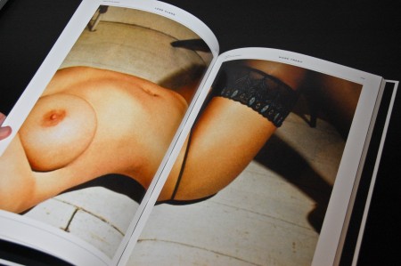
Toward the midway point of the book
The paper stock in the beginning was printed on a very glossy, magazine like paper. The quality of the print is amazing and everything looks terrific, albeit a little tawdry due to the magazine like finish. This was intentional, as the second half of the book was printed on a matte off-white stock, providing a stark contrast to the first part of the book, both in look and feel. The idea being that, as you progress through the book (and through the history of the brand), the materials become more sophisticated and elegant. Both sets of pages were printed at Plotnet here in San Francisco. The print process was done on an Xerox 700 Digital Press and the clarity of the text is remarkable. I gravitate towards really small type (3pt..4pt…) and I’ve gotten used to losing some detail on my inkjet. I’m not famililar with the specifics of the laser process, but the output was very detailed and exact. Not to mention fast as anything; one set of 75 pages took about 10 minutes to print.
The second half of the book is all about the repositioning. As the logo is the most prominent portion of this process, it got a large number of pages. It starts with a small selection of the hundreds of sketches I did before deciding on the final mark. While the quality of my sketching may not have deserved as much face time as it gets in the book, I felt like it was important to include, if only to show the evolution of the conceptualizing. The next section is the brand standard manual in which all of the rules for the new brand are explained. I had never produced a full standard manual before and this was one of my favorite parts of the project. Our teacher provided us with many (fascinating) examples of other company manuals (Skype’s is great) and this helped guide the layout. The contents of the section include discussions of all typography, colors, grids and composition regulations, and logo usage.
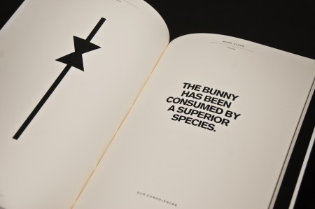
Start of Second Half
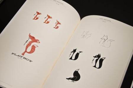
Logo iterations
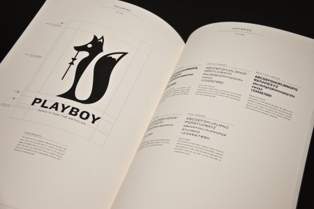
Logo usage rules and explanation
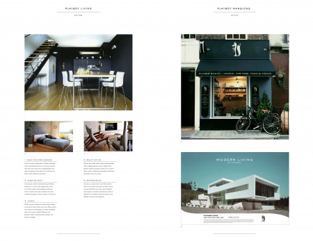
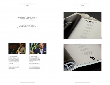
After you’ve learned exactly why the new brand looks as it does, you finally get to see it in action, with the last section of the book. The official title of this section is the “brand extensions” — basically where we flesh out what the new brand has become by showing it in use. Here is where we are free to concoct whatever new products or services the brand can offer. For example, the new Playboy as I imagine it is not just a magazine. It is now divided into three categories: Playboy Living, Playboy Travel, and Playboy Publishing. Each division has its own color, and each subdivision is identified by a title where the tagline usually is.
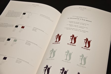
Brand categories and sub divisions
For example, one part of the new brand under Playboy Living is called Playboy Mansions. This is basically a realty service where you can buy luxury homes inspired by the new priorities of the brand. Modern, minimal and stylish homes, brought to you by Playboy. You can see a Monocle shop repurposed as the Playboy Realty office in the spread below. Other extensions include Playboy Furniture (for use in the mansion), Playboy Nightlife (a bar called “The Den”, as in a fox’s), and Playboy Children’s (‘What’s Happening to my Body” books for kids).
Imagery for this section of the book was sourced via a combination of personal photos and scans from magazines. I hate to use photos that aren’t my own in projects, but given the scale and breadth of the project, I figured I’d have to scrounge around outside my hard drive for appropriate images. The downside of this is I feel like this limits project’s ability to proliferate much past the educational realm. Fair use etc protects us within the school’s walls, but you torpedo any chance of these portions of the project being able to live on their own.
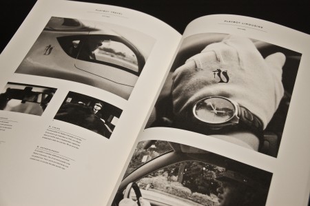
Playboy Limousine
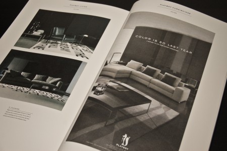
Playboy Furniture
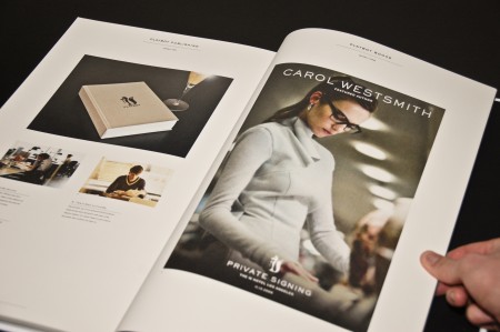
Playboy Books
The first thing I decided regarding the production was that the book was going to be huge. I had never produced a book bigger than letter size, and I thought this project would be a good time to experiment with a large format. The page size turned out to be 11″x17″ — down from 13″x19″ due to printing concerns. While 11″x17″ isn’t exactly massive, it is a good deal bigger than I am used to designing for editorial layout, and I really appreciated all the negative space it afforded me. I wanted there to be a lot of room for the content to breathe.
I may have mentioned it before, but I am a terrible book binder. My Set in Stone project was a mild success, but there were a few glue related incidents that I would rather not repeat. Because of this, I decided on day one that I would be outsourcing the printing and binding of my book. As this decision was made before the project even started, I was able to work on a timeline that took into account the extra month I would need for production. Technically this short changed me one month of design time, but when you know from the beginning that you only have so much time, it really isn’t an issue.
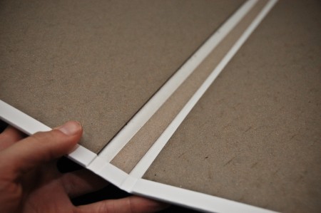
Cover without pages
Once I had my pages printed, I took them to The Key in Oakland. I had seen some of their work at student portfolio presentations and had been really impressed with the consistent professional quality. As I had been designing the book, I imagined the cover bound in white leather. The idea being to push the “luxury” aspect a little bit too far. As I continued to think about it, I stopped understanding the rationale behind this decision. I thought it was a good idea in the beginning, then lost sight of what the purpose was. I ended up abandoning the leather idea and used a paper stock with a nice little bit of texture. The graphics were then stamped on with black ink using the dies in the picture below.
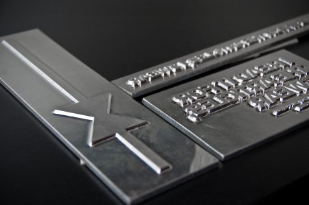
Cover dies
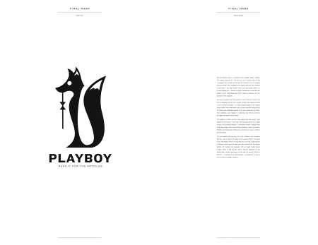
The cover itself reads “I Read it for the Articles I Swear – The Story of What Happened to the Playboy Bunny”. I wanted to put my new logo right on the front, but my teacher suggested that I find a more subtle solution and leave the new logo “reveal” for the inside. I loved this idea and stuck with it for the final cover. The bow tie hanging down from the top is of course part of the new logo, which you know if you’ve seen it already, but for the new reader, it’s just enough to conjure the brand and get them wondering why it’s hanging out of its normal position around the bunny’s neck. I liked the minimal black and white look, as well as the immediate shock of the slutty first spread in contrast to the cleanliness of the cover.
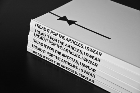
Finished copies
The end result feels great to hold, though that might just be because I spent three months with the project. Total page count was 75 and production time was about three weeks from printing to binding (book design time was approx 1 month). It’s fantastic to spend so long on a project and end up with such a complete physical manifestation of the process.
I’m still waiting for my invitation to the Playboy mansion (even if it’s only to be reprimanded). Maybe I should send Hef one of the books.
(click here to read Part One: Logo Development)

77 Comments Leave A Comment
Andy Mangold says:
December 21, 2009 at 12:31 amReally fantastic and thorough work, Alex.
Ross says:
December 21, 2009 at 12:50 amThere’s your rationale right there… Who wouldn’t want to be reprimanded by the Playboy bunnies?!
Seriously, though… Must be satisfying to finally have all that work done and such a great end product. Well done Alex.
eydryan says:
December 21, 2009 at 1:02 amLooks great, quite a lot better than I had expected given the direction of the logo, I must admit.
Must feel awesome holding the results of your work in your hand :)
Cheers and keep us posted on more of your work, it’s quite impressive!
Shelby says:
December 21, 2009 at 1:10 amLove how this project is coming out.
How did you do the stamping?
Matt Davis says:
December 21, 2009 at 1:16 amHoly shit. flawless.
Scott says:
December 21, 2009 at 1:51 amWow man, amazing… They really came out great, make sure and bring one in next week, I want to see it in person. Loving the paper color of the later pages.
Matthias says:
December 21, 2009 at 1:54 amGreat concept and great-looking outcome. I’m jealous.
AEON says:
December 21, 2009 at 2:34 amGood job :)
Conor says:
December 21, 2009 at 4:14 amThis is amazing work. I need to get a copy of that book haha.
TheMem says:
December 21, 2009 at 5:17 amAmazing work! your concept behind the branding and the imagery is simply stunning… Kudos.
Chris says:
December 21, 2009 at 6:19 amReally really great work Alex! I can’t imagine turning out that many pages in the time you had to do it.
mg33 says:
December 21, 2009 at 7:31 amMy disagreements with no nudity aside, this book looks incredible. Your layout and typography throughout is just perfect. We could go on and on about whether or not this rebranding would really work, but the book really came out perfect in terms of showing your suggested rebranding.
Oh, and you forgot a period on the Key Features “2. There are no photographs” item. ;)
Alphonse says:
December 21, 2009 at 8:59 amAs I expected, this is gorgeous.
The first photos show just how beautiful and engaging the female body is. Nudity could have easily worked with your new layout. The airbrushed to hell look would just have to go, and be replaced with a Terry Richardson style.
David Rohrsheim says:
December 21, 2009 at 9:07 amMy father kept 10 years of 1960’s-era Playboy magazines inside “Popular Mechanics” binders
grey says:
December 21, 2009 at 9:08 amFirst of all, and most importantly, what you have here is outright sexy.
Mission accomplished.
You ABSOLUTELY need to get a copy in to Hefner’s hands. I’m surprised that’s even a question for you. If you didn’t have a job immediately, I would honestly be surprised.
I’m super impressed. I wish I could see a copy in person.
ian says:
December 21, 2009 at 9:34 amI’d love to be able to get a copy of this to go through. Overall massively impressed. Wish I had the opportunity during school to do a project like that. Mad props.
NAVIS says:
December 21, 2009 at 9:59 am…
That’s all I can say. Gorgeous Alex.
schroeder says:
December 21, 2009 at 10:07 amoverall looks pretty good, although i’m always a bit put off when students outsource their book binding. I know its a pain and you’ll never probably do it again but it’s something every designer should learn how to do in school…kinda like algebra…i just think it’s more reflective of what a student’s skill set really is (when it comes to craft at least)
other than that, good job
Justin says:
December 21, 2009 at 10:34 amBeen checking this out for a little. Great final piece!
Tom says:
December 21, 2009 at 10:40 amVery nice work alex,
I love the overal layout and process you posted here, can I ask you how much it did cost approx? print + binding?
Thanks
Cecilia Salinas says:
December 21, 2009 at 10:44 amWow, this is amazing! Good job.
Marc Hughes says:
December 21, 2009 at 10:45 amThat is an amazing rebrand. I hope someone out there is taking note of what you did. Great work.
John Helmuth says:
December 21, 2009 at 10:46 amWow…looks amazing. At first i was like, there’s no way scott just crafted 6 books like that in such a short period of time haha. Def worth to loss of design time to have it outsourced to such a great company. I just finished an editorial in my typography class and we basically were only required to print the book out and bind it as an accordion fold. I was kind of disappointed as i wish we would be able to actually make these as books. Scott Did you have a colophon in the back of the book stating which typeface, typesize and leading you used in the book? If not, which actualy typeface’s did you use for this project?
Tim Cheneval says:
December 21, 2009 at 11:04 amlooks awsome! very clean and attractive design, provocative to say the least. the concept is hilarious and genius! impressive work. i was wondering what you went through to get those custom dies created, im looking into the same sort of thing for a permanent branding of my own services..or just to know for the future.
Tebb says:
December 21, 2009 at 11:17 amReally nice, Alex. The final result is stunning.
Joaquim Marquès Nielsen says:
December 21, 2009 at 11:27 amI get the feeling that you’ll receive an invitation pretty soon. It’s just an awesome project!
Spencer says:
December 21, 2009 at 12:50 pmBravo Alex, you really came through on this one. The new logo is flawless and way more versatile than the old one. Good work.
Robert says:
December 21, 2009 at 1:10 pmWow really great work. Great project.
rent says:
December 21, 2009 at 1:32 pmreally great. wish i could flip through it to really get the full effect. fantastic work, alex!
Alex / HeadUp says:
December 21, 2009 at 1:51 pmAwesome! I knew when I read the first post that you had something really nice, that signature Alex Cornell look that you’re developing, which can make anything printed look good. It’s clean, elegant, no-nonsense, sort of harkening back to the early days of Playboy.
I too think that you should send a copy on over to Heff himself, you certainly make a good case for such drastic changes.
Mbithi says:
December 21, 2009 at 2:21 pmThis book is so excellent! Bravo Alex. If you don’t feel like sending one to Heff, I certainly wouldn’t mind a copy.
That layout has me drooling. Damn.
vidyaputra says:
December 21, 2009 at 4:44 pmwow… the fox and tie idea is great.
ji says:
December 21, 2009 at 5:53 pmhow much did this cost you to get all of this stuff produced?
I remember being in design school and having a hard enough time to pay for simple 11x17s getting printed, much less a whole fucking book of them complete with binding, ink dies, etc.
Julian says:
December 21, 2009 at 6:03 pmLet us know if you receive any kind of comment from Playboy.
Horacio says:
December 21, 2009 at 6:07 pmLove the final result. Typography is great.
Kyle says:
December 21, 2009 at 6:14 pmYou would be a fool to not send a copy, not only to Hef but to maybe to Playboy’s current editor-in-chief or art director too. You do some outstanding work!
Anonymous says:
December 21, 2009 at 6:25 pmabsolutely amazing. great job alex.
Greg says:
December 21, 2009 at 6:52 pmMan, this is really rad. Super impressive. I wish I could flip through the physical pages… any plans for digitizing the book? A solid PDF would be a great educational tool, not to mention killer inspiration to all us designer kids. Either way, awesome work.
Brian Keith says:
December 21, 2009 at 7:19 pmWhat font do you use that is readable at 3pt ?
Oliver says:
December 21, 2009 at 8:09 pmAre you considering selling your book and if so, how much could I purchase it for?
Tyler Willis says:
December 22, 2009 at 3:56 amWow, gorgeous reprint. Well done.
Any chance you’d be willing to let an SF native have a look through it? Would love to see that in person, and would happily buy you a beer/coffee for the privilege.
No worries if not, just had to ask ;)
jules says:
December 22, 2009 at 7:04 ambeautiful work. i just cant get past how wrong the concept is.
mat says:
December 22, 2009 at 9:39 amgreatness!
Daniel Carvalho says:
December 22, 2009 at 1:54 pmArgh. Nudity. A little warning is all I ask. Even a simple display of internet etiquette such as NSFW would have been sufficient.
jacob says:
December 22, 2009 at 2:15 pmMan I’d love to flip through those 75 pages but I understand that you would run in to some copyright issues if you shared it with us. Love your concept though and it’s been a really interesting read.
Any chance you could share those style guides you were handed out as inspiration? Being autodidact I haven’t had much chance to study best practices like you do on the school bench :)
Steve says:
December 22, 2009 at 3:20 pmVery tasteful, but not very interesting. It’s well handled but doesn’t really take the audience anyplace new. Clearly the gentlemanly route–GQ does porn–is where 99% of the design world would take the project.
When you pick Playboy, there’s a lot that goes with it. It’s a tough assignment, but a super rich topic. When you ditch the rabbit, which is unthinkable (but it’s a grad project go for it) you gotta do something drastically different. The fox is very well made, the bow tie a great idea, but it doesn’t do anything different that the rabbit.
Anyway, I’m being the voice of critical sobriety in the middle of this love fest for the book. It’s still very lovely and I would keep one on my coffee table.
Vincent says:
December 23, 2009 at 11:01 amVery good job, would love to flip through it one time. Shame you can’t release it ’cause of the copyright issues.
KT says:
December 24, 2009 at 11:59 amThis is a really dope project man. I would love to own a copy of it….
AJ says:
December 24, 2009 at 5:50 pmAny way you could upload a PDF version for us to take a look at?
ps says:
December 24, 2009 at 7:59 pmnice job overall, but too bad the letterspacing in the logo is off. the p stands by itself…
slofu says:
December 24, 2009 at 9:57 pmGreat work, Alex. I love the fox and am glad to see it as part of a strong presentation.
alex says:
December 27, 2009 at 2:34 pma few replies..
@ Shelby – The stamping was done using the dies pictured by The Key. I provided the artwork and placement information, then they stamp it once they are ready to bind the book. The dies themselves are expensive, but once you have them made once, you can continue to reuse them over and over for much less $$. The annoying part of this project was that I needed to make three separate dies because of the location (and size) of all the items to be stamped. Ideally you only need to get one done to save cost/time.
@ Schroeder – Regarding the outsourcing of the binding, I hear you — it’s something I wish I was better at. Though I would completely disagree that one’s binding ability is any indication of overall ‘skill’ as a designer. I see them as two completely different things. While it is always great to see a student that is really great at “craft”, I see no direct correlation between it and overall design skill.
@ John – I did include a colophon at the back of the book. In it I listed all of the vendors used in the production of the book, photo credits where they were due, instructor and school info, and the typefaces used. I love the colophon part because I like to write little weird things here and there amidst all of the boring info. Kind of like the very beginning of “Heartbreaking Work of Staggering Genius”. I loved all that weird random information.
@ Greg – A PDF version would be cool and I’ll have to think about that. In the meantime, I want to get a PDF version of the Color Management post up first. I’ve been meaning to do that for a while now.
@ Daniel – Sorry about the lacking NSFW tag. Honestly it didn’t even occur to me to do that. (Though it should have, the big red NSFW tag on Reddit made it stand out and say “Click here!!”) I feel like people are overly sensitive to that sort of thing here in the States — it pains me to think that anyone is actually offended by those tiny photos of semi-nude women. Well that’s just how I feel anyway, but I understand that my sentiments are not universal, so apologies if any bosses or teachers were spooked by the post.
@ps – Interesting note about the letter spacing. I don’t see the issue you mention, I wonder if you could be more specific. (Perhaps it’s an artifact of the photograph of the page, try looking at the logo on the other post)
Alessandro Mingione says:
December 30, 2009 at 4:44 amI don’t like the ide behind the logo (the execution is sweet), but the book looks great! Clean, modern and sophisticated!
Daniel Carvalho says:
January 4, 2010 at 3:38 am@alex – Thanks. For most people NSFW is a “don’t-view-this-at-the-office” warning, something to come back to once you’re at home if you’re still interested. But for me the NSFW tag serves a dual purpose.
Personally, it helps let me know that there’s possibly nudity up ahead, and so I’ll — hopefully — avoid it. It’s a personal and moral issue for me. I’d rather not see naked woman.
AEON says:
January 5, 2010 at 6:54 amBTW Why dont you put up a downloadable PDF of the book?
Sky says:
January 6, 2010 at 6:41 amAwesome.
You should put up a downloadable PDF of the book. And you should send a book to Hef, just saying.
Sky says:
January 6, 2010 at 6:50 amAlthough, I have to say, killing the iconic Bunny might be a little bit over the top. That is the strongest part of the Playboy Brand. And Fox has an idea of cunning and dangerousness that might not fit well when meshed with women in a Playboy sense. That could actually alienate the target audience. Your final Typography and Design works well with the current Bunny icon. Or re-branding the Bunny to make it have the lines and sophistication of the Fox might be an even better direction to go, rather than consuming the Bunny. Though, I like the idea. For certain brands, that could work well–particularly flagging ones.
The Playboy Bunny is iconic.
Jeff says:
January 6, 2010 at 4:53 pmIts a strong idea and a lovely execution. Even the naysayers are asking for a copy for their coffee table and I’m willing to bet there isn’t one issue of the current Playboy w/ the iconic bunny on theirs currently. Simply swap the mark out for Playgirl and please everyone. :)
HP says:
January 6, 2010 at 6:30 pmNice to see the completed project.–it looks pretty amazing.
I would buy it without a second thought.
Typography + Playboy history + good design + breasts = victory.
Job well done sir.
chinmay says:
January 9, 2010 at 11:52 pmReally great design…simply awesome..and I WILL READ IT FOR THE ARTICLES, I SWEAR.
Moka says:
January 20, 2010 at 11:46 amWow! great work Alex! Congratulations.
Tatu Siltanen says:
January 27, 2010 at 11:57 amVery cool book project.
You should have included a real bow tie as a bookmark.
The new fox logo is pure genius!
cf says:
February 3, 2010 at 6:38 amNice work. I wonder about the logo, though. The logo shows a “pre-tied” bow tie; the kind usually worn by, for example, hospitality staff. A real bow tie doesn’t look anything like the logo you’ve designed. In fact, if you look at a pre-tied bow tie, it doesn’t actually look like the one in the logo either, which led me to question is it were perhaps a stylized brassiere rather than a bow tie. I know this seems like splitting hairs, but just thought I’d mention it. This would definitely come up with at a presentation to the board.
witebojo says:
February 17, 2010 at 2:41 pmhey…guess what…this logo is soo retarded…u should have picked a less better loooking logo to redesign…seriusly it sux….the original is soo much betterrr…….a fox??? really a foxxx???? come on..u can do better than that…i hate to be the asshole but u could have gone a bit further with the fox if u wanted it soo bad. but u tried…so …i guess its alright..not the best thing in the world but it will do…
HDT says:
March 8, 2010 at 6:19 pmThe measure of any artist/designer/creative-type is whether or not he inspires and you have done just that, inspire. Congrats on your hard work. Its glorious.
Drinks on me.
Cheers!
Outsourcing Providers Philippines says:
March 9, 2010 at 9:36 pmI love the book and your idea. I also love the way it looks. Wish I could get a copy of it ! Cheers !
Joao says:
March 12, 2010 at 7:58 amI agree with the the gentlemen called HDT, your work is inspiring.
The logo is outstanding. The re-positioning of the brand is very well developed.
Now, where can I order a copy of the book?
James Macfarlane says:
July 14, 2010 at 4:15 amAwesome work Alex! Blown away that this is for your course… I look forward to following more of your work.