Everyday Magazine
Posted by Shelby White
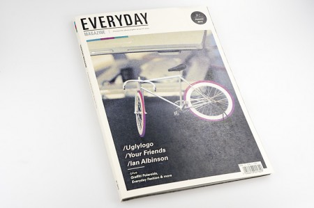
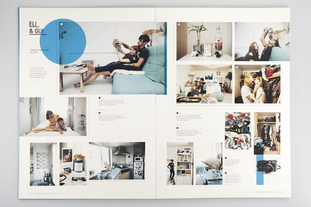
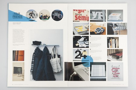

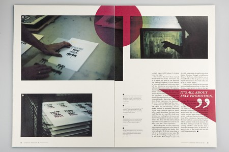
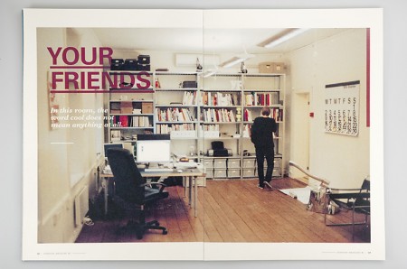
Everyday Magazine is a magazine that focuses on the behind the scenes of creative folks. I find the design to be quite relaxing and the inner pages to be nicely laid out. The project was created by Mikael Floysand as an assignment at Westerdals School of Communication.

11 Comments Leave A Comment
Jesse says:
September 20, 2010 at 7:04 amI love this layout so much. The white space is beautiful. Creative, Attractive, and easy to visually navigate. Well done.
Trevo Triano says:
September 20, 2010 at 8:33 ameverything i find, i find in groups that seem to influence eachother
everyday magizine – yay everyday blog
a continuous lean blog – a continuous report blog
ffffound – jjjjound
etc etc…..
so interesting. the layout even looks like the yay everyday blog
Bryant Eslava says:
September 20, 2010 at 8:42 amThe layout for these pages are great! I’ll have to get a copy and check it out.
thanks for this post Shelby!
-Bryant Eslava
etiamvita.net/
RAUL NARCOS GIMÉNEZ ROBRES says:
September 20, 2010 at 9:04 ambufff, genial!!!! Great!!! :)
Luke says:
September 20, 2010 at 9:36 amJust to let you know I love everything about this blog. Very inspiring shit. Thx!
d|| says:
September 20, 2010 at 10:15 amSimplistic design with substance.
Rafael Ikenaga says:
September 21, 2010 at 12:10 amShit, that’s Gui.
thehalvo says:
September 24, 2010 at 3:01 amsimple but beautiful. Thanks for sharing!
rent says:
September 27, 2010 at 8:10 pmDamn, we’re definitely following the same brainwaves this month, Shelby. I just recently found some of Mikael’s work and was very impressed with his portfolio. This magazine and an identity system he created are spot on.