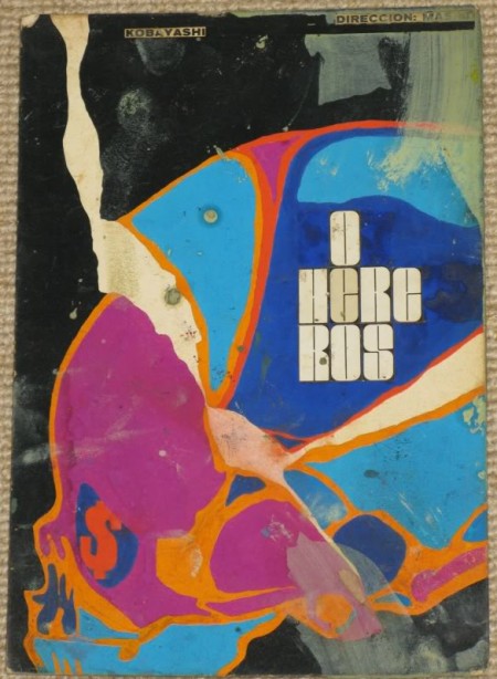
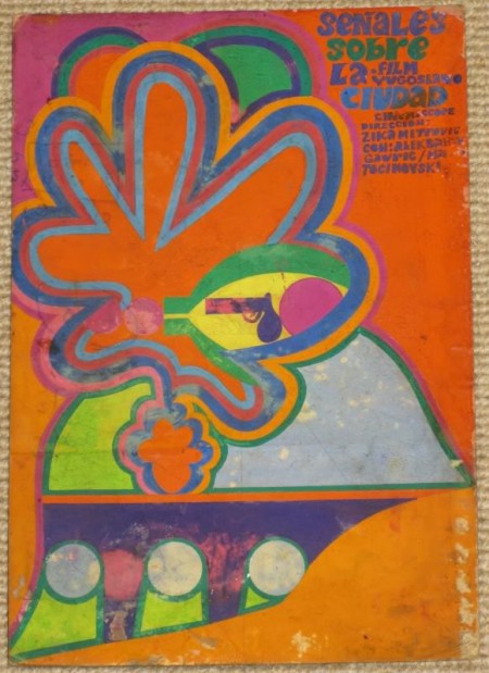
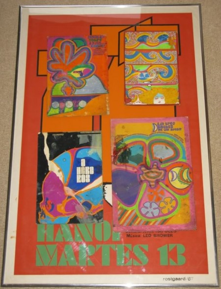
Cuban Poster Mock-Ups
Posted by Scott


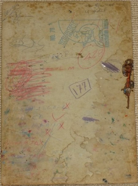
These are some original mock-ups of Cuban posters; painted on boards and then sent to the printers to have the shapes cut out and separated into colors for silk screening. It’s amazing to see how much the printing industry has changed. It seems that back then the printer had a more of a role in the composition itself, defining the edges and choosing the colors. I can’t imagine dropping off a painting at a modern print shop and expecting them to deliver a silkscreened masterpiece based on it.
Via Cuban Posters

2 Comments Leave A Comment
nick robinson says:
March 11, 2010 at 8:15 pmWhat typeface is that in the first one? Looks familiar
danseharald says:
March 18, 2010 at 4:48 pmwhen speaking of paper! check out this amazing guy and his paper sculptures, pretty interesting stuff. love the textures, and the role of lighting in the photography. http://www.flickr.com/photos/richardsweeney/190580245/in/set-72057594105588057/