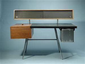
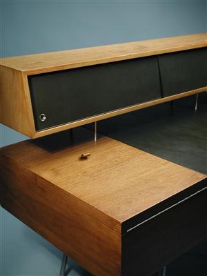
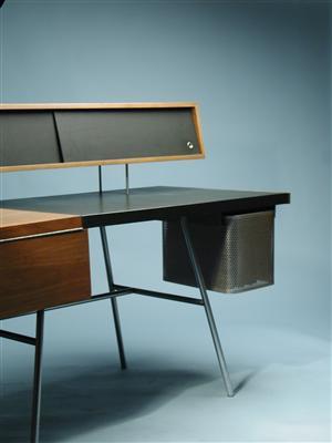
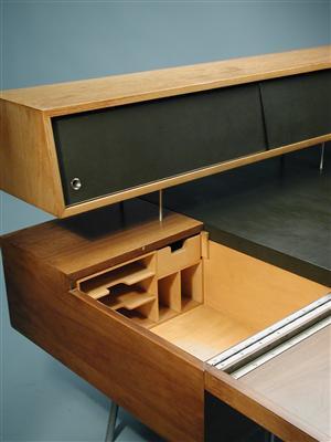
George Nelson Home Office Desk
Posted by Scott


I love desks by George Nelson, his Swag Leg is a favorite. I came across another great example of Nelson’s work over at Modernity, the Home Office Desk by George Nelson for Herman Miller. Absolutely perfect; I’ve always liked the idea of large desks but seeing this and the Swag Leg make me think it might be nice to have something a little more compact. And I love Modernity’s photographic style, great product shots (sorry for the small pics though, they didn’t have anything bigger). Some more can be found here.

13 Comments Leave A Comment
jarred says:
January 18, 2010 at 6:29 amI’m a fan of the large work space as well, I’m not sure how this guy would support scanners, hard drives, drawing spaces and all of that good stuff. It does look great though. Love the finger holes for the slider doors on the top shelf!
Alphonse says:
January 18, 2010 at 8:34 amThis is amazing, along with the swag leg. Perfect size for me too. I’m far too neat and anal to have a huge desk, but don’t like being crammed.
jonathan says:
January 18, 2010 at 8:51 ami’ve been lusting after this desk for years, ever since my friend and i saw it in an a mod antique store for $12k. since that day, it’s been my “i’ll know i’ve ‘made it’ when i have” item.
joe says:
January 18, 2010 at 9:34 amLove his work – though couldn’t help but notice, is the left side of the desk sagging from the weight of the drawer? It would be a shame (amazing given the price) if the construction was shoddy in person.
Perhaps it’s just the way the picture was taken though.
Jesse says:
January 18, 2010 at 10:02 amInteresting design. Looks like its a little wobbly though. Also the storage area would probably fill up with stuff that would block access to the little compartments. And it seems like your pencils might always be rolling off the left side like Joe was pointing out. But it is pretty, if not totally usable by today’s standards (as is the problem with most vintage pieces).
Ryan Le Roux says:
January 18, 2010 at 10:56 amGood god that thing is beautiful.
Scott says:
January 18, 2010 at 11:06 amAnything Nelson Office for Herman MIller is pure class.
For more great pieces with great photography I suggest Wright in Chicago.
http://www.wright20.com/
Christopher says:
January 19, 2010 at 9:16 amThis seems like a good candidate for a re-issue – along with minor modifications for the 21st century like they did with the Swag Leg. Love it.
RA_OUL says:
January 19, 2010 at 3:35 pmI need this right now! I love it!
chris heimbuch says:
January 21, 2010 at 3:47 pmscott –
agreed. one of his finest and my personal favorite of all his office inspired works…
a few years ago, i became a little obsessed and tracked a couple down. they are hard to get ones hand on, but once you see it in person, you’ll never want another mid-century desk again. simply, it’s a beautiful exercise in asymetrical balance…
ps think this photo is deceiving; the original design, does not sag
pps would – love – to see this, as a reissue…
Long Island Web Design says:
January 25, 2010 at 6:45 amThese are awesome …
thanks for sharing
quality office furniture says:
December 15, 2010 at 5:31 pmWow, this is a very unique design. It would feel amazing while using this desk, it’s like you have the answer to a box of mysteries. Thanks for sharing!
bay gallery says:
February 7, 2011 at 3:38 pmI feel most of the furniture made up with oak timber. they are shiny and good for offices