Movie Posters of the Decade
Posted by Scott
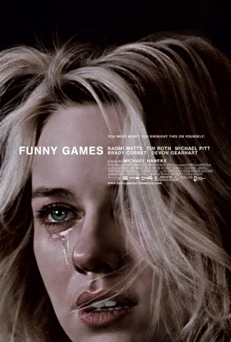
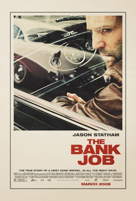
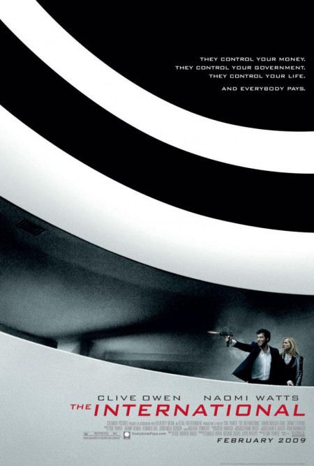

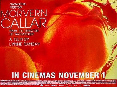
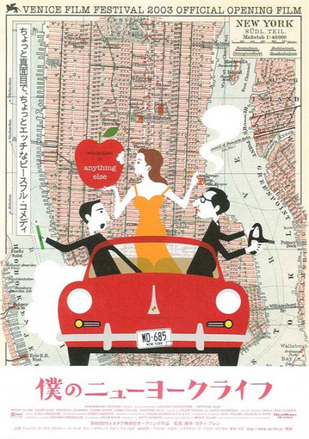
The Auteurs has a post on their picks for the top movie posters of the decade. Considering that the vast majority of modern movie posters fall short of the standards set in heyday of film, this must have been a difficult list to assemble and a boring task to complete. Nevertheless, they have managed to dig up a few gems. Good to see The Bank Job in there — always a favorite — but I was pleasantly surprised by Funny Games, hadn’t seen that one.
Can you think of any obvious omissions from this list? Let us know in the comments
For some background, more good movie posters from years past can be found in these older posts: 50 Beautiful Movie Posters, 100 Greatest Movie Posters, and, of course, SOLARIS!.
Via The Auteurs

27 Comments Leave A Comment
Vaughn says:
December 22, 2009 at 3:04 amI reference that Funny Games poster so much, it reflects the film so well and the type is so beatiful.
The other Funny Games posters for the 2009 remake are so far from the greatness of the “Naomi Watts face” version, they look like general ‘slasher film’ posters.. the film is definatly not a ‘slasher film’ haha
Tetsuo says:
December 22, 2009 at 6:50 amthat funny games poster is ace!
Brad says:
December 22, 2009 at 7:26 amThis one’s brand new. It’s actually the trailer that amazes me. Hope the film lives up!
Brad says:
December 22, 2009 at 7:27 amOops, sorry, I was talking about this:
http://www.apple.com/trailers/weinstein/asingleman/
Design Police says:
December 22, 2009 at 8:18 amMight I also recommend the poster for ‘Moon’. You can check it out at the url below, although, no one has a good version of it up because it was only an indie film.
http://www.daemonsmovies.com/wp-content/uploads/2009/04/moon_poster_sam_rockwell.jpg
Harley Turan says:
December 22, 2009 at 8:40 amYeah, there was a post about that Moon poster when the trailer was released, probably one of my favourite posters of 2009. As for my favourite of the decade, probably this Lost In Translation one: http://www.impawards.com/2003/posters/lost_in_translation_ver2.jpg
adam says:
December 22, 2009 at 8:40 amSome nice ones on here.
Chaz Paul says:
December 22, 2009 at 9:19 amc’mon Scott, no big floating heads, trajan, or big red bold type in any of these? haha
Daniel Hertzberg says:
December 22, 2009 at 9:44 amSomewhat related: 80 best movie posters of ’09: http://www.picksflix.com/?p=914
shawn says:
December 22, 2009 at 9:49 ami thought the dark knight “why so serious?” promotional campaign was well done. the messy make-up look has been reproduced throughout popular culture, much in the same way the obama/hope poster has been seen everywhere.
and of course, there was the phenomenon in LA, where obama was portrayed as the joker, to much fanfare.
the campaign was exhaustive and effective, and quite disturbing.
some examples:
the hi-res “stupid bats” poster:
http://host.trivialbeing.org/up/tdk-jul1-dark-knight-poster-stupidbats.jpg
others:
http://tinyurl.com/yactrgb
http://bitsandpieces.us/wp-content/uploads/2008/08/imageswhy-20so-20serious.jpg
http://megantower.files.wordpress.com/2008/01/batmanreturnsthedarkknightposter.jpg
alex says:
December 22, 2009 at 9:50 amYeah that one for the International is great. That whole scene in the movie is pretty awesome. Don’t remember much else from that film, except that Guggenheim shoot out.
The type in the Funny Games poster stopped me in my tracks. Never really noticed it until someone mentioned it — I guess I was always distracted by Naomi Watts. Anyway, the type lockup is spot on.
Mark C. says:
December 22, 2009 at 10:33 amI’d love to have the “Morvern Caller” poster in the form of one of those 80″x80″ 6-sheet movie posters.
Someone did a cool feature on those here: http://www.atimetoget.com/2009/03/6-sheets.html?showComment=1238006340000#c5605074609712389326
Alphonse says:
December 22, 2009 at 10:35 amI absolutely adore both The House of the Devil posters. Absolutely gorgeous.
http://www.impawards.com/2009/house_of_the_devil.html
Neil Kellerhouse did them. He’s also responsible for some of Criterion’s best packages.
http://www.kellerhouse.com/#/?item=71
rent says:
December 22, 2009 at 10:45 ami agree with Design Police on this one. the Moon poster is awesome, along with the movie itself.
Mark Dude says:
December 22, 2009 at 5:07 pmBrushed fabric with brushed sweaters scarves, handkerchiefs and collars, velvet and so on, mostly texture to acrylic products, wool followed. Acrylic electrostatic dust features, hair easier to dust and dirt accumulation. FlockFabric.com Such as washing properly, brushed clothes easy to deformation, contraction compaction.
MMC says:
December 22, 2009 at 6:14 pmi’m proud to see one of our posters on that list, the one for wilco. so perfect for that film.
also really love the funny games and bank job posters. both fantastic.
definitely surprised the “why so serious” poster was omitted. and i always like this one for Little Miss Sunshine: http://www.impawards.com/2006/little_miss_sunshine_ver4.html
Andy Babb says:
December 22, 2009 at 6:16 pmAlso agree with Design Police on the Moon poster. Enjoyed the movie but the poster will probably leave a longer-lasting impact. Not sold on The International poster—great image, pedestrian type treatment.
How about Burn After Reading? Clearly derivative of Bass but at the time it was released last year, somewhat refreshing I thought. Another case of the poster being more impressive than the film.
Antonio says:
December 22, 2009 at 8:04 pmI’ve always loved the Funny Games poster, it’s perfect. I wonder who did it. I also love the poster for Visual Acoustics.
http://jessreynolds.files.wordpress.com/2009/10/visual_acoustics.jpg
Antonio says:
December 22, 2009 at 8:09 pmThe poster for Birds of America is also very nice.
http://www.impawards.com/2008/posters/birds_of_america.jpg
Jeff Finley says:
December 22, 2009 at 8:19 pmGreat picks for sure. Whenever I think of inspirational posters, the Funny Games one is the first I think of. It’s so powerful, and as everyone else has said, the type is perfect.
I’m a big fan of the Death of Mr. Lazarescu poster – which you didn’t feature here, but you should. If you’ve seen the film (definitely not a comedy), you’ll appreciate how much of a risk they took.
http://auteursnotebook.s3.amazonaws.com/multiple%20images/MPOTW/5_Mr_lazarescu_500.jpg
This post got me inspired again to work on film posters. I’m recently did one for this new documentary on high school wrestling called Pinned and did a version of Old Joy for this poster show being put on by All City in UK. Hopefully these lead to more poster opportunities so I can start getting my feet wet in a new medium. Thanks for the inspiration Scott!
MMC says:
December 23, 2009 at 12:29 pm@ Antonio, the funny games poster was done by Crew Creative. Here’s more from them: http://www.impawards.com/designers/crew_creative.html
dB says:
December 23, 2009 at 4:39 pmI don’t there are too many that know this movie. Check the poster please.
http://www.moviegoods.com//Assets/product_images/1020/493663.1020.A.jpg
dB says:
December 23, 2009 at 4:40 pmI meant …I don’t – think- there… sorry. Typo:)
Josh says:
December 26, 2009 at 5:58 pmAwesome collection. I missed some of these so it was a nice surprise.
witebojo says:
February 17, 2010 at 2:44 pmi disagree
high equity says:
September 22, 2010 at 3:14 amThank you for the sensible critique. Me & my neighbour were preparing to do lots of research about that. We got a very good book on that matter from our city library and most books where not as influensive as your information. I am pretty glad to see such information that I was searching for a long time.That made extremely glad Smile