High Ceilings

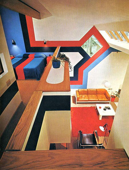
Love vaulted ceilings, love skylights, love plenty of angles. Is this a home or a cabin? Not sure of the details on this, if anyone has any info let me know in the comments. Obviously a few things could have been handled with a bit more restraint (never been a huge fan of oak), but overall it’s a great feel. If some crazy design comes off the wall and turns into a bed, you really can’t complain much. $20 says there’s a matching Porsche parked out front with perforated leather driving gloves in the console. Seems to be some variant of the Marcel Breuer Wassily Chair in the foreground, name that couch.
Whenever I see setups like this I always wonder who lived in them, did they actually get much use out of the place? Wonder what it looks like now….probably totally gutted and replaced with stock art fake paintings and plastic floral arrangements everywhere.
Update: Via Fisker in the comments “The picture is from the book ‘Decorative Art 70s’ published by Taschen

18 Comments Leave A Comment
=mill=r says:
October 4, 2007 at 11:53 pmI like the way you think man. Great analysis and just a plain cool examination of things past present and plastic floral arrangement filled.
Brandon says:
October 5, 2007 at 7:02 amLove the shape of the space. Personally, I would have muted down those Trapper-Keeper colors a bit, but otherwise a very cool find. Love your work, Scott.
Jakub says:
October 5, 2007 at 10:38 amThat lighter blue with Red and Navy never fails as a color scheme on most things during this time from a matching snowmobile outfits to a camping backpack.. My personal favorite item here is the caramel leather couch with the white fiberglass base, i actually saw it on Good Morning America a few years ago and they voted it the ugliest couch which made me almost move to Canada when i heard that.
Mark says:
October 5, 2007 at 12:43 pmLike a museum…
NAVIS says:
October 5, 2007 at 2:06 pmWhat the hell is Good Morning America doing talking about a couch? I love the over all design and concept. I’m just not an avid fan of the color scheme. The furniture in the living room quarters is great. Especially the lamp/chair combo.
Dustin Askins says:
October 6, 2007 at 10:32 amWhat? Not a fan of oak? I agree that it was used poorly here, but in general?
Thanks for the photo; like you, Im not hopeful that the space is being used wisely today…
Scott says:
October 6, 2007 at 2:10 pmDustin-
yeah, sorry…I like walnut and darker stains. Seems like oak traditionally has that lighter stain and I guess I just don’t like the openess of the grain in oak. Check this out, something about it just seems more refined to me, I really like the tone and the grain patterns. Maybe it’s just that oak reminds me of every suburban house built in the 80’s… There was this huge outlet in Sacramento where I grew up called “The Oak Mill”. Had all the worst furniture, the place was basically a 10,000 sq. ft. monument to mediocrity. I suppose that went a long way to sullying the good name of oak in my mind.
Fisker says:
October 8, 2007 at 5:33 amThe picture is from the book ‘Decorative Art 70s’ published by Taschen: http://www.taschen.com/pages/en/catalogue/design/all/01886/facts.decorative_art_70s.htm
Scott says:
October 8, 2007 at 1:50 pmThanks Fisker… posted.
Obelisk says:
November 2, 2007 at 5:00 pmLooks EXACTLY like a cabin i rented in South Lake Tahoe, built around the time of the Winter Olympics in Squaw Valley. Nice1
Retestign says:
November 27, 2007 at 4:29 pmHi, hello, privet
bostonterrier
Dratappardy says:
December 7, 2007 at 7:54 amvery interesting point of view, has never been conceived of this
btw dingbat
clecykeri says:
December 21, 2007 at 5:42 amHello, i want to note that your question is typical
she’d refused to
DatAbsewssell says:
December 27, 2007 at 10:30 amHi
look: bikini kill
Children Furniture says:
January 26, 2008 at 10:57 pmHello,
What a great post. Thank you for your hard effort. It’s a brilliant work.
Dave says:
August 6, 2008 at 6:25 amWhat a helpful article!
Worktop Jig
Worktop Jig says:
August 6, 2008 at 6:26 am.