Workspace: Parliament Design, Portland
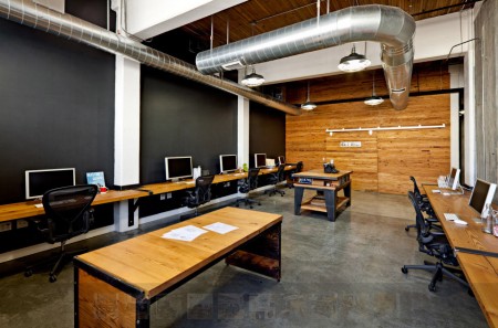
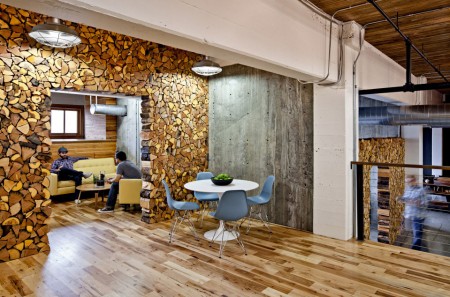
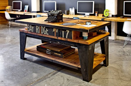
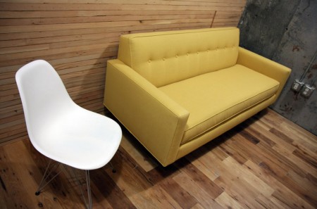
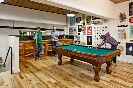
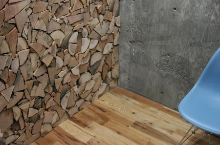
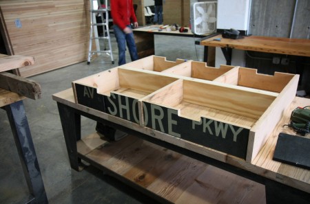
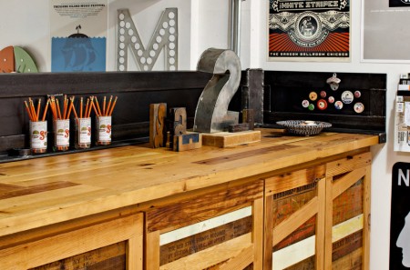
I just got back from Portland tonight, I had a great time up there, thanks to everyone who made it out Friday for the show. I’ve always been impressed by Portland’s overall design sensibility, they have that very distinct kind of industrial aesthetic that is the hallmark of the Pacific Northwest. Portland based Parliament Design’s studio embodies that ethic to a tee. The reclaimed warehouse space has been meticulously crafted into a living, breathing workspace that oozes creativity. The really striking part is that most of the space was purpose-built for the studio from reclaimed materials and design relics. More pictures here.
I’ve never taken the aesthetics of my workspace very seriously, but seeing this makes me want to reconsider. I do envy pure design studios like this, it seems much easier to make a space look clean and minimal with just computers and graphic design tools. Trying to house my music and design studio in the same space has always posed a challenge, I end up feeling crowded by all the equipment and it’s hard to create a layout that’s both accessible and clean. Hopefully someday I can split them up, but until then I will have to look at pictures like these and be jealous.
How about you? How important do you feel the look and layout of your workspace is to your overall creativity and productivity? Sound off in the comments »

46 Comments Leave A Comment
Ross says:
December 7, 2009 at 5:12 amAbsolutely beautiful space!
Mine consists of a corner desk in work, with a view of apricot-coloured walls. Or sprawled on my bed with a laptop.
Envy!
Jason says:
December 7, 2009 at 6:07 amminimal is key. a cluttered studio often clouds and confuses my creativity.
jonathan says:
December 7, 2009 at 6:32 amGeez… Look at the place. I’d love to just hang out there, and I think its that feeling that makes a space produce great design work. Maybe one day!
Ben says:
December 7, 2009 at 7:12 amThis place does look amazing. I’m just starting out as a freelancer, working out of a spare room in my parents house, but the space needs to be creatively re-hauled and I plan to do it.
Aurel says:
December 7, 2009 at 7:17 amArt is born in space. It needs some.
In your case Scott, you should ask yourself if the coherence that rules your visual and sonic work ( you know, layers, textures etc ) does not exist because both are created in the same place. I’m not saying it’s the only reason for it, but I’m sure it plays its part.
Thomas says:
December 7, 2009 at 7:42 amI don’t really understand how designers take so much care with a poster or whatever but then don’t attend to other designed objects/spaces. If you think as a designer, you give the same attention to everything to create. Everything you touch should reflect that you think in terms of good design, and designing physical spaces is one of the best places to see where one truly succeeds or fails as a designer.
Jesse says:
December 7, 2009 at 7:44 amWow that is an amazing space. It absolutely destroys the firm I work for! I was content today at work until I looked at those photos haha.
It would be interesting to do a study on what types of design work comes from people in what types of spaces. Just to see if any patterns develop.
At least now when I dont have any good ideas I can blame my workspace!
Scot says:
December 7, 2009 at 8:37 amLook, feel, layout, flow, materials, light. Extremely important even in a home office.
Christopher Meeks says:
December 7, 2009 at 8:39 amOk, count me in as jealous.
In continuing with the Portland design theme, have any of you been to Wieden+Kennedy? Wow. I was lucky enough to be there for an afternoon and I was absolutely blown away.
While Parliament’s studio is fantastic, WK’s is almost unreal.
And I’m not sure about overall creativity, but it was very common for employees to stay at WK till late at night. The main reason being their workspace was 1000 times nicer than their living space.
Ian P says:
December 7, 2009 at 8:43 amI’d love to have an actual studio, but I’m a college student so my workspace right now is a 4′ long desk with room for my mouse pad, 15″ MacBook Pro and a bag of microwave popcorn.
At home though I have a desk made out of a door (sans handle and hinges) on two saw horses. It’s fairly crude, but the 7.5′ of desk space gives me plenty of room for some CDs, computer, DJ equipment and room to draw, simply by rolling my rolly chair up and down along the length of the desk.
Nuno Abreu says:
December 7, 2009 at 8:45 amHi,
it’s not the same, but we’ve done what we could in our really old building in Évora, Unesco World Heritage City in the south of Portugal.
This is a really old building (more than 200 years), in the center of the city, near the roman ruins.
http://www.nad.pt/agencia/espacos/
Thanks Scott,
(We met at Lisboa, at last years OFFF)
Nuno
kasey mahoney says:
December 7, 2009 at 9:06 amNice, I love the way the firewood looks… Great idea! The work area for parliament design has here is on point. Clean… literally. I feel that a clean well looking place is key, allowing you to create with a clear mind. Your surroundings have a large impact on creativity therefore a cluttered, chaotic workspace would be a no go. Nice images… haha the best I have seen so far.
-Kasey
Mark C. says:
December 7, 2009 at 9:14 amF*cking awesome!!
While it’s not thee end-all/be-all, I do feel that the look and feel of a workspace is important for good design in that it works to produce a better outcome. Atmosphere is that silent 3rd component in the design process (in addition to sheer talent and inspiration).
Boss not Boss says:
December 7, 2009 at 9:14 amThis find is fresh. I’m diggin the different materials
JP says:
December 7, 2009 at 9:29 amIt’s great to be in an inspiring place to work. Some of my classrooms were like that in school. For now, my bedroom is also my studio. :( haha
JP
Joshua_ says:
December 7, 2009 at 10:00 amanything beats a cubical… (as I am sitting in a cubical = internship)
The environment I am in now is stale and lacking anything creative.
I would have to say… the best environment to work in is an open environment filled with collaborative bodies.
thearchitect says:
December 7, 2009 at 10:29 amThis is stunning, nearly Picturesque. I like to call myself a web designer but, walking into that studio, I bet you could sell me a wordpress theme for a gazillion dollars. It shows you guys really know your craft.
My only concern is, is it “too perfect”. Will it pass the test of long nights and coding marathons? With the sharp furniture and concrete flows, its going to be pretty ‘cold’ in there, in all sense of the word.
But then again, its a ‘work’ space not a vacation spa ;-)
blackabee says:
December 7, 2009 at 12:08 pmpure beauty. love the feel.
Op says:
December 7, 2009 at 12:45 pmThe ‘living/’play’ areas look cool to hang out in, not as keen on the actual work area and looking at black walls. Guess I like having a window to look out of though!
I always wonder about studio photos, about how tidy they are – be good to see some with everyone at work on a big project or 2 and whether it still looks the same :)
(hey…who swapped the chairs around between pic 1 + 4 !)
Anonymous says:
December 7, 2009 at 12:47 pmI like the aesthetics of the place, although post #20 brings up a good point about the all the open space creating a cold atmoshere during long work periods. The first thing I thought of when I saw the space is that it was nice, open, and a perfect place to hold a party or reception with lots of people.
I may be different from the rest of the group here, but as long as I have a desk, light, and a place to use my internet connected computer I can get my creativity going.
Eric T. says:
December 7, 2009 at 1:59 pmOverload.
Colin says:
December 7, 2009 at 2:18 pmWonder what a build-out like that costs. Pretty sweet though. I agree with some of the other posters here that it doesn’t seem like the most functional space. I know they have a junk room somewhere– I just want to see it.
Kevin says:
December 7, 2009 at 2:20 pmFantastic space!
dan says:
December 7, 2009 at 2:49 pmcolin is right, the junk room is definitely hidden from our view. Sweet place though, I could work there for sure.
Daniel Carvalho says:
December 7, 2009 at 3:01 pmMore so for my personal workspace at home, I’m just constantly annoyed at the pile ‘o random crap that seems to accumulate on the right side of my desk.
But, where to put miscellaneous papers that you don’t want to throw away? Even my keys, wallet, cellphone, glasses and accessories frustrate me to some degree on my desk. I think I need more shelf space, a box or bowl or something.
Long story short (haha, too late, all those feelings just came up from nowhere), I think it’s highly important for creativity and focus; to have a clean, semi-uncluttered workspace that mirrors your style.
Chris Robinson says:
December 7, 2009 at 3:53 pmReally nicely done, love the use of all the re purposed materials
Chris Erickson says:
December 7, 2009 at 4:25 pmScott and all, thanks for the props.
When laying out the space, functionality was at the top of our list and we designed it to support our workflow and collaborative way of working. While there are certainly things I would do differently next time, overall I’m superpumped about how it turned out. And yes, we do have a junk closet: http://bit.ly/5mGfFN
I wrote a few behind-the-scenes posts a while back if anybody would like to learn a bit more about the project.
Firewood Walls: http://bit.ly/ERqmj
Kitchenette: http://bit.ly/8udJJ7
Brooklyn Streets Table: http://bit.ly/8art9y
Collaborative Table: http://bit.ly/7xlBC6
Jefta Varwijk says:
December 7, 2009 at 4:38 pm@Jesse: i love your portfolio. really do. awesome stuff
Austin says:
December 7, 2009 at 4:53 pmI design electronic music devices and I’m always a bit envious of these minimal, uncluttered spaces. While much of my work is done on a computer, I just can’t get around having shelves of parts, a workbench littered with half a dozen prototypes in various stages and all the accompanying test gear. Some of it gets put away, but a lot ends up staying out where it can be easily accessed.
Jesse says:
December 7, 2009 at 6:39 pmJefta: Thank you very much for the kind and encouraging words! And thanks Scott, since I owe a large amount of early inspiration to this website (and even before it was filled with all this fun bloggery).
Jesse says:
December 7, 2009 at 6:40 pmAssuming you meant me…
WAcreative says:
December 7, 2009 at 7:09 pmI love having a clean and clutterless workspace. It’s hard sometimes when you live in a one bedroom apartment and are engaged (you can’t just have the WHOLE space to yourself anymore.)
I still try as it makes productivity so much better.
Kevin Tong says:
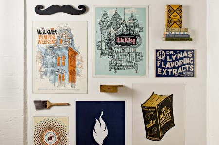
December 8, 2009 at 3:05 amDitto all the above comments. A great space leads to great work. BTW, those posters on the wall are by another wonderful design studio, Methane Studios.
http://methanestudios.com/
Digitalshep says:
December 8, 2009 at 8:11 amI believe the guy that’s doing most of the wood construction on this place including the firewood wall is Kyle Sharp. Here’s his website/blog hasn’t been updated in a while but neverless pretty cool stuff.
http://www.kylesharpco.com/
For-W-Art says:
December 8, 2009 at 8:55 amThat’s it I’m done, I’d kill to work there.
It’s like the designers version of Tom Hanks working in Toy factory.
Josh says:
December 8, 2009 at 12:29 pmDang…. just when I was about to turn my shed into a version of Michael Pollan’s writing house you have to post this! That is some sweet space right there!
ghostinthetoast says:
December 8, 2009 at 4:58 pmPretty critical. I work in a dismal workspace presently and have to leave often to retain sanity or find inspiration. It’s a utilitarian approach that probably won’t be changed, as it’s difficult to calculate the loss of providing such poor working conditions.
michael j. says:
December 9, 2009 at 2:42 amWithout actually being there, I’d say it’s a bit overwhelming. I love the space in pictures, no doubt, seems like a dream to work in or even just hang out in. I myself like a warm cozy space where I feel inclined to retreat into my own world and create. Also, I like a place I feel I can make a mess and be ok with it there. I think in this space I’d want it to be a show piece all the time to keep the feel of these wonderful photos.
Forrest says:
December 9, 2009 at 11:34 pmMan, I was just in Portland, but I didn’t know this place existed! I would love to make a mess in that place, see the true potential of the creative energy that it seems to emit.
Lincoln Barbour says:
December 10, 2009 at 3:22 pmIn case anyone wants to know who took most of those photos, that would be me.
Just saying since there’s no credit line. Originals are here:
http://www.lincolnbarbour.com/blog/200908/work-parliament-design-interiors/
Darren Morgenstein says:
January 10, 2011 at 12:21 pmIt had been some time since I visited web site with such quality information. Thansk rather a lot for the useful data
Allyne the Phoenix title loans guy says:
January 14, 2011 at 6:27 pmHi. I needed to appreciate the super information you’ve posted in your blog. I will likely come back to read it again and have agreed to your RSS feed. Have a wonderful day.