Perky Bros. LLC


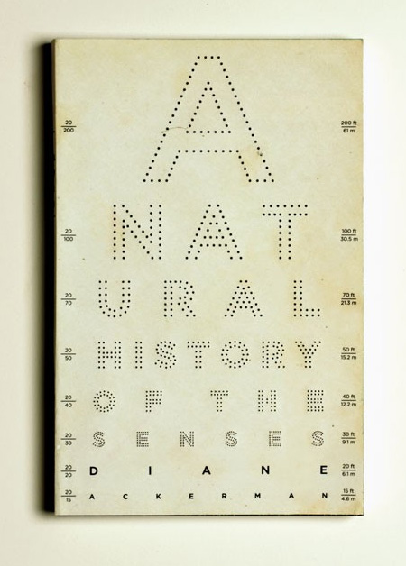
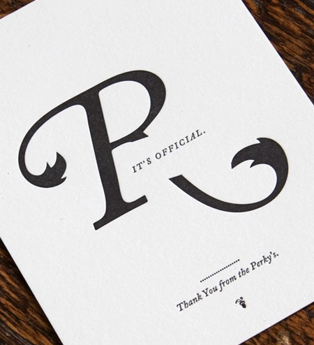
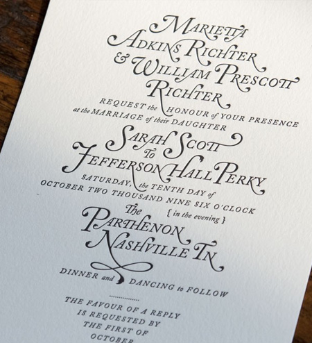
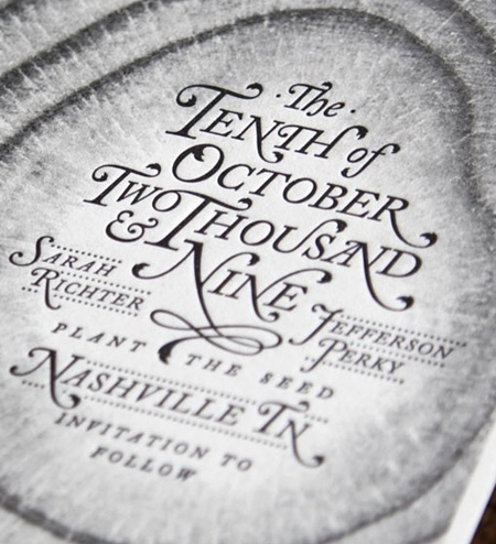
I’m always a sucker for letterpress. You could almost use any design and I’ll love it if it’s on the right paper and embossed like this. Perky Bros., aka Jefferson Perky, is producing some beautiful work out of his studio in Nashville, TN. You can check out the rest of his portfolio here.
I forgot when I heard this, but this girl with a letterpress was explaining how in the old days it was actually frowned upon to de-boss the paper. The more skilled the letterpress operator, the lighter the impression the type would make when it printed to the paper. She went on to explain how in recent times artists have begun to purposefully de-boss the paper when printing as an effect. It’s always interesting to see how people take equipment that’s been painstakingly designed to produce a certain effect and turn it on it’s head to do something new and creative. It sort of reminds me of a lot of recording techniques where you’re taking something designed to produce the most pristine possible sound and abusing the process to create effects and distortions.
Via Graphic ExchanGE

13 Comments Leave A Comment
torrans says:
November 30, 2009 at 5:07 amI’v been lucky enough to be able to incorporate letter press in some of my projects over the last year. My college has a nice letterpress workshop with a massive selection of type, but because most of the projects we get are to improve are digital skills it gets very under used.
Adam M. says:
November 30, 2009 at 10:14 amPrint-nerd correction: de-boss
Jesse says:
November 30, 2009 at 10:46 am“It’s always interesting to see how people take equipment that’s been painstakingly designed to produce a certain effect and turn it on it’s head to do something new and creative.”
To true! when things change, like Polaroid being discontinued or something, it just pushes creatives to further explore new possibilities. I love the way creativity flows over and around all obstacles and innovations.
Sean says:
November 30, 2009 at 11:18 amThat’s interesting about embossing being frowned upon in the old days. Kinda like with printmaking how everyone would strive to get the cleanest looking prints possible and then people like warhol indulged in the beautiful marks and happy mistakes that could be made when you weren’t so careful. Now I often find the messier a print looks the more beautiful I find it.
Justin says:
November 30, 2009 at 12:36 pmThat’s awesome. Jeff is a great guy and one of the most talented designers I’ve ever met. He singularly makes Nashville less inferior.
Scott says:
November 30, 2009 at 1:28 pmAdam M.-
Thanks, updated
Malik says:
November 30, 2009 at 6:11 pmRosario Dawson said that in the movie 7 pounds, will smith is fixing her letterpress or something
jesse says:
December 1, 2009 at 8:13 amYeah he does, i saw the movie a while ago but I remember the part. Beautiful machine, but I was wondering when I saw it how realistic Will’s repairing job was. The last time I used a letterpress was a while ago.
david says:
December 3, 2009 at 9:08 pmthat piece was printed by minneapolis based letter press shop studio on fire.
check some of the recent work at beastpieces.com
Gary says:
December 25, 2009 at 2:54 pmI ran a single color hand cranked letterpress in NYC from 1969 to 1974 and embossing or de-bossing was never a consideration. The printed sheet was not supposed to show any evidence of the plate when looking at the back of the printed sheet. Getting to know the press, the packing, the bed, ink rollers and the plate being used was an art. A properly inked plate and all other variables adjusted and tweaked to perfection was an art learned after years with the same press. Letter Press sheets should not look embossed any more than an offset litho sheet does.
Mike says:
December 26, 2009 at 11:37 amThank You from the Perky’s? From the Perky’s what? Why does a typo in letterpress seem that much more permanent? (Beautiful type and concept, though)
kris says:
January 22, 2010 at 6:58 pmAnyone know what FONT was the basis of this design?? Really tight design going on here!