Versus Series: Dubstep+AltHipHop+Disco


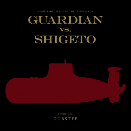
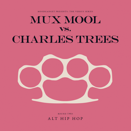
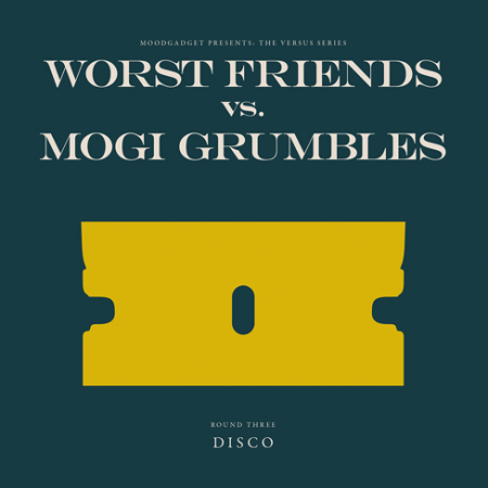
I don’t do much actual design on Moodgadget, mostly just thinking up the concept for the covers and work side to side with the designers sometimes. This series is one that i’m pretty proud of done by Alex/HeadUp[he posts a ton in the comment sections on the ISO50 blog] and I, the goal was to have a strong 2-D iconic image that was related to the genre a bit but also a weapon in a way (i.e. disco having a razor for your hardcore late night clubbers and a razor also being a weapon in a way), a changing 3-color color scheme, and simple consistent text layout, kind of like a label for a vinyl but digital only. The series will come out in 3’s and each being a different round and we’ll go up to 12 and this hopefully will help define genres in the electronic music world. Below is a little more info on the series:
“Moodgadget has caved in to its most savage and pugilistic desires to see electronic genres battle to the death, leaving the listener with the sense of euphoria you get from watching your favorite kung-fu flick, or that adrenaline rush that comes from a flare-up of tempers.
Make no mistake though, the Versus series, while born from a sense of friendly competition, is dedicated to revealing the diversity within each genre. Like a sumo wrestler taking on a fencer, the style of each musician is unique, their approach exotic, the result is pure entertainment, and the battle itself becomes more appealing than the outcome.
Songs are presented as Rounds, a one-two-punch of tracks from the opposites sides of the spectrum. In Round 1, experience Dubstep tracks from Guardian and Shigeto, Round 2 features Alt Hip Hop from Mux Mool and Charles Trees, and Round 3 brings Disco producers Worst Friends and Mogi Grumbles into the ring.”
[audio:beatitup.mp3] [audio:exodus.mp3] [audio:skihive.mp3]
5 Comments Leave A Comment
Bas says:
October 27, 2009 at 4:24 amLooks superb; super efficient and clean! Well done.
Jesse says:
October 27, 2009 at 7:55 amLove the simplicity of the concept and colors. Would you just reduce the character size if the name gets to long? That font is still growing on me.
Jesse says:
October 27, 2009 at 8:11 amActually I like the font (Engravers I am guessing?) I think the kerning is whats a bit to tight for me. But I realize there is limited space. Overall nicely done!
Rent says:
October 27, 2009 at 3:53 pmgreat concept and designs. the music ain’t too shabby either.
Mike says:
October 29, 2009 at 9:10 amThese are awesomesauce. Nice work!