Newwork Magazine
Posted by Alex
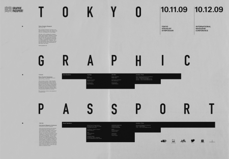
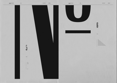
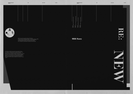
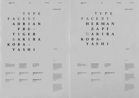
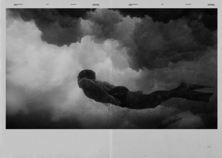
These spreads from Newwork Magazine are exceptionally awesome. At first I wasn’t sure why I was so taken by them, but I think it’s a combination of the following factors: sole use of (mostly) black and white, implementation of a strict grid, lots of little type details throughout, and a sophisticated and effective use of negative space. Newwork Magazine (ink on paper / 32″ x 23″) is put out by Studio Newwork.

11 Comments Leave A Comment
RA_OUL says:
October 26, 2009 at 7:26 amI absolutely love the type treatment and grid use in all of the spreads. My favorite is the use of the macro type in the second composition. Nice post.
Peter says:
October 26, 2009 at 8:32 amhttp://www.lvlvb.com give me surprise!!!
d says:
October 26, 2009 at 9:06 amthat last photo is by wayne levin. he’s got a lot of really incredible b&w underwater photography. puts everything in a while new perspective. a lot of the images are really powerful. check it out:
http://www.waynelevinimages.com/
Kala says:
October 26, 2009 at 9:16 amThird one is Willi Kunz.
Rent says:
October 26, 2009 at 10:48 amyummy stuff. great post.
D says:
October 26, 2009 at 1:48 pmah! check this out!!! picture over the fireplace!!!!
http://www.flickr.com/photos/55397648@N00/4016511435/
Matt Davis says:
October 26, 2009 at 2:55 pmI agree. I think somethings will never change or go out of style. So sick.
blackabee says:
October 26, 2009 at 3:13 pmquality stuff. thanks for sharing.
Fireplace Designs says:
January 29, 2010 at 10:01 amthis is really good. how long did it take?
Anonymous says:
February 26, 2010 at 1:44 pmso chill