Louis Reith
Posted by Alex


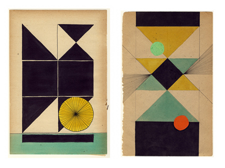
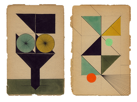
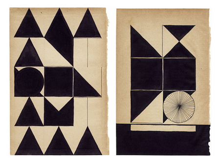
Assorted works by Dutch graphic designer Louis Reith. I really love the texture and the color of the paper he’s working on. I’ve spent hours in Photoshop trying to replicate that same off-white mix; can’t beat the real thing. Even more exciting is the color at work in the shapes — each hue is dialed in exactly where it should be. Some of the forms in the bottom image remind of the typographic stylings of Non-Format.
More info about Louis, including upcoming gallery showings, can be found on his Myspace.

8 Comments Leave A Comment
RA_OUL says:
October 13, 2009 at 8:33 amI really love the simple use of line, shape, color, and form.
Jesse says:
October 13, 2009 at 9:33 amI love these! Great color/forms/layout… Does it remind anyone else of the colored wood shapes from grade school? I remember a red rhombus, and blue triangle, etc. I would love to do a poster series on those pieces again…maybe i will. Another great activity for those that remember was the rubber band boards with all the colored rubber bands. Great memories.
I’m glad to know I am not the only one to obsess over a digital version of vintage white paper!
koneyn says:
October 14, 2009 at 1:32 pmI guess basically this is inspired a lot by Bauhaus/De Stijl kind of work, though less exciting for me. But I like his wall drawing, with a bird on a man’s lower lip (it’s right there on flickr) :]
Do says:
October 15, 2009 at 8:57 amDamn! Reith rules!
max says:
October 25, 2009 at 5:39 pmhey cornell,
just giver and make some screen prints on rag or unbleached paper. push your work off da computer screen! be worth it dude. get the real texture.
grace says:
October 27, 2009 at 4:15 ambreath taking – I’m awe struck!
Daniel Kent says:
July 7, 2010 at 6:03 pmGreat work. Man, I love the palette. I made a series in 07 on book pages torn out of a 1880s bible. You may enjoy these as well. http://ikhoor.com/#370209/Art-Collage-07
Rento says:
July 8, 2010 at 2:11 amthe myspace link doesn’t work, but check out his website
http://www.louisreith.com