Katja Gretzinger
Posted by Scott
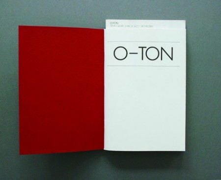
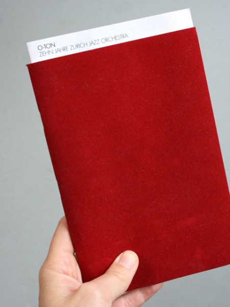
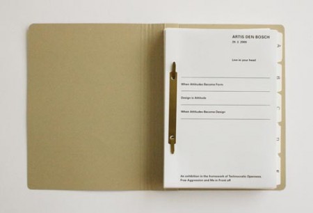
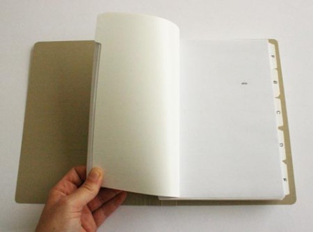
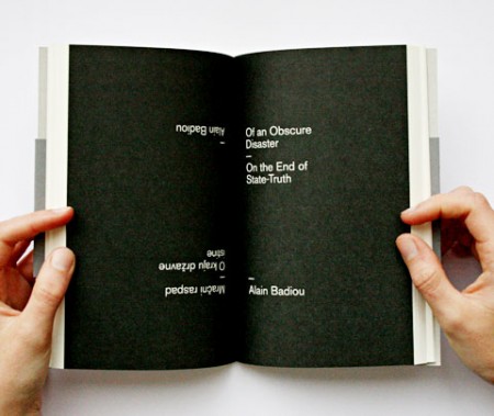
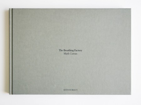
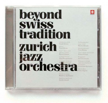
Absolutely loving this brilliant work from Berlin/Zurich-based Katja Gretzinger. This is the kind of work that really expresses the core ideals of design to me; it’s efficient, functional, and pleasing to the eye.
You can have a look through the rest of Katja’s excellent portfolio here.

5 Comments Leave A Comment
slofu says:
October 12, 2009 at 11:49 pmGreat work. Thank you for sharing.
RA_OUL says:
October 13, 2009 at 3:38 amThis is absolutely beautiful. I really love type dominant treatments because it shows the essence of a design using core elements. I think mastering typesetting can enhance a designer’s skill level in all aspects of design because those principles can be applied to image as well. Nice post.
Greg Vickers says:
October 13, 2009 at 10:54 amOH MY GOODNESS what is that font on the cd …????!!!
Aled says:
October 13, 2009 at 12:29 pmArbiter bq Bold
http://new.myfonts.com/fonts/berthold/arbiter-bq/bold/
Steve Zimmerman says:
October 13, 2009 at 7:35 pmI really like the binding technique that was used in in the 3rd image. It really gives off a more industrial feel to me. The overall look has a nice balance of ascetic & function.