Typographische Monatsblätter


Typographische Monatsblätter 10, 4, 8/9, 12. 1955
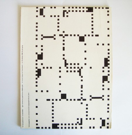
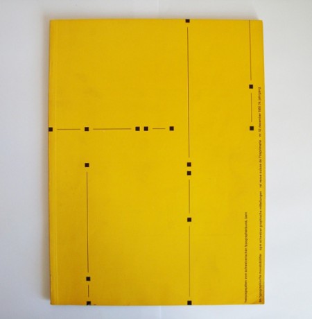
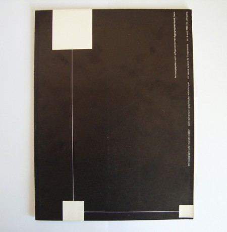
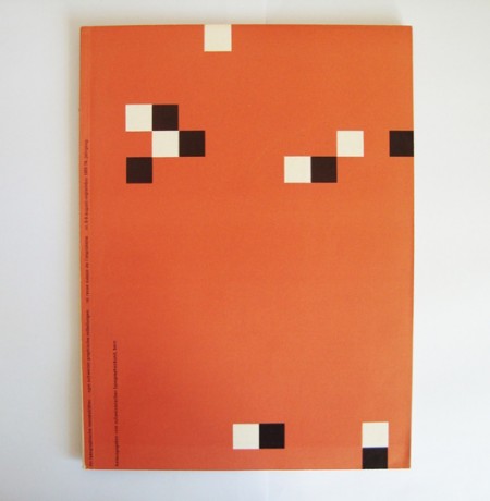
In keeping with this week’s (completely unplanned) typographic theme, I thought I’d post these excellent covers by Emil Ruder. I’d love to see someone try to get away with type layout like this on a client project.
Some additional info (apparently translated) from 80 Magazine:
“in 1953, TM held a competition to design a cover series, inside layout and advertising pages. 12 people took part, including the basel typography teachers emil ruder and robert büchler. the TM jury report on ruder’s entry:
‘the designer if his competition work chose the square as design motif, wich also resonates again in the page layout. this cover series is designed with sparkling fantasy; bold and new, far way from tested solutions, in a darling refreshing attemp. […] a really new solution which could have an interesting change from the arrangement up to now’
five covers by emil ruder were applied to break the monotony of the winning entry of robert büchler”
extracto da revista-libro ‘ruder typography ruder philosophy’. idea magazine 333. vol. 57. marzo 2009. xapon. issn 0019-1299 +
Via 80 Magazine

5 Comments Leave A Comment
Rob says:
September 30, 2009 at 7:13 amDo Emil Ruder make hard covers with just plain old lined paper in them? I’m looking for a cool design like that to write in.
Mark C. says:
September 30, 2009 at 8:21 amAlthough these graphics are a tad too abstract for my tastes, I do however, appreciate being provided the rationale behind the designs. Sometimes, an understanding is all that’s required in order to make a subject more palatable.
Jakub says:
September 30, 2009 at 1:09 pmI’d hang the yellow one on my wall
blackabee says:
October 1, 2009 at 1:40 pmI’m a fan. Thanks for sharing.
Tobias says:
October 1, 2009 at 4:01 pmIch steh total auf typographische Monatsblätter!