Non-Format Interview

Non-Format is one of the most exciting studios working today. Comprised of Kjell Ekhorn (Norwegian) and Jon Forss (British), Non-Format is known for an exceptionally innovative approach to typography and a fresh, boundary-smashing graphic style. Clients such as Nike, Coca Cola and The New York Times have all tapped the studio’s award winning and internationally acclaimed design talent. Operating on two continents, Non-Format is based in Oslo, Norway and Minneapolis, USA.
One of my first assignments at design school was to bring in some books that I found inspiring. As I had just started the program, I didn’t really have much to show for myself, and I distinctly remember arriving that day to see that around 3/4 of the class had all brought the same book: Non-Format’s Love Song. The extent of their influence on the field of design became immediately clear to me. Since then I’ve kept a close watch on the studio and am always excited to see what they’ve been working on. Recently I had the privilege of interviewing Jon and Kjell and our exchange is after the jump.
What were your goals/aspirations when you all started Non-Format in 2000?
We’d been working together for a year or so before we set up Non-Format, so we knew we were compatible as a design team, but the decision to make things more official came about because we were offered the chance to art direct the monthly music magazine The Wire. We hoped we’d be able to use that project as a solid platform from which to build a small design firm. We weren’t too sure what kind of clients we would attract, but we’d been working for a couple of small independent record labels so we hoped this might lead to more music packaging work, perhaps for major labels and, if we did a good enough job with The Wire, perhaps we’d be offered the chance to design other magazines too. We really had no idea where this was all leading, just that we thought it was an exciting new development for our careers.
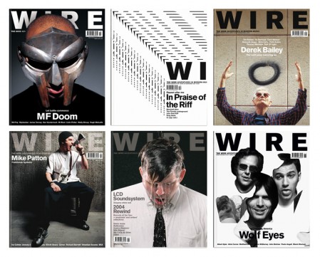
Art direction and Complete Redesign of The Wire
What are you working on now? Anything coming up in the future that you are really excited about?
We’re working on a mixture of projects, as usual: some music packaging that should see the light of day quite soon; we’ve just completed some advertising image work for a well-known information technology company; we’re working on a typeface that’ll become our very first commercial font release; and we’re finally starting to explore moving image/typography with a couple of interesting projects in the early stages.
How has your perception of your own work evolved over time?
We’ve slowed the pace of change down quite a lot from what it was when we first started. Whereas we once felt the need to reinvent with each new project we now take the time to slowly evolve and develop a line of visual enquiry or approach so that it’s allowed the time to mature. It tends to lend our work a more recognisable texture than it ever had before. We certainly don’t regard our approach as a ‘house style’ by any means, but we can recognise that clients come to us with an expectation of a visual approach as much as a conceptual approach.
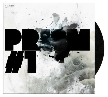
Stateless | EP packaging
Describe a typical day at Non-Format (if there is such a thing).
Well, Non-Format’s day is very long. It starts at around 9am Oslo-time and doesn’t end until around 8pm Central US time. That’s a typical working day of around 18 straight hours but, of course, we split that between a studio in Oslo and one in Minneapolis. Kjell works alone until I log in during his afternoon. We have a few hours when we can discuss our projects together, get our emails sorted and perhaps even Skype each other. Then, once Kjell has finished his day, I carry on with things for a few more hours. The workload changes all the time, so there’s rarely a typical day.
What is one of the biggest mistakes you’ve made in your career and what did you take away from it?
It’s really difficult to think of one really big mistake that has changed the course of our careers. We tend to believe that if you change one thing you change everything, so we certainly don’t ever dwell on ‘what-if’s.
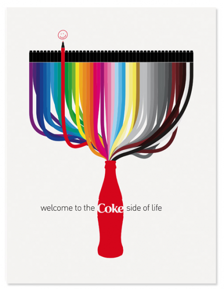
Coca Cola | Illustrations for the Coke Side of Life Campaign
You’ve mentioned that some of the best parts of a project tend to be unplanned and unexpected; — can you describe a specific example from your career?
These tend to be very small incidents that are difficult to pin-point, and are difficult to quantify, but one example would be the Red Snapper packaging we produced for Lo Recordings. There were two albums produced: a standard album and, later, an album of remixes. For the standard album we produced a woven cloth clothing label which was stitched across a blank LP sleeve. When we were given samples of the woven labels we noticed that the backs of the labels had really interesting strands of cloth hanging off them and that the design on the front of the label could be seen in reverse through the strands. This got us thinking it would be nice to produce a label with the design woven on backwards and then used with the reverse side showing as the front. We would never have thought to produce this had a label not landed on our desks the wrong way up.
One of the biggest challenges that faces an art director, or designer, is to spot the potential in things that are unplanned and recognise the opportunities. If you design something in your head and then spend all your time trying to recreate that vision, you tend to close yourself off from the opportunities that serendipity sometimes throws your way. Chance is often a great designer.
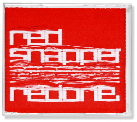
Red Snapper | CD Packaging
What is the state of graphic design? Is there anything you would like to see more of? Less of?
Graphic design seems to be doing quite well, particularly as things are moving away from print and towards more on-screen applications, which opens up so many new opportunities for designers. One thing that happened just recently was Apple’s launch of iTunes LP. This allows the kind of involved music packaging that once graced printed LP sleeves and CD booklets to make it onto the millions of iPods that cover the globe. We’re hoping it’ll be, at the very least, a million times better than the 240 pixel square image that music packaging had become.
For aspiring creatives looking to launch a career, do you think it’s best to develop a portfolio based around one visually identifiable style, or show a mastery of a broad range of styles in an effort to demonstrate artistic versatility? To a large extent I imagine it depends what you want to end up doing, but I am curious A) what you think is best and B) which path you each initially took.
There’s a big difference between showing design versatility and showing merely a knowledge of a variety of design trends or styles. If someone is producing great work that translates across all kinds of media then that’s certainly demonstrating a great deal of versatility. But if they’re simply churning out a schizophrenic body of work in a number of different styles, it doesn’t show a mastery of design but merely a superfluous attitude that can be detrimental.
When we began Non-Format, we were keen not to be pigeonholed for producing one clearly identifiable style. We wanted each new project to be treated on its own merits and believed that whatever layer of styling would be added only after we’d created a solid core concept. These days we tend to approach things in a more integrated way: we still believe in searching for the core truth of a project but the aesthetic is now a much more integrated element that’s considered right from the beginning. Of course, now that we have a decade’s worth of personal research and development under our belts we tend not to be looking too closely at other people’s work for guidance on matters of aesthetics.
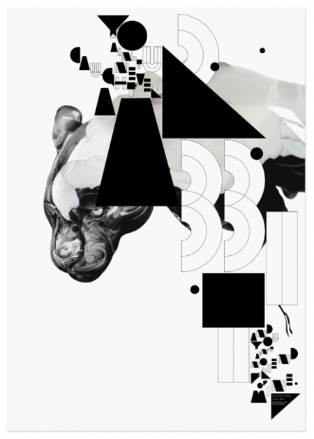
Hellovon | Limited edition silkscreen poster
When (and if) you are in a creative rut, what has proven to be the best tactic to get back on track?
We swap files between us continuously to make sure they are regularly seen by a pair of fresh eyes but if we’re really stuck, it’s best to go and do something else entirely. Good ideas have a tendency to hide in the most unlikely of places.
What is the best piece of advice you ever received, from who, and why?
Jon: This is a difficult one to answer. I must have been given hundreds of pieces of good advice over the years and I can’t think of one individual and profound answer to this one. So, here are some bits of advice I’ve picked up over the years. Firstly, “Don’t mistake legibility for communication”. Type design shouldn’t be about striving for legibility; it’s about communicating a message, or an idea, or a feeling. I think I first came across this maxim on a piece of typography by Phil Baines in the late 1980s. It was true then and it’s still true now. It also goes hand in hand with, “We read best what we read most”. However, a great source of amazing advice can also be found in one little book by Brian Eno called A Year with Swollen Appendices. Apart from his ideas on Axis Thinking, which suddenly opens up any field of endeavour into an almost limitless expanse of possibilities, I really love the story he tells about encouraging his kids to draw (at least, I think it’s in this book). Well, my version of his story is that he opens up a huge tin of felt-tip pens that are in a rainbow of colours, offers them to his kids and says, “choose three”. I love this. In a world with so many choices and options presented to us, sometimes the best thing to do is to self-impose limitations.
Kjell: “Never so bad it’s not good for something” is what my mother used to say to me if I was down or felt, as a kid, that something had gone horribly wrong. As I’ve grown older and wiser I’ve come to appreciate what a genius piece of observation it is, both for work and life in general. It makes me look out for positive outcomes of everything that happens, however challenging or horrid it might seem at the time.
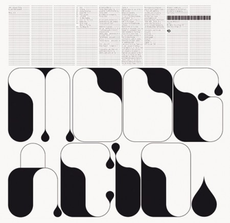
Lo Recordings | Music Packaging
What are some current obsessions?
Jon: Since I moved to the ‘Land Of Ten Thousand Lakes’ I’ve developed a hankering for a canoe and/or a kayak. And, now that I’m surrounded only by American cars, I’d really like to get an old British or Italian motor car. Well, anything European actually. And did you notice the use of the word ‘motor’ there? I don’t just want a car, I want a ‘motor car’, if you know what I mean.
Kjell: Looking at outragingly expensive outdoor equipment (purely a result of relocating from London to Oslo); building airplanes out of a limited number of Düplo bricks and vehicles with my kids; making our type move.

Bary 7's Connectors | Packaging
If you weren’t designers, what would you want to do?
Jon: I can’t imagine not being a designer. I’ve no idea what else I would do. Or, at least, I can’t imagine being able to do anything else that wouldn’t spiral me into bankruptcy.
Kjell: I quite like the sound of being a clinical psychologist – but maybe it’s just because I love the word clinical.
Finally — favorite city you visited last year?
Jon: Tokyo. As ever.
Kjell: Yep, as far as cities go, Tokyo is rather hard to beat.
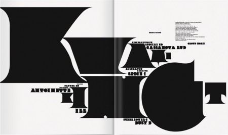
The Epitaph | Fader Magazine
—
Thanks again to Jon and Kjell of Non-Format for the interview. Don’t forget to check out their website to see more of their incredible work. You can also purchase their book, Love Song, on Amazon.

16 Comments Leave A Comment
mat says:
October 5, 2009 at 8:25 amgood stuff
Yaco Roca says:
October 5, 2009 at 9:04 amVery excellent work and interview. Great post.
Christopher says:
October 5, 2009 at 9:23 amNice interview
Christopher Meeks says:
October 5, 2009 at 11:53 amThat is a really helpful interview for any of those designers/artists (me) that just don’t know how the great ones do it.
I’m very impressed with their style and focus on typography.
The most personally helpful answer they gave was in response to whether designers should focus on one style or show a mastery of styles.
It seems like artists are becoming increasingly more segmented by nature. While that lends itself to field experts being created, it takes away from versatility.
The true trend-setters tend to be those that become expert across media or visual styles. Their work is timeless and media-less. It sure seems like these guys have figured it out.
-Christopher
Rent says:
October 5, 2009 at 2:05 pmReally great interview. Amazing insight and so inspiring.
Robert says:
October 5, 2009 at 2:55 pmThanks for a great interview. Wasn’t aware of Non-Format and now i know. Thanks again.
awe says:
October 5, 2009 at 7:48 pmI have to admit, I had never heard of them. I checked out all of their work, and was thoroughly unimpressed on all levels. Perhaps this is one of those cases where everyone likes something because everyone else does.
Rent says:
October 5, 2009 at 8:11 pmouch.
slofu says:
October 5, 2009 at 9:43 pmNot my thing, either, but good to see [peeking from beneath my rock] what’s popular/successful. Thank you, Alex.
Op says:
October 5, 2009 at 10:15 pmPretty good interview, like how they work in different continents … one thing, “Don’t mistake legibility for communication”, always thought that was a well known David Carson qoute rather than Phil Baines?
Scott says:
October 5, 2009 at 11:02 pmawe, slofu-
really? I know beauty is in the eye of the beholder, but I always thought non-format were one of those situations where there really isn’t any room for argument. But I suppose everything is up to interpretation.
Whether or not you like them, there’s no denying their influence though. There isn’t much design today that doesn’t have at least some element of their work in there somewhere it seems like. If you look back at their earlier work you’ll see that they launched a whole style genre that is still going strong today.
clippingimages says:
October 6, 2009 at 9:11 amNice interview and great stuff, cool design , thanks for sharing this nice post.
nick p says:
October 7, 2009 at 12:11 amgreat stuff!
Nothing insightful to say here, i just really like their work.
slofu says:
October 7, 2009 at 1:13 amAre/were they at all affiliated with the Designers Republic? I like the Barry 7’s Connectors packaging, but it looks a lot like tDR.