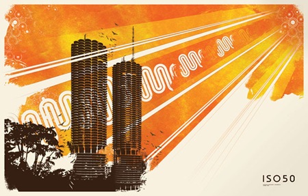
Chi Town
Posted by Scott

I’m sitting at SFO waiting to take off for Chicago (thanks Kiyoka), brought 3 jackets, hopefully that’s enough. The MOMI show with Jonah Sharp is tomorrow at Millennium Park, but unfortunately it’s sold out. I’m doing a set later that night as well, not sure on the details just yet but will post as they become available.
The image above features Chicago’s Marina Towers which were designed in 1959 by Bauhaus alum Bertrand Goldberg. I created the illustration (sans towers) originally as an album cover for Tha Fruitbat and then later adapted it into poster form which is available at The ISO50 Shop.

10 Comments Leave A Comment
Joaquim Marquès Nielsen says:
February 22, 2008 at 10:41 amGreat to get this info on how it has developed from a cover to a full poster.
Also, it’s one of your more rare horizontal posters (if not the only one?).
Scott says:
February 22, 2008 at 3:01 pmJoaquim-
I just realized I omitted part of the story. Between it being an album cover and a poster, it was an illustration for a computer arts article on photoshop plugins. It was the standard two page spread, hence the horizontal format. There are more coming, first up will be the elk Illo from the ca cover, should be out in the next few weeks. In a cab right now on the way to the hotel, it’s almost as cold as it was that night in Stockholm!
ray says:
February 22, 2008 at 7:24 pmjust wanted to drop by and tell you how much of a fan i am
jacob says:
February 23, 2008 at 12:26 amHi Scott:
The most recent issue of Dwell (March I think) has a short write up and bio on Goldberg and mentions the Marina Towers and specifically their use on the WILCO album cover.
It’s a decent read…
– jacob
Salarrue says:
February 23, 2008 at 8:59 amI saw the towers in WILCO album cover, and I love BAUHAUS history… also I admire your work. (last night i had a ISO50-ESQUE dream where i was turning the pages of a book that had your style, maybe because i open your site everyday) But this design I found it basic, to be honest for the Photoshop plug in article is perfect. don’t get me wrong is a clean composition but the top corner circles reminds me istockphoto elements.
drew kora says:
February 23, 2008 at 10:00 am…about to head downtown to grab lunch and go to the show right now. Can’t wait!
vhgriyyhia says:
April 23, 2008 at 6:49 pmWow, cool man, big thanks! http://yntkzmubdfwoo.com
Achy says:
April 29, 2008 at 12:14 am好棒!!
sinbinho says:
May 9, 2008 at 7:46 ami like it!
Frederic Visnosky says:
June 10, 2010 at 7:10 pmHey there, firstly, I would like to let you know that I think it’s a good website you got here. What I wanted to ask is, I haven’t figured out the way to include your web site feed in my rss reader – where’s the link to your RSS? Thank you