826LA Time Travel Posters v.2


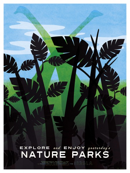
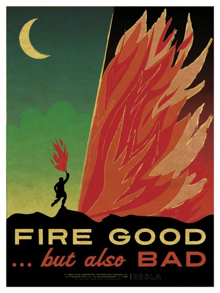
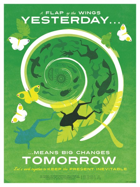
826LA has released a second round of Time Travel posters, on sale at their Echo Park Time Travel Mart. You can view the first series on this page as well, just scroll down a touch. Both were created by Los Angelas based illustrator/designer Amy Martin. As Amy notes on her blog, the sans-serifs at work are Turnpike and Featured Item. The script face is Vitrina.
I love both editions — can’t really decide which set I like better. I think they each have their strong points; for me, the illustrations of the first series and the typography of the second are the standout features. If there were some way to make a super amazing hybrid of the two I’d be all for it. At the end of the day, they are both great — terrific concept and strong execution.

9 Comments Leave A Comment
Mo says:
September 8, 2009 at 12:26 amHi, i’m sorry, but i really can’t figure out what font that is for the “explore/enjoy” words. i love the posters, they are great.
p.s. sorry for my bad english ;)
Scott says:
September 8, 2009 at 12:38 amwow….The last edition you have is nice and all but this is a whole other level. amazing. you getting them?
Alex / HeadUp says:
September 8, 2009 at 8:07 amOh yeah…these are wonderous! Love the use of type, color, and shape.
Mark C. says:
September 8, 2009 at 8:49 amI really dig the first one; I like the prehistoric theme and how it gradually fades into darkness towards the bottom. I can actually visualize this one handing in my place.
slofu says:
September 8, 2009 at 9:31 amThanks, Alex. I’m with you on the illustrations on the first set and type on the second.
Is it just me, or is the arrow wrong on the Bushido print? I understand artistic license, but I don’t know that my inner samurai can let it fly.
Dave C. says:
September 8, 2009 at 12:28 pmThe font seems to be Presicav, but “Nature Parks” looks artificially condensed.
Scott Strickland says:
September 9, 2009 at 3:09 pmDid they stretch “NATURE PARKS” vertically in the first print? I’m not sure, but it doesn’t seem to match the other examples of the typeface. I love Turnpike, but I just can’t get past the funky “S’s”. Something about how they always look like they are tilting to the left 5 degrees or something. Killer prints, though. In my opinion the last one kills it hands down.
WittJACQUELINE22 says:
September 16, 2010 at 9:18 pmCars and houses are not cheap and not everybody can buy it. However, personal loans was created to aid different people in such situations.