Emil Ruder
Posted by Alex


Five incredible posters by Emil Ruder.
via 80magazine.
Five incredible posters by Emil Ruder.
via 80magazine.

I have 39,447 fonts on my computer. Or at least I did, up until about 30 minutes ago when I cleansed my machine of all the typographic nonsense that was polluting my list. I had thought about doing this font purge for some time, but hesitated, just in case I might one day need to design a document using the official Jedi Knight font, or something similarly ridiculous.
I remember hearing Massimo Vignelli say in the Helvetica documentary that he only uses about three typefaces. I was embarrassed at the time, thinking of my infinite list compiled over many years of dafont downloads and “BEST FONTS!!!” torrents. I guess I considered myself a typeface collector and I worked hard to “get them all”, even if I had no idea of what use some of them would ever be.
As I progressed through school, I noticed that just about everything I had ever designed used the same 5-10 typefaces. Every time I opened Illustrator I scrolled endlessly past hundreds of handwriting fonts, “distressed” fonts, you name it; always searching for the same go-to options. When I did deviate, the work usually suffered.
After much deliberation, I widdled my list down and trimmed the fat as it were. No longer will I be tempted to use weird knockoffs of Gotham or Helvetica clones. I consider myself much better off because of this — not just because it’s easier to manage a smaller list — but because the typefaces I kept are good typefaces. They’ve stood the test of time, and are the result of a tremendous amount of hard work and development by expert typographers. I know something about each one; who designed it, where it came from etc. In this way it’s a bit like my iTunes library; I probably have about 60,000 songs, but mainly listen to a few selected playlists. I have thousands of songs with a play count of “zero”. Why I keep them around I have no idea.
The book pictured above is 30 Essential Typefaces for a Lifetime by Imin Pao and Joshua Berger. It’s a good place to start if you are considering a font purge of your own. (Though I disagree in a few places; for example I would not include Trajan on my list). My final count is now about 50 typefaces; a much more manageable number I’d say. It’s not Massimo’s magic number — I don’t think I could survive on three alone — but scrolling through 50 sure beats scrolling through 39,447.
note: I, and and many designers I know, tend to use the terms “font” and “typeface” interchangeably. Technically this is incorrect as they are not the same thing. Both this and this article do a good job illustrating the difference. Old habits die hard for me; I didn’t actually know there was a difference until about a year ago, so it’s taken some time for me to change my language.


I’ve got a few projects coming up so I’ve been browsing through some of my old design books for inspiration. These two posters by Max Huber kick-started my mind into creative gear. I really like the color palette at work in both; really unusual and effective. The second one is all about the type for me. Didot Bold in all caps always does a good job. I was recently in Switzerland and am really bummed I missed out on the Max Huber Museum. Next time I guess.


Antonio Carusone from the always excellent Aisle One Blog has written a great article covering the various problems we as designers face when setting type and how to best approach them. The article focuses on using web-based CSS solutions for type layout, but the concepts covered are universal to typography and can be applied to print layout as well. The hanging quotes part is great, but they’re missing the part about “hanging T’s”, I always have trouble with that one. Link


As you may already know, Alex Cornell — the same Alex who posts on this blog — is also my intern around the studio. A while back Northwestern University asked him to take on the daunting task of layout and design for their “Day For Night” magazine. The previous design was pretty much your run-of-the-mill college publication without much thought put into the design so this was a great chance for him to really evolve the visual language of the magazine. The big constraint was colors; apparently he can only use black, white, and one spot color of his choosing per issue. As you can see, the finished product is superb, Alex’s excellent eye for typography and layout really shine through in his first issue for the magazine. This project was featured (and deservedly so) by Behance last week and is up on Alex’s portfolio page there. Congrats Alex, very nice work!
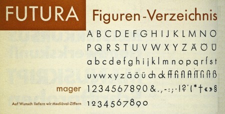
MyFonts released an iPhone version of their WhatTheFont identification tool last week. It has a very simple and easy to use interface. You basically just take a picture of a font, crop and upload it, and it will run the characters through a recognition database and give you possible identities for your mystery font. Works well so far (at least it was able to recognize Futura above), but it will be interesting to see how it does with some more challenging typefaces.
Image via 20th Century Type