Process Post / Student Project
A while ago I mentioned a project I was working on for class regarding a film festival. The project is about halfway done at this point and I thought I’d post a little (tiny) bit of what I’ve been working on. The project is to create a hypothetical film festival centered around a director of our choice. We are to design all of the collateral that would support the festival; posters, catalogs, tickets, schedules, signage, products, a website, trailer, and DVD packaging to name a few. The style is to be reminiscent of the director, but we are not meant to copy the existing visual branding that surround the films.
As Wes Anderson is my favorite director, I decided to create my fictional film festival surrounding his work. His films are packed with beautiful imagery and all adhere to his very distinctive visual tendencies and style. Of all the directors I was considering (Gondry, Allen, Fincher) his work seemed to have the most exciting/appealing visual possibilities. I started out with a much different approach than what you see above, and was mainly just taking pictures of random objects and curiosities and slapping type over the whole thing. My first directions were really bad, fantastically terrible even. I was pretty much just poorly recreating shots from some of the films and not inserting any additional concept to the look and feel. (I’ll post some of these earlier directions in later process posts).
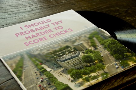
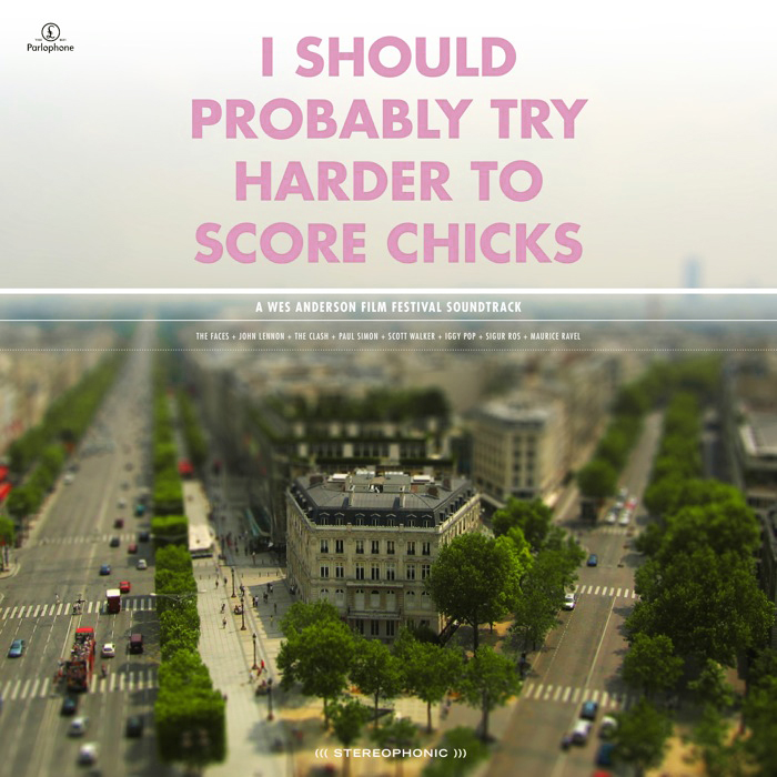
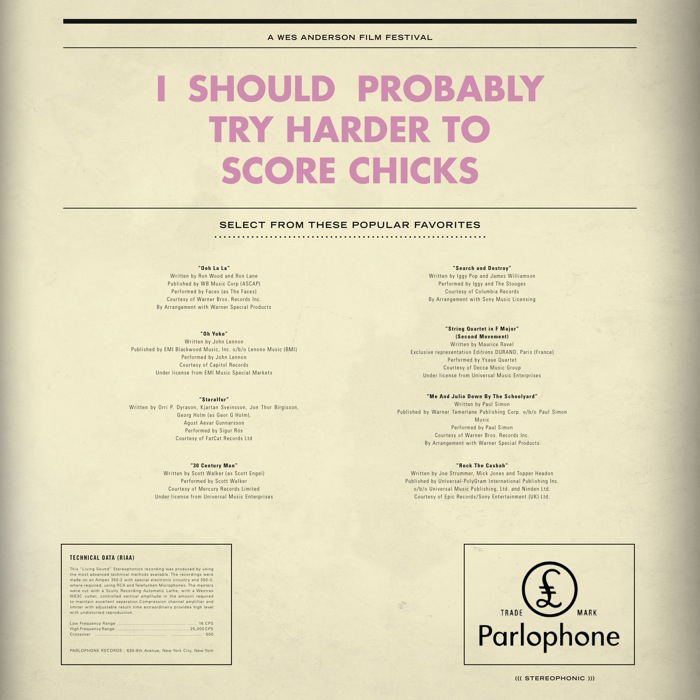
The direction I eventually landed on, and what you see a piece of above, was a combination of tilt-shift photography and Anderson’s typeface of choice. The use of Futura Bold is a direct tip of the hat to his style. I figured I needed to have at least one direct visual link, given that my image style was much more divergent, and Futura Bold would be immediately recognizable to anyone familiar with his work. The concept behind the tilt-shift choice was based on the observation that all of Anderson’s films seem to take place in a parallel social universe where people say what’s on their mind and things unfold in most peculiar ways. Anderson, being the auteur that he is, sort of curates this whole crazy universe. The tilt shift look, in addition to being visually captivating enough to grab attention, is meant to conjure this image of Anderson overseeing this unusual world that exists in his films. I have been tilt-shifting my own photography so far, with fairly successful results, and it’s been a fun technique to learn. I try to use my own photography whenever possible, and find the “Flickr look” (as in people sourcing images on Flickr) that pervades most projects at school exceptionally irritating. It’s hard to generate your own imagery for a project this big, especially if the concept is unusual, but I feel much more proud of the end result when everything is of my own creation.
The centerpiece of the project is meant to be the logo. We spent the first couple weeks coming up with logo treatments and titles for our film festival (Just calling it the “Wes Anderson Film Festival” was not allowed). For my project, I have neither a title or a consistent logo mark. The logo and title unfold throughout my project, and are consistent in their type treatment and ridiculousness of the language. For example, the title of the LP above is “I Should Probably Try Harder to Score Chicks,” a line from Rushmore. The “logo” that appears at the top of the main film poster is “They Were Giving Each Other Handjobs While You Were Taking a Nap by the Pool.” When you see a lot of pieces of the puzzle, the lack one mark is not evident because the consistent type treatment and language tie everything together. It’s also fun to have super random sentences gracing the front of all of the work; makes for a much more humorous project.
Above is just one piece of the massive project that I am attempting to put together. It is a soundtrack of songs that are either in some of the films, or feel like they might be, and is still very much a work in progress. Having landed on a image/type style, with about a month to go, my motivation has trickled to a crawl. The hardest thing for me is conceptualizing what the project will look/feel like, and once I have this locked down (and it’s just a matter of applying it to all the different formats), I lose a lot of interest in what I’m doing. I’ll kick back into gear soon, and hopefully will have more pieces to show in the weeks to come.
