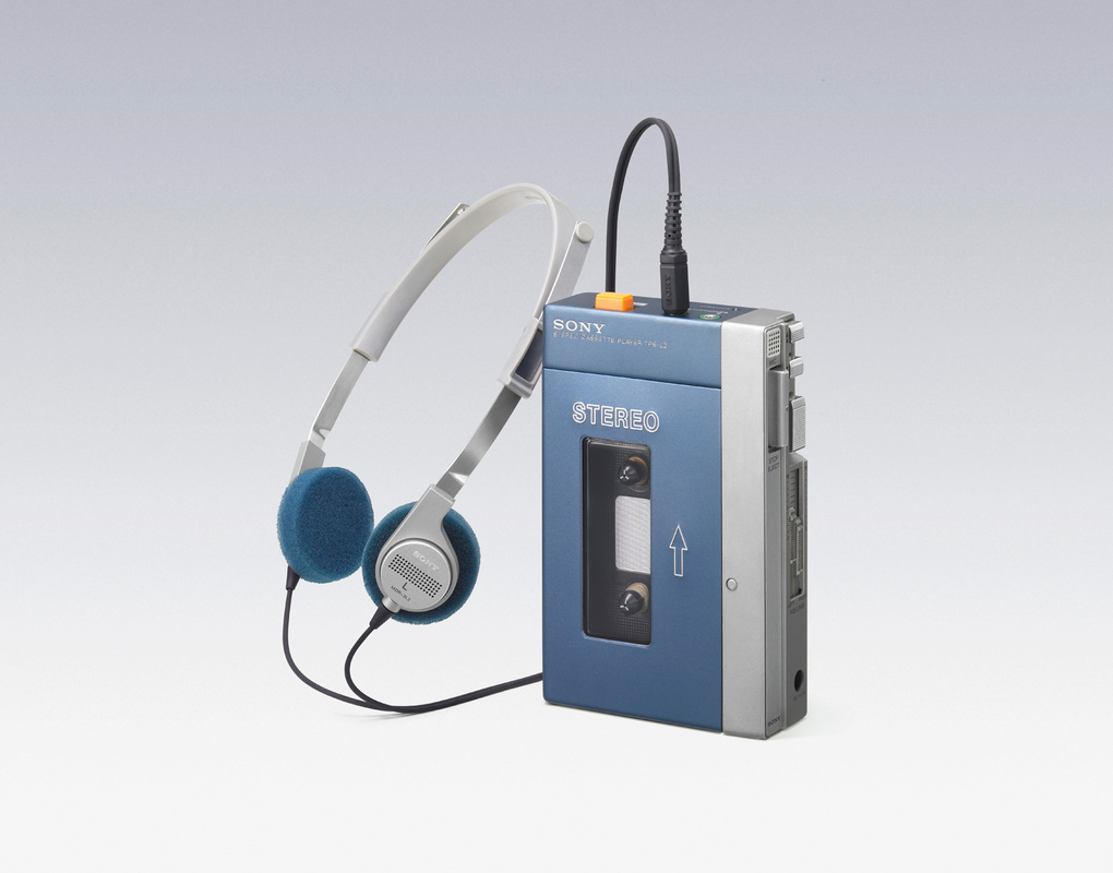
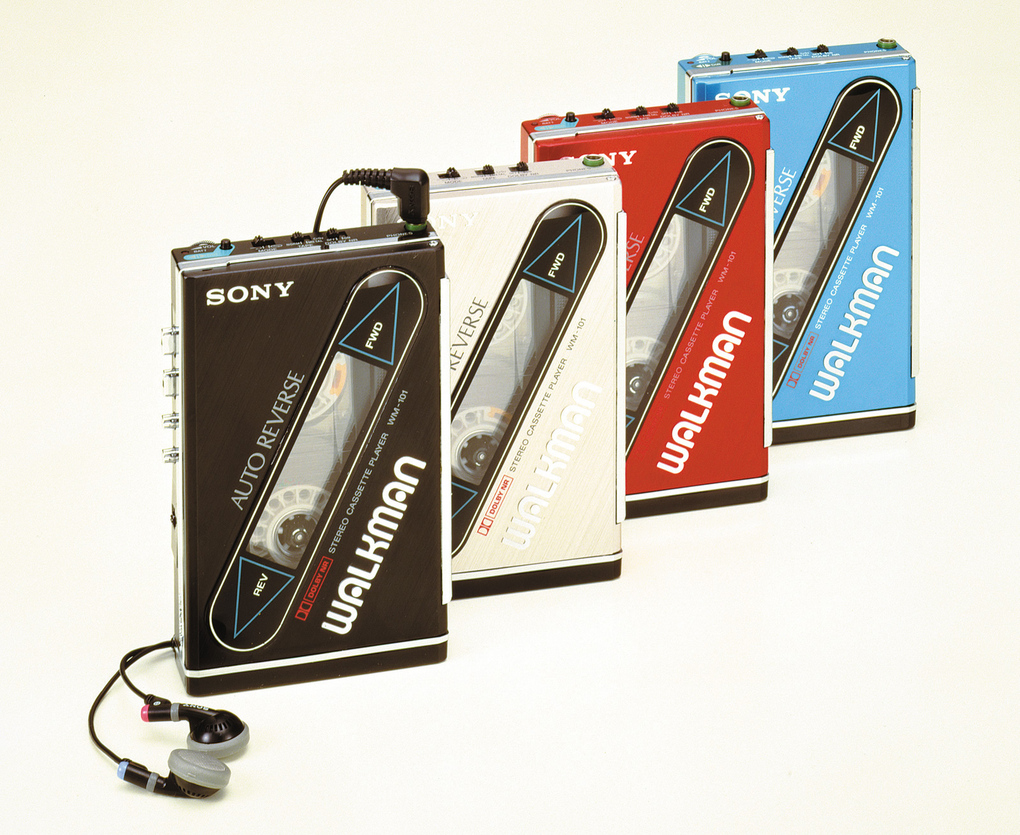
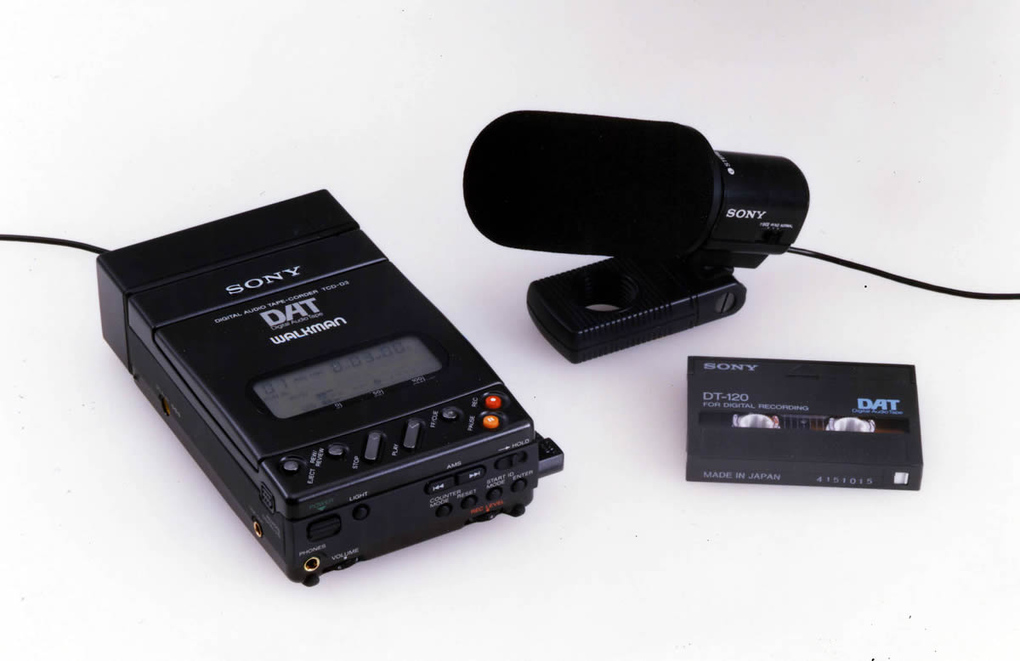
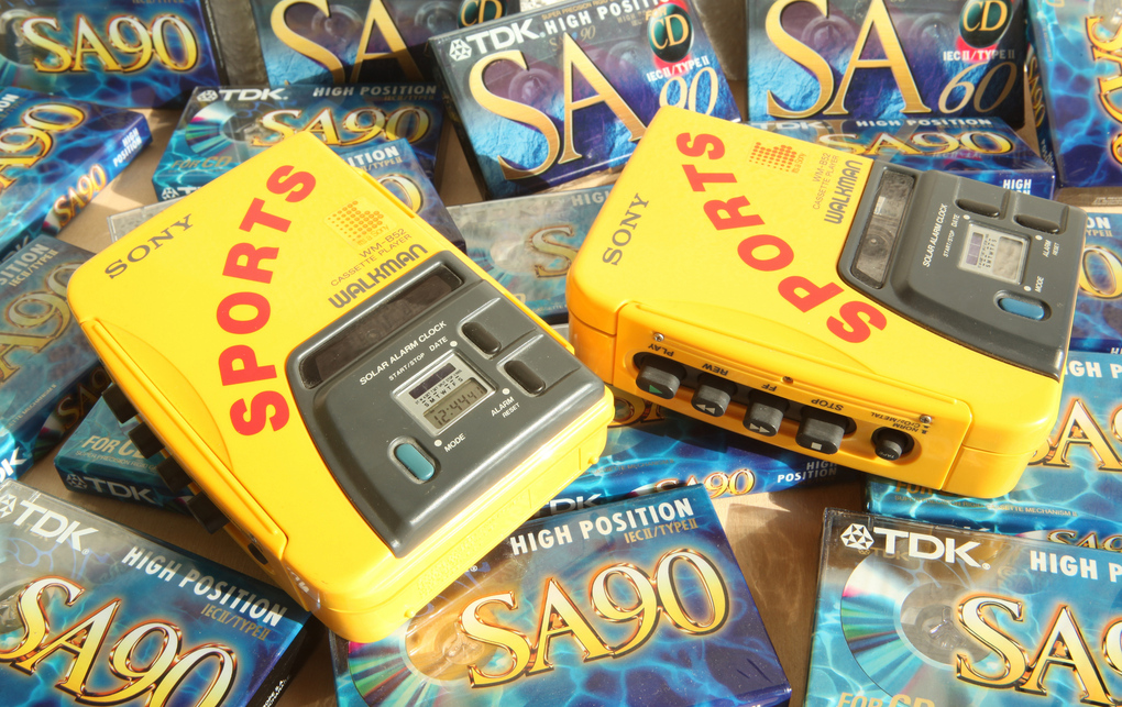
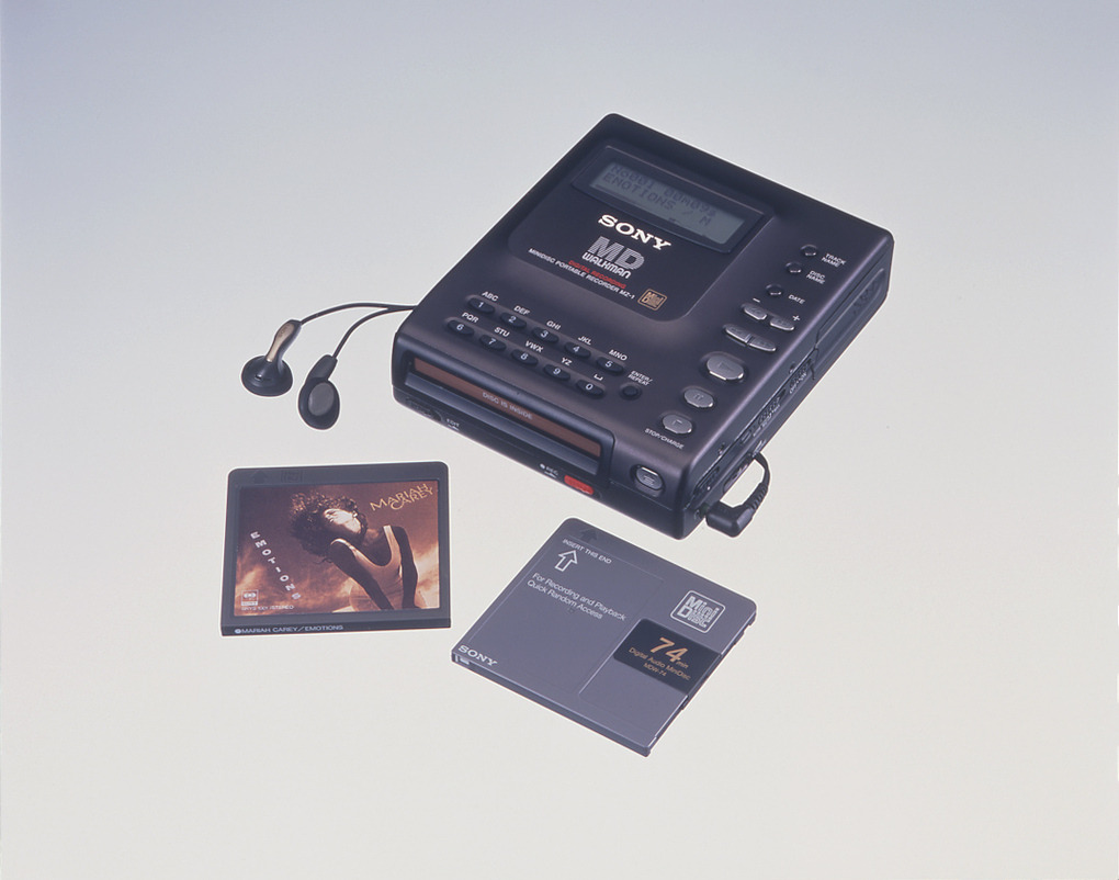
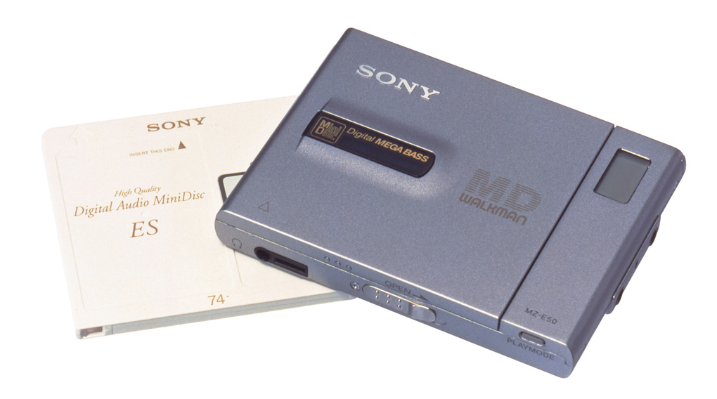
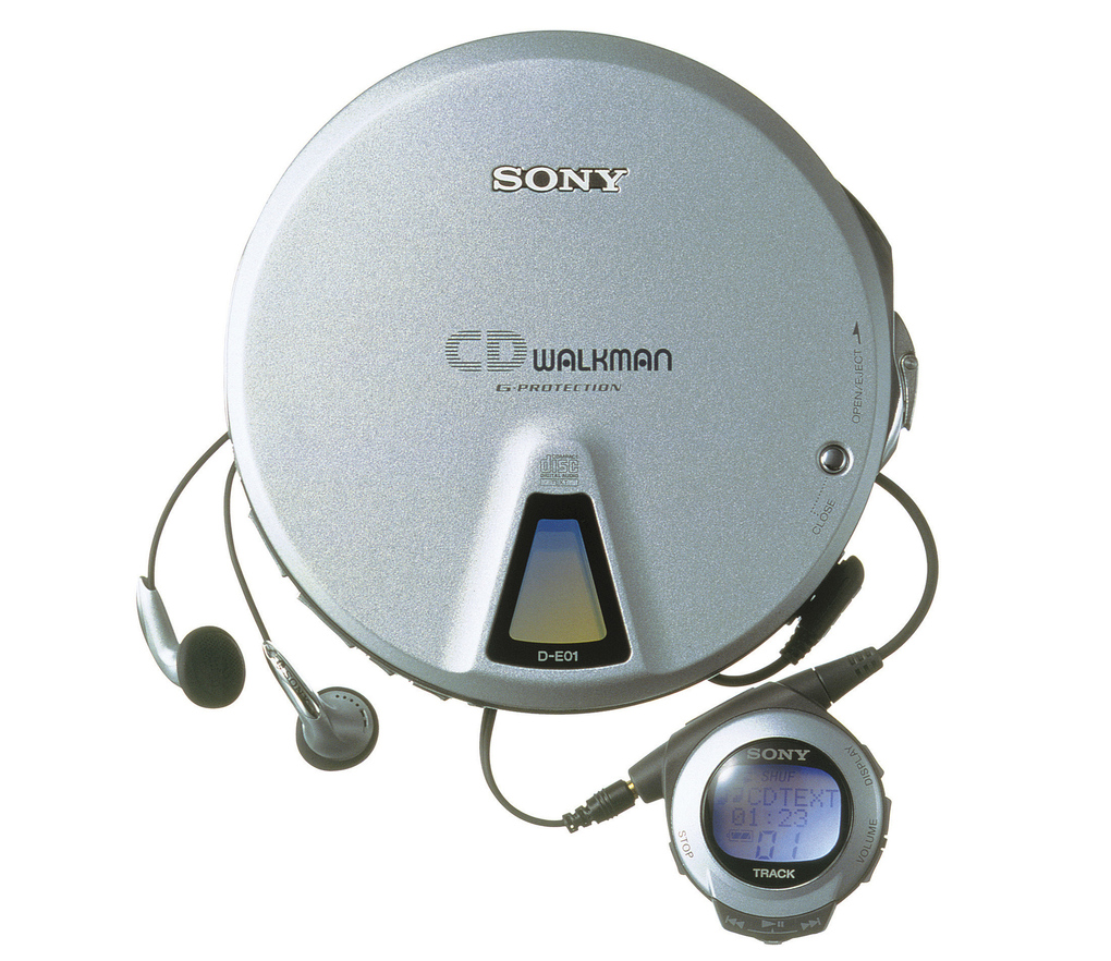
The Verge has a nice piece on the history of the Walkman, which is apparently now 35 years old. I think I became aware of what a Walkman was sometime right before the yellow “Sports” version came out. I never actually owned a real tape Walkman, but had a few of the Minidisc ones and of course some CD players.
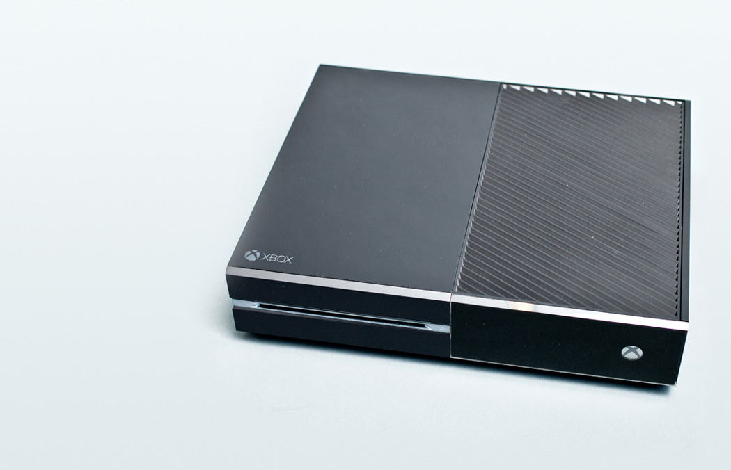
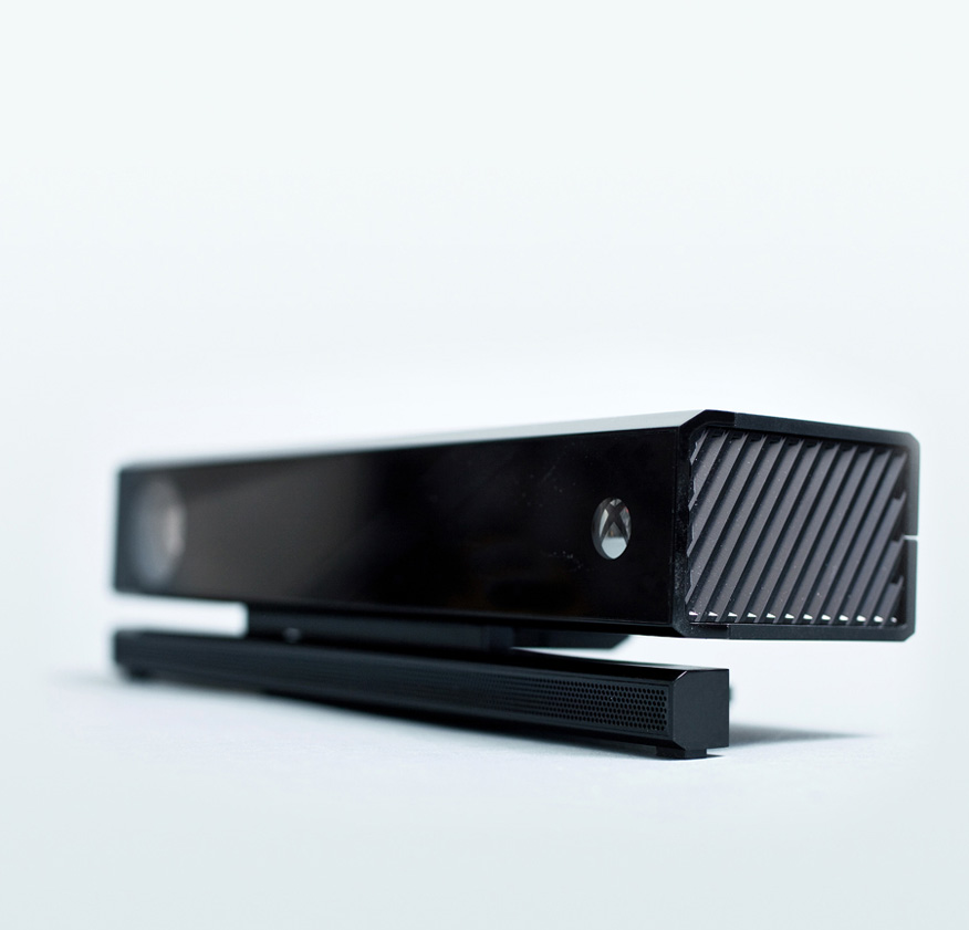
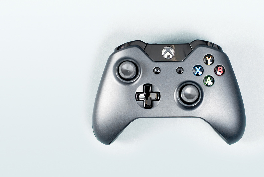
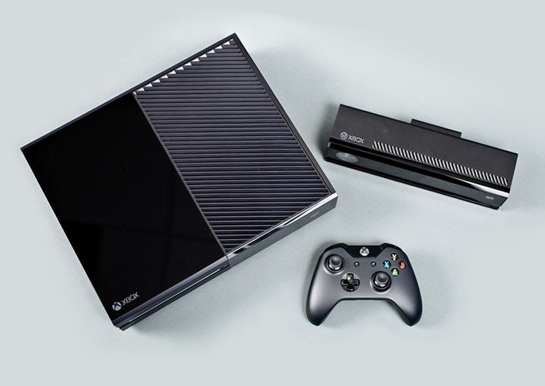
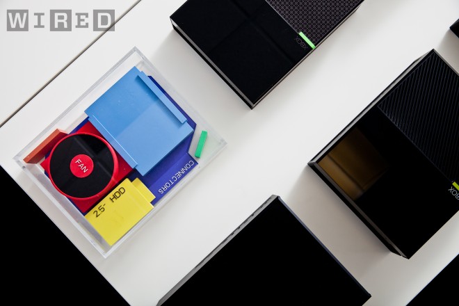
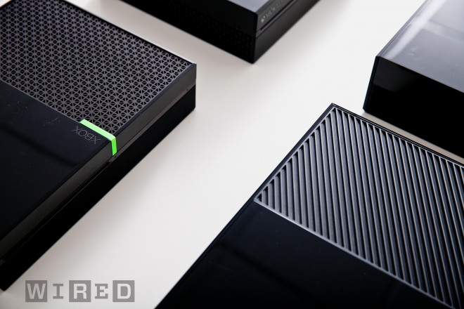
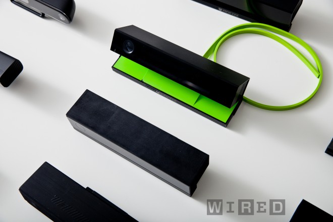
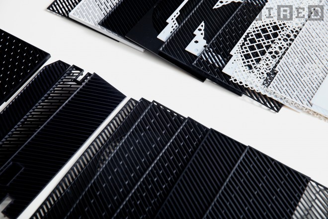
Pleasantly surprised by the striking good looks of the newly revealed Xbox console. Wired has a piece detailing the new unit and the design process that formed it.
I’ve read a lot of people bashing the design after the reveal. I’m not sure what they’re comparing it to, this or this or even this, but in my book it’s the best looking console thus far. Of course it’s all relative considering the gaming industry consistently produces some of the worst product design imaginable given their budgets and resources. I’ve seen a lot of people online comparing it to an 80’s VCR. I love 80’s VCRs, I love stackable media components, and I’ve always loved Xbox, so I suppose I’m somewhat biased.
Really beautiful pixelated looking vases from Phil Cuttance. Now based in London, the New Zealander’s FACETURE series consists of vases, side tables and lightshades, all handmade using his custom FACETURE machine and molds. The reusable molds are made from an extremely thin polypropylene sheet, which when handled, allow him to reshape the form due to the malleability created by his “live hinge” system. The results are that no two objects cast are the same.
In the era of stereo lithography and other 3D printing methods, Phil’s analog workflow is inspiring, and the process seems just as important as the results, which are impressive to say the least. Head over to his site for a more in depth look at the process.
The “Kitchen Satellite” by Luigi Colani, 1969. An exercise in extreme ergonomics, Colani’s kitchen was designed to have everything at arm’s length. The kitchen pod would connect to the main house. This is sort of the domestic equivalent of Vince Clarke’s dome studio, which it is my dream to replicate in my backyard, should I ever have one.
So apparently there is this guy in Switzerland who either owns or has access to many of the most iconic product designs from the 60’s and 70’s. He also takes amazing pictures of them, and posts them in high resolution for us to enjoy / print. This man is a hero.
I always wonder though, would having these artifacts make me happy? Would being surrounded by the objects of my desire actually fulfill my need for order and beauty? Or would I obsess; constantly dusting and arranging them symmetrically on walnut desks made by George Nelson? Probably all of the above, but for now one can only dream.
Whenever I get to lusting over design like this I start thinking about the nature of appreciation. What abstract facet of the human condition allows us to seek and covet objects which may not necessarily provide any meaningful function or benefit our daily lives? I can’t tell you how many fellow designer’s homes I have visited to see various defunct or otherwise unused products neatly displayed on shelves, never again to serve their intended purpose. Why do we surround ourselves with these relics? Devices which through some perverse twist of fascination have been stripped of their intrinsic usefulness and rendered as some fetishized monument to our personal design sensibilities, gathering dust on a mantle.
That’s probably reading way to deep into things so I’m going to take the easy answer and say it’s simply the act of art appreciation. There is just something about the fact that these were originally designed as functional objects that throws a wrench into the whole concept of approaching them purely as works of art. At any rate, I want every single thing up there, in my house, now.
Shelby picked out some really nice shots from Das Programm, which features beautiful images of various classic Braun design icons. Can never get enough of the old Braun / Rams stuff. Alex got me Less and More and I’ve been meaning to scan some of the shots in there and blow them up on the Epson 9900. Soon!
I had the pleasure of meeting fellow San Francisco artist Amy Franceschini yesterday. Amy is from the design studio Futurefamers, a group of people who create “platforms for sociability within new media spaces; internet, wireless devices and public space”. I remember being aware of — and influenced by — their work when I was starting out in design but this recent meeting prompted me to take a look at what they’re been up to in the years since.
As you can see, their output doesn’t exactly fall within the scope of your average design studio — although they did design the Twitter logo. This excerpt from Amy’s bio sums up the themes I find most interesting in the work “[she] creates formats for exchange and production that question and challenge the social, cultural and environmental systems that surround her. An overarching theme in her work is a perceived conflict between humans and nature.”
Aesthetically pleasing and challenging at the same time, really great to see people doing work like this.