Jakub posted some stills from the upcoming Where The Wild Things Are movie a while back and now we have a very nice movie poster to go with them. This thing is looking better and better with each new development.
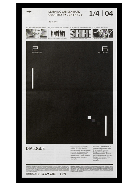
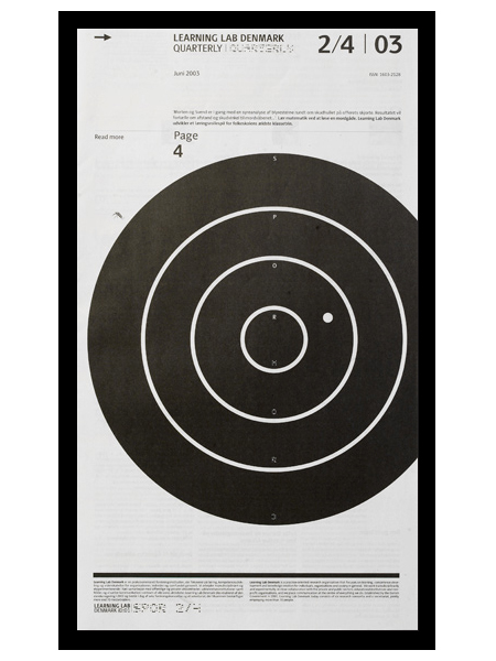
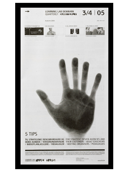
e-Types did this newspaper series for Learning Lab Denmark. I am a big fan of the compositional style at work here. Anything with a strong grid, effective use of scale, and highly refined details will win me over quick. I especially love the second one; the slightly off center target gives it a really refreshing balance. (I should also mention that I’m a sucker for black and white.)
I actually thought (and hoped) these were posters when I first saw them. I prefer posters that take a minute to digest. For me, the more sections, information, and images you can incorporate into a poster, the better. Sure it may not be effective in terms of getting a message across quickly, but I think the end result is usually more visually intriguing and effective, from a design standpoint. (Advertisers would certainly disagree.) Seeing as these aren’t posters, perhaps it’s beside the point, but regardless of their deliverable form, I think this series is very well executed.
When a design doesn’t work – go old school. Forget hype, think craftsmanship. Heavy skills prove over and over to be the best tool to overcome the creative crises we all encounter at least five times a week. Creativity is nourished by structure.
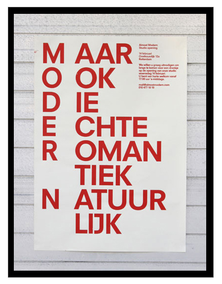
Just got turned onto Dutch studio Almost Modern this morning. I’m definitely a fan of their poster work; there are some misses here and there, but most of it is simple, minimal, and very effective design.
Just some random perfection from Mr. Crouwel for a perfectly random Thursday. Experimental Jetset has an interesting article about the invitation shown above (the third image down).
Adolphe Jean Édouard-Marie Mouron is one of my favorite commercial poster artists. Unfortunately, he went from running a successful advertising agency (Alliance Graphique who’s work includes the Yves St. Laurent logo), to losing it all and serving in the French army in World War II, to doing set design to get by, and finally suffering from depression and committing suicide in 1968. It’s very sad to think this was the fate of a man who contributed so much to design. You can find more information on Cassandre here and here.
Perhaps his most recognizable work, the Dubonet Wine poster is all but ubiquitous in vintage poster collections these days. This style of poster art is sort of a bittersweet thing for me. I really do love it, but once you start seeing something sold at Target it’s hard to take it seriously as art. I have a few old advertisement posters from this period around the house (all reproductions), but I really want to start focusing on later modernist stuff.
My “Progress” print will be featured in the upcoming Manifest Hope:DC Gallery as part of the lead up to the inauguration ceremony on Tuesday. The gallery runs Saturday, Jan. 17 through Monday, Jan. 19 in DC. I had #112 of the original 200 I signed at press framed and shipped it out last week. Unfortunately, I won’t be able to attend, hopefully somebody can check it out and let me know how it went. Here’s the details:
The MANIFESTHOPE: DC Gallery will be open to the public in Washington, DC for the days preceding the Presidential Inauguration, Saturday, January 17th, 2009 through Monday, January 19th, 2009 between the hours of 10:00 AM – 6:00 PM. Art exhibition management will be provided by our Washington, DC gallery partner, Irvine Contemporary.
MANIFESTHOPE: DC
January 17th-19th, 2009
10:00am – 6:00pm
3333 M Street NW, Washington DC 20007 http://www.manifesthope.com