
One of the very first articles I ever wrote for this blog lamented the careless proliferation of Archer, the slab serif from H&FJ. At the time, I was specifically reacting to the unfortunate redesign of the San Francisco Chronicle. That was in February of last year. Since then, the typeface has spread itself ever further, and continues to pop up just about everywhere.
Lauren Adams wrote a article about this very topic over on the AIGA blog. She states, “Archer’s instant stardom raises questions about its appropriateness. Can a font with such a defined character properly suit so many purposes?” She goes on to point out numerous recent examples of Archer’s continued domination of the ‘friendly’ typeface sphere. I was excited to see her article, as this issue continues to bug me the more I spot those little ball terminals. (Be sure to check out the blog she mentions, Archer Alert, for recent examples of Archer in the wild.)
At the end of my article back then, I asked if “Archer was the next Papyrus” — a polarizing contention to be sure — but maybe now my question doesn’t seem so far fetched. Before you get all crazy on me, let me say again that I am a *fan* of Archer. It looks good. I have nothing against the way it is drawn and actually think that it is quite amazing (like all of H&FJ’s work). Though as Lauren states, “an elegant typeface doesn’t simply translate to universal functionality.” I would add that such a distinctive typeface shouldn’t translate to ubiquity.
Like Papyrus, Archer shares a unique personality and the aforementioned “defined character”. Just as Papyrus became the go-to font for “exotic” or “earthy”, Archer has become the easy choice for “friendly” and “approachable”, which makes its misuse all the more prevalent. The more Archer is used in scenarios where it’s vaguely appropriate, the less effective it becomes in situations where it actually makes sense. As Christopher Simmons points out in the comments over there, “In unskilled hands even a Stradivarious will only make noise”. With Archer being clumsily wielded as frequently as it is, it’s this “noise” that has rendered unbiased viewings of the typeface impossible.
So I’ll ask again and this time duck for cover, is Archer the next Papyrus? Is it just a matter of time before the next summer blockbuster uses Archer for the movie poster?

I saw Avatar last night (in full 3D IMAX glory) and really enjoyed it. It reminded me of how I used to feel when I would play video games as a kid — not so much because of the graphics or anything like that, more because of how in it I felt. I remember when I used to play Zelda for example, my imagination would just take over and for those couple hours I lived in that universe (I was a nerdy kid). Avatar is like this; it is very easy to forget you are watching a film and think you are actually physically along for the ride, as there are no visual limitations to give you any indication otherwise. There were moments when you could hear the whole theater let out audible gasps as something incredible came on the screen. The first time you see one of the giant mining machines is pretty amazing. Of course the plot follows an extremely predictable trajectory, but seriously who cares. When things look this cool I am willing to make concessions on freshness of plot.
I saw the film with a few friends, one of whom is an interaction designer. He was mesmerized by all the crazy user interfaces the characters were manipulating. The spherical and detachable computer screens were a favorite. Meanwhile I couldn’t get over the choice of typeface for the subtitles; Papyrus (or some variant, essentially the same thing). The rest of my friends thought I was a huge nerd when the first thing I said out of the theater was “What was with that subtitle font!?” It is crazy to think (in my opinion) that $280 million went into this movie and they chose the one font that is at the end of most typography jokes (save maybe for Comic Sans). I know it probably fit better than a super clean sans serif (and I can’t imagine there weren’t hours of discussion over this point), but seriously, Papyrus?
Further: Kottke describes another interesting issue, regarding the realism of the Na’vi’s technological development. I don’t necessarily agree with his point (I think they were as advanced as they wanted/needed to be given the physical and spiritual qualities of their world), but he makes an intriguing argument.
The San Francisco Chronicle just unveiled a redesign of their print edition this past Sunday. According to them, the new look is “brighter and more modern” and retains “its distinctive, classic character.” I’ve never felt like the Chronicle was fantastically designed, but this most recent incarnation is definitely a step down for me. The colors give it a USA Today-esque vibe, and I don’t feel like I can take it seriously at all.
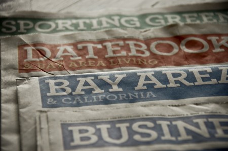
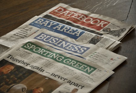
Central to the new look is the incorporation of Archer, the “colorful slab serif” by H&FJ, as their principal headline typeface. I like Archer, always have. I really like the ball terminals on some of the uppercase letterforms, and I think they did a great job crafting a distinctive and more exciting slab serif. I’ve found it very useful for clients that want to look reliable, safe and friendly, and still seem unique and exciting. Given my general fondness for the face, I was surprised to feel such disgust when I saw Archer staring back at me on Sunday morning.
I think it’s a combination of things that ruined Archer for me. First, it’s played out. As much as I love it, I see it everywhere these days (assignments at school, adverts for just about every paper company, home and garden magazine, etc). That sort of typeface proliferation is fine for something like Helvetica, but Archer is too distinctive to work in so many different scenarios effectively, let alone a national newspaper. It reminds me slightly of what happened to Papyrus over the years. It was distinctive font that was rendered completely useless by millions of people browsing through their font list and picking the most “unique” looking. Of course, Archer is not included on your computer when you buy it, or as specialized as Papyrus, but a similar thing seems to be happening at least to some degree. Either way, I was sad to see two things ruined for me on Sunday morning: Archer and the SF Chronicle.
What do you all think? Is Archer the next Papyrus? Any Bay Area readers still receive the print edition of the Chronicle and like the redesign? Let us know in the comments.
