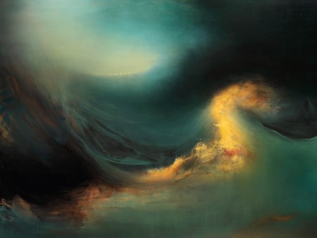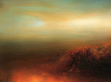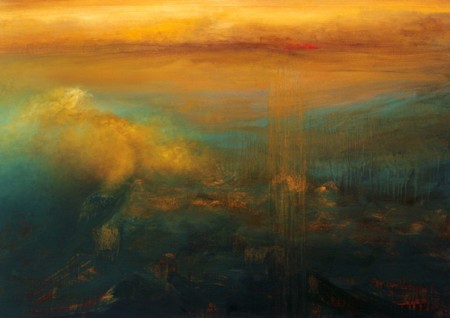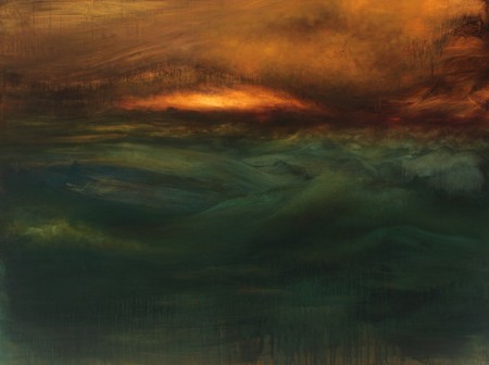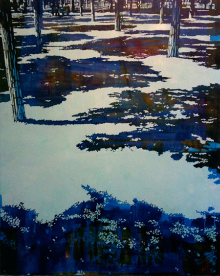


Paintings such as Samantha Keely Smith’s make me want to throw my camera away and pick up a paint brush again. I miss the quiet, tranquil nights or afternoons where it felt like it was just me and my canvas and the world around me dissolved entirely. I love inspiration like Samantha’s paintings.
According to her website, she uses oil on canvas along with shellac, varnish and enamel. I’d imagine, given the size of these paintings, that they command every ounce of your attention. They are simply powerful. Her new work is jaw dropping and I can’t imagine what they look like and how they would make me feel viewing them in person. If any one feels like buying me the first one, I would forever be your friend.
I could sit here and explain how I feel about Samantha’s work but I would rather let her paintings speak to you. Take a look at her website to see the rest of her work and her artist statement. I would be first in line to purchase a print if she offered them.
Samantha Keely Smith.


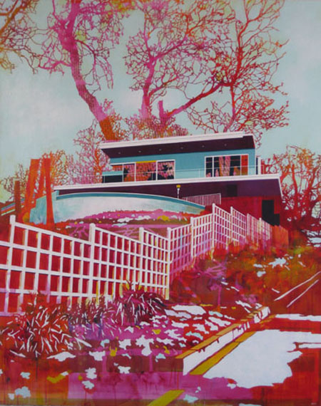
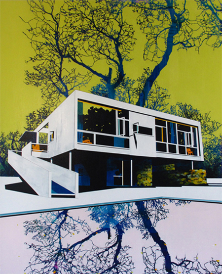
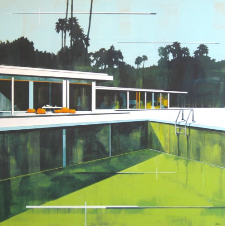
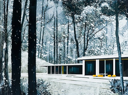
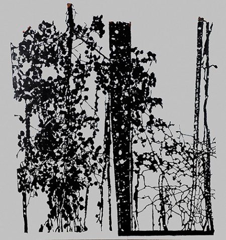
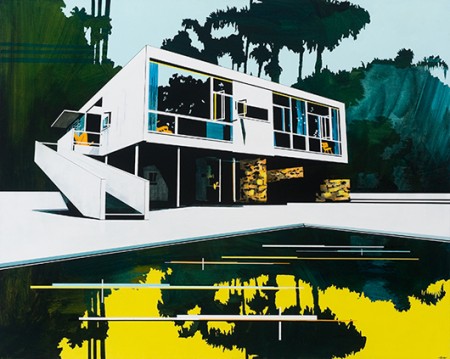
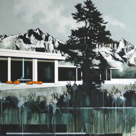
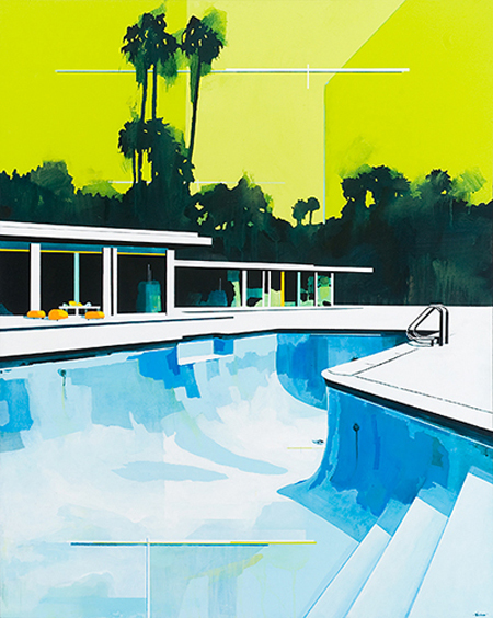
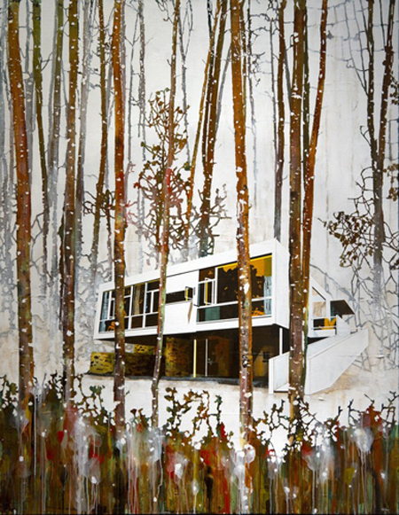
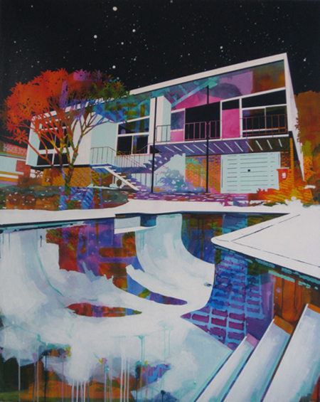
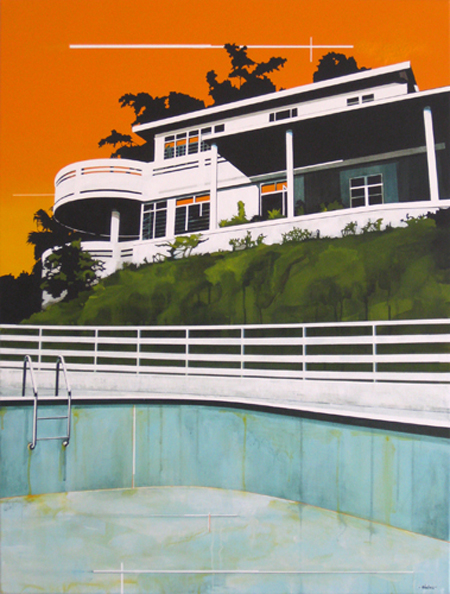
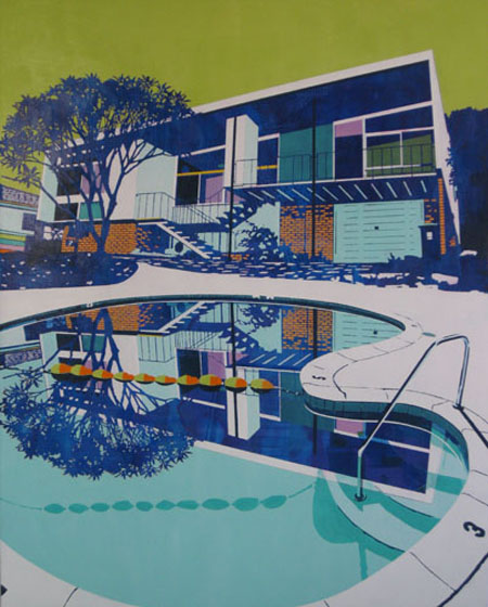
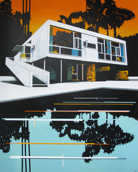
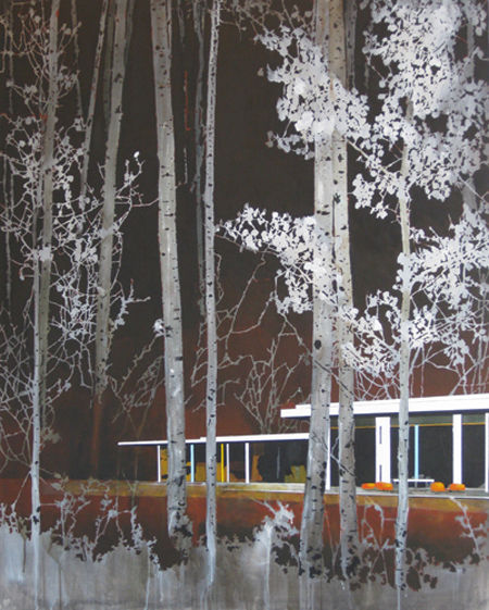
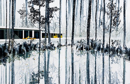
Fascinated by the work of Paul Davies, an Australian architectural-landscape painter and sculptor. Can’t help but to find some parallels between his work and Scott’s, who both seem to have the ability to create “dream-like sequences”, through the manipulation of layers, color and texture.
In the words of Paul himself:
Much of this work has been sourced from my recent visits to America and Europe. During these visits I examined The Eames House and Schindler House, both in Los Angeles, Frank Sinatra’s holiday retreat in Palm Springs, The Bauhaus in Dessau and The Villa Savoye in Poissy. I have also visited the modernist buildings in Phnom Penh, Cambodia, by Van Mollyvan, who spent time training under Le Corbusier. Gaining access to these sites often takes many requests as some of the buildings are privately owned. I was interested in these examples of international landscapes and architecture because of the striking, atmospheric qualities I could capture when photographing them. To amplify these images, I collaged them with sourced landscape photographs, of North America’s West Coast, by Ansel Adams. Adams’s photographs, with their crisp cinematic quality, allowed me to play with the composition and to stage dramatic, non- existent scenes. The photographic images reminded me of typical holiday postcards and I have attempted to capture this in my work by intensifying the perspectives and altering the colour ways.
Although the scenes and structures that inhibit them seem picturesque, in reality, these iconic homes can often feel austere and isolated. My work investigates these images as portraits of space, devoid of human form, inviting the viewer to generate their own emotional response to the painting. The absence of people in my work encourages the viewer to wander uninterrupted through the space and appreciate the built and non-built qualities of the surrounding environment. Through my practice I have attempted to explore this concept of isolation by incorporating empty swimming pools in the picture. Throughout my school years I swam competitively and was fascinated by the vacant feeling of the outdoor pools when they were drained for winter. I recently visited David Hockney’s underwater swimming pool mural, painted in the 1980’s for The Roosevelt Hotel in Los Angeles. Hockney’s work addresses issues of space and location, and his swimming pool design is a brilliant 3D version of these concepts. This year I designed a version of Hockney’s mural, for my Father’s swimming pool, and the experience was helped by the understanding of space I learnt from my Sculpture study at NSW College Of Fine Arts. By creating my paintings devoid of people, “emptying” the swimming pools and “burning” the forests, I am attempting to convey this dislocation to the viewer and raise environmental concerns that face us today.
Posted by B3PO


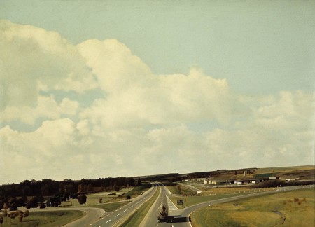
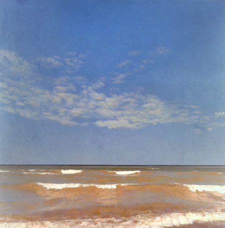
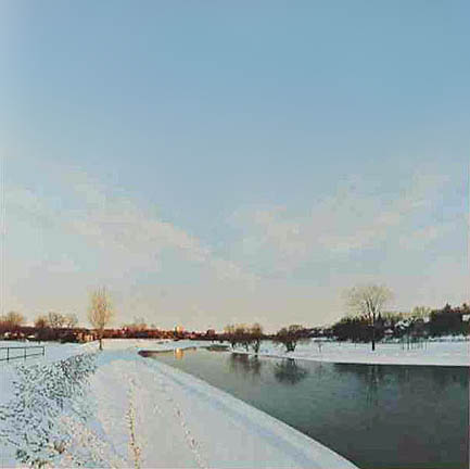
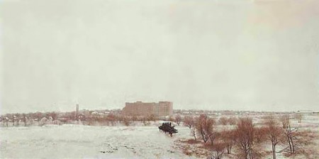
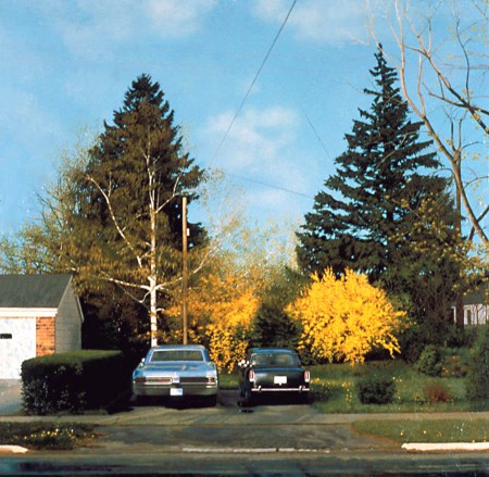
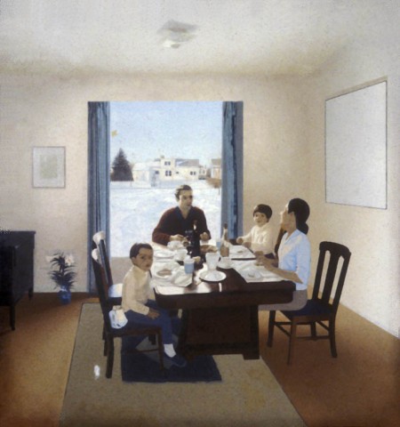
Jack Chambers (1931-1970) was a Canadian painter and filmaker who shifted from surrealist to photo-realist during his career. I was turned on to Chambers’ work via this article in Walrus Magazine about his unfinished masterpiece, Lunch (1971), which after working on for ten years, Chambers died before completing.

Chambers completed six films between 1960 and 1970, I tried to find footage online from one, The Hart of London, but they were taken down. I did find some excerpts from a movie about Chambers’ work and life here.
A couple other photo-realists working in a similar I’ve posted on previously are William Eggelston and Mike Bayne.
http://www.ccca.ca/videoportrait/english/chambers.html?languagePref=en&
http://c4gallery.com/artist/database/jack-chambers/jack-chambers.html


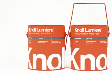
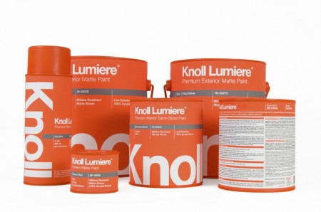
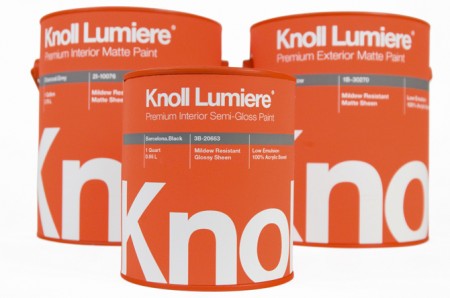
Knoll paint! Sorry, it’s not real. These mock ups were made by Kristin Agnarsdottir for a package design class. Really amazing stuff, and I was just complaining about how bad packaging is these days.
More over at Kristin Agnarsdottir’s site (cool logo too!)


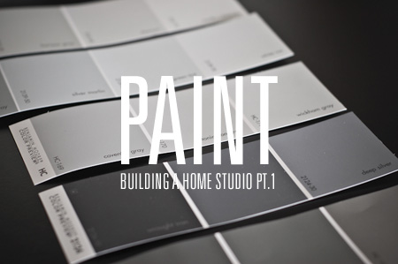
I am in the process of moving into a new apartment in San Francisco. Amidst the endless furniture shopping, cleaning, painting, and waiting during absurdly long delivery-time windows, I have been planning the construction of the ultimate apartment-based graphic design studio. As I’ve always set up shop in a room with another purpose (currently my studio also serves as my bedroom and recording area), the prospect of having a dedicated design room is very exciting. I figure this move will be a good opportunity to really take my time and build the perfect work room — from the paint on the walls, to the the table tops and filing cabinets — every detail will be meticulously considered.
The room itself is 11.5′ x 9′, plus a generous closet. The purpose of the room will be a place where I can work, file, cut, store, display, print and create. Basically a little graphic design super room. Unfortunately there will not be space for my music set up, so my guitars are going to have to bunk with me in the bedroom. You’ll notice there is also a small window. Ideally, for consistency reasons, I would prefer to have no window — but I’ve come around on the issue in hopes of the keeping studio morale high…
Continue reading →


Wired has an interesting article about the new F1 rules and the resultant car designs (McLaren MP4-24 pictured above). It details how new rules for the sport — which many expected to create a significant design challenge — have actually served to beautified the new models. These things are starting to look like they can fly and if it weren’t for the fact that your work would be ruined by about 800 ads, designing the paint for one would be a lot of fun. Check out the Wired article here.
