


Intelligence in Lifestyle magazine is the new holy grail of infographic greatness. It is a high-end Italian magazine aimed at men. The magazine is equipped with a beautiful design by the art director Francesco Franchi and the creative director Luca Pitoni.
For some of us, getting ahold of the magazine could be difficult. However, several several of the layouts from the interiors spreads and covers are archived on Flickr. Check out the larger sizes, they may compliment your desktop nicely. If in case you’re wondering, the magazine utilizes Publico, a serif face that fits perfectly into the design is much less ubiquitous than say Helvetica or Archer.
On another note prior to being introduced to this magazine via Colorcubic, I was starting to become overwhelmed by the amount of infographics being pumped into the designosphere. Infographics about infographics were being designed for crying out loud. It just seems like it has become trendy very quickly. It’s not to say its a bad thing, but it sure makes me appreciate great design like in this magazine or Nicholas Felton’s works more than ever before.
I’m curious to hear what your thoughts are on this topic.
Do you feel there is an influx of infographics and is it a good or bad thing?
Continue reading →


I was reading the New York Times this weekend and was pleasantly surprised to see the work of Cristina Couceiro as part of one of the magazine articles. I recognized her distinctive style from when Scott posted her work a little while back. In the capacity of the magazine article, it was interesting to see how the use contemporary imagery changed the overall impression of her work. I think it was successful — it brings context, and an slight twinge of humor to the work that wasn’t present in some of the earlier ‘found imagery’ pieces. Something about Steve Carrel especially just works for me…maybe it’s that ridiculous shirt he’s wearing.
This is probably the third time recently I’ve randomly stumbled upon the work of an artist I recognize in a magazine; I saw Leandro Castelao in a recent issue of GOOD, Mark Weaver in Wired, and someone else I’m forgetting now. It’s great to see how their work translates into an editorial environment. And great to see that magazines are supporting the amazing talent of all these artists!


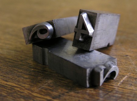
The New York Times’ T Magazine often comissions artists to create their own version of the iconic T that is the magazine’s logo. There’s a great collection of the work over at the T Magazine blog featuring some of the standouts. Interesting to see so many fresh takes on the same theme, they should make a coffee table book out of these if they haven’t already. My personal favorite is that first ceramic one; the negative space is so perfect. Unfortunately, whoever did the type layout decided that neon green in the title would somehow work with the vibe. Clearly it didn’t.
Link
A great article by Michael Bierut about how things have changed in the world of design since the incorporation of the computer. An excerpt:
Design work that would have taken me a week in 1980 can now be done on a personal computer in less than an hour. Cutting and pasting, when needed, is done in the basement, often by interns. I get the impression that this kind of work, to which I once applied myself with the pride of a master chef, is now viewed as a chore like dishwashing. (The New York Times)
image via threedots


