Just a few gems from the Modernism 101 collection. Modernists in the 50’s had it down and it’s images like these that remind me it wasn’t all garishness back then. Not everything had bubbles and fins and bulges; some people were hiding out in the woods quietly appreciating their straight lines and right angles. Unfortunately, most of them stayed in the midwestern United States. Out here in San Francisco, apparently they decided that the height of architecture was the victorian age so all we got is a bunch of ugly houses with 400 rooms in them and Mel’s Drive In.
I’ve always been a huge fan of books on modernism, but unless you’re Dave from Grain Edit, it’s pretty hard to get your hands on the good stuff. And so it was with great pleasure that I stumbled onto Modernism 101 booksellers. the site, featuring a vast collection of rare and out of print books on modern design and architecture, serves up cover images and very detailed information on a wide array of classic design texts. Many of the books featured are have sold, but they archive the pages so it’s a great resource for images and information on many books that you’ll probably not find elsewhere. I’ll be running a (hopefully) weekly feature aptly titled “Modernism 101” highlighting the best examples from their collection.
Today’s selection is a collection of Dutch printmaker H.N. Werkman’s work edited by Fridolin Müller. Enjoy!
H. N. WERKMAN
Fridolin Müller
Fridolin Müller (editor), Peter Althaus (introduction): H. N. WERKMAN. NYC: Hastings House, 1967. First edition. Tri-lingual edition in English, German and French. A near-fine hardcover book in decorated glazed paper boards issued without a Dust Jacket: trace of wear overall. Interior textblock in fine condition. Volume Two in a projected four-volume set called Documents in the Visual Arts. A nice copy of a scarce book.
8.5 x 9.75 hardcover book with 104 pages with 79 plates (14 in color) of Werkman’s avant-garde Dutch typography. H. N. WERKMAN presents the most extensive published collection of Werkman’s typography to date. My highest recommendation.
Beautifully designed and printed by Verlag Arthur Niggli in Switzerland with the plate engraving and printing setting a new standard for the reproduction of the presented artwork. Spot colors are used throughout for maximum color fidelity.
Dutch designer and printmaker Hendrik Werkman (1882 1945) is best known for his innovative printing techniques and avant-garde typography. As publisher of De Blauwe Schuitt, a series of underground booklets produced by Jewish dissident poets and writers during the Nazi occupation of Holland, Werkman was imprisoned by German secret police in 1945 and executed without trial just three days before the country¹s liberation.
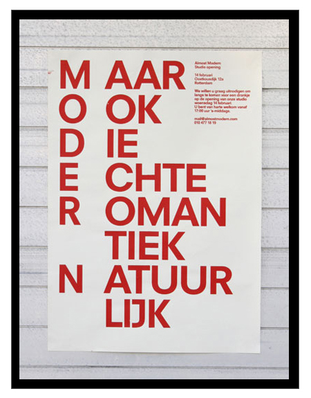
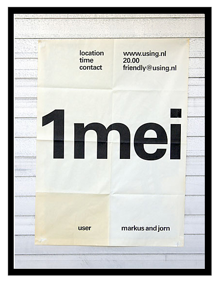
Just got turned onto Dutch studio Almost Modern this morning. I’m definitely a fan of their poster work; there are some misses here and there, but most of it is simple, minimal, and very effective design.
Can you name this poor, unidentified chair? Some people were asking that same question in the comments of today’s Dieter Rams post so I thought I’d put it up in the hopes that someone out there can solve the mystery because, as Joe Clay put it, that is a damn sexy chair. Sound off in the comments. First correct answer gets a Tycho single!
By the way, how badass is Univers LT Std 39 Thin Ultra Condensed? Completely, is the correct answer.
Update: That was quick, Vito called it, it’s a 620 Chair by, of course, Dieter Rams. Here’s some very nice high res shots from the link vito Provided.
Some classics via Helloairecords. It always amazes me to see such forward thinking design from this period. It’s 1955 and design this evolved already exists, it’s incredible. Of course, this is Europe. Unfortunately, most of us in the states were too concerned with Elvis and Marilyn Monroe to appreciate the finer points of the grid system or minimalist design theory. There is something very pleasing about such simple shapes and colors modulated by the quirks and imperfections of the analog printing process, it really brings life to the composition.
I stumbled across this great article about architect Tom Kundig’s work on WSJ today. That first house is off the charts amazing, I’d move in tomorrow despite the fact that it’s in the middle of nowhere (at least I’d get a lot of work done). Kundig’s goal is to find balance between the structure and the landscape and from the looks of things he’s doing just that. Once again though, after browsing his portfolio I am realizing if I ever want an amazing house like this I’ll probably have to move to a more rural setting (and find a bag full of money on the way out there). It must be so amazing to be in, for example, Mazama, Wash., and come across structures like these in the wilderness.