

As I would have suspected, the master typographer Erik Spiekermann, has a deluxe, modern house in Berlin. Some features include a full Bulthaup kitchen, a bookshelf that requires a hoisting harness to peruse it, and prismatic windows that allow warmth from the sun to pass through only when hit at a low angle. Sold yet?
On the fifth floor is the office of Spiekermann and his wife Susanna Dulkinys—a designer. The sixth floor is the kitchen and living area while the seventh floor is the bedroom. All of the surfaces of the house are painted a shade of light grey. It keeps the interior bright and cool but not cold.
Susanna Dulkinys on keeping the house’s interior free from clutter:
It’s like creating white space so you can free your mind and be creative.
Found on Wanken
Continue reading →


Some of the most interesting homes aren’t those that are colossal. Take this East Village Studio in New York City for example. Sure its small apartment living but its also small, clean and minimal while having a warm, welcoming vibe. What more would you want in an apartment—besides an Eames chair.
I’m not sure about hiding my clothes in the stairs but at the point of creating a more spacious home it works. Is it just me or does this seem like an apartment that would be great for someone who’s a fan of Dieter Rams?
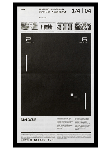
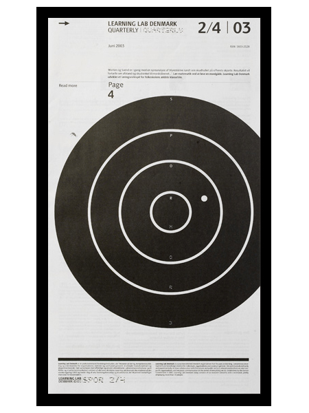
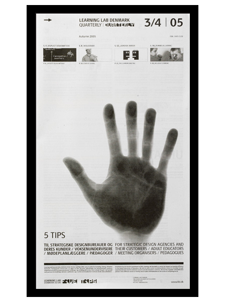
e-Types did this newspaper series for Learning Lab Denmark. I am a big fan of the compositional style at work here. Anything with a strong grid, effective use of scale, and highly refined details will win me over quick. I especially love the second one; the slightly off center target gives it a really refreshing balance. (I should also mention that I’m a sucker for black and white.)
I actually thought (and hoped) these were posters when I first saw them. I prefer posters that take a minute to digest. For me, the more sections, information, and images you can incorporate into a poster, the better. Sure it may not be effective in terms of getting a message across quickly, but I think the end result is usually more visually intriguing and effective, from a design standpoint. (Advertisers would certainly disagree.) Seeing as these aren’t posters, perhaps it’s beside the point, but regardless of their deliverable form, I think this series is very well executed.
An excerpt from e-Types 10 Rules for Modern Living:
When a design doesn’t work – go old school. Forget hype, think craftsmanship. Heavy skills prove over and over to be the best tool to overcome the creative crises we all encounter at least five times a week. Creativity is nourished by structure.


