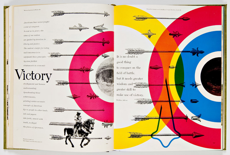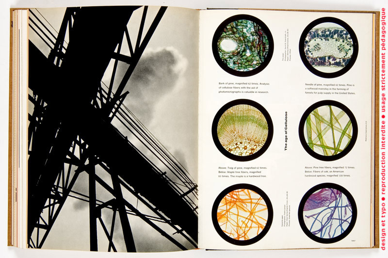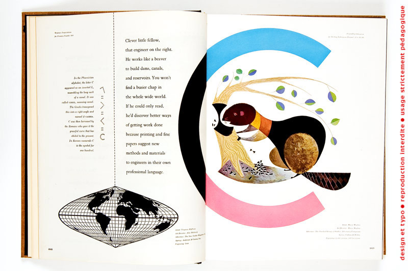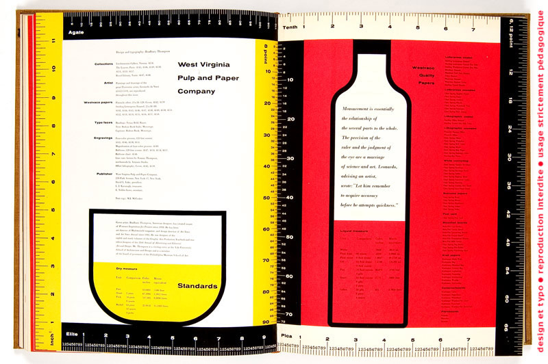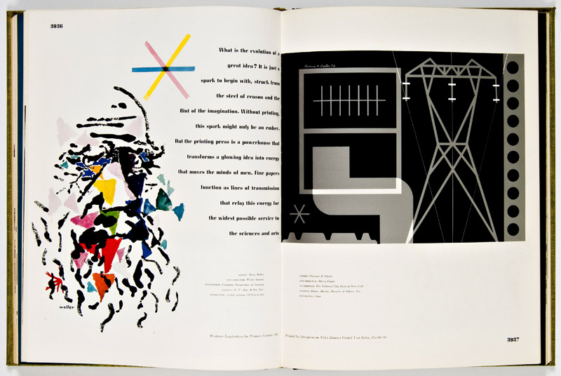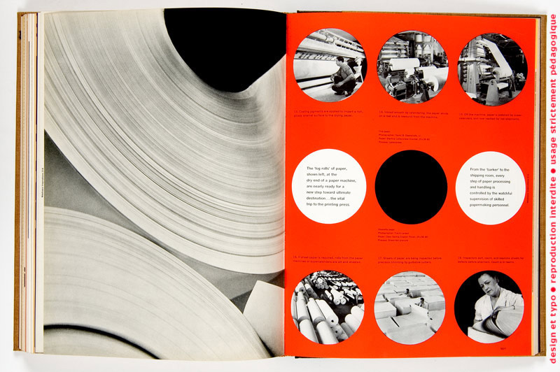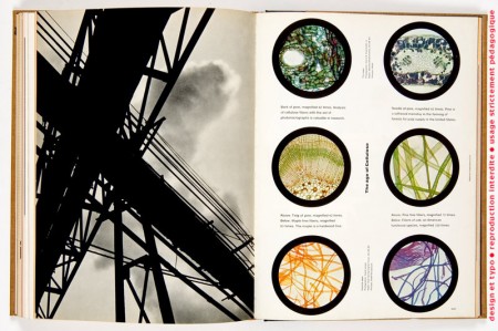
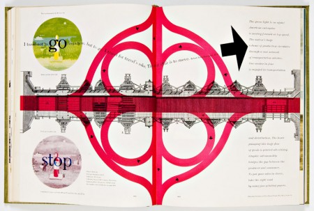


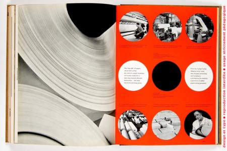
These fantastic spreads were designed by Bradbury Thompson for Westvaco Inspirations in the 1950s and early 60s.
Westvaco Inspirations was a graphic arts publication issued by the Westvaco Corporation, formerly named the West Virginia Pulp and Paper Company, with the objective of showing typography, photography, art work and other graphic inventiveness on papers manufactured at its mills. Because Westvaco Inspirations was intended to demonstrate printing processes and papers, its primary audience consisted of 35,000 designers, printers, teachers and students.
Thompson designed more than sixty issues of the magazine over eighteen years and utilized a variety of printing methods, including letterpress and offset lithography. Tons more great scans at Typogabor.
via Matthew Lyons
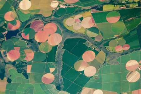
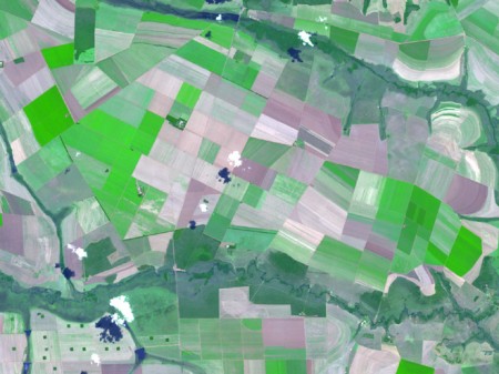

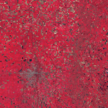

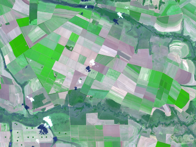
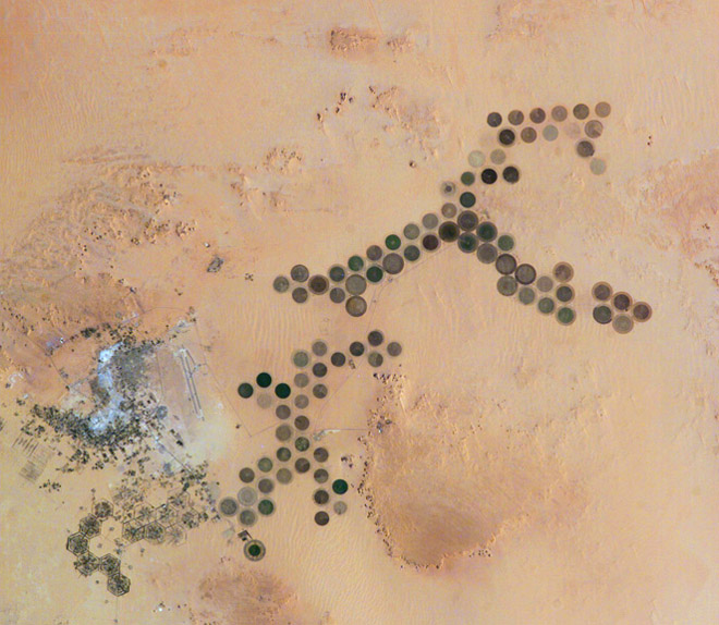
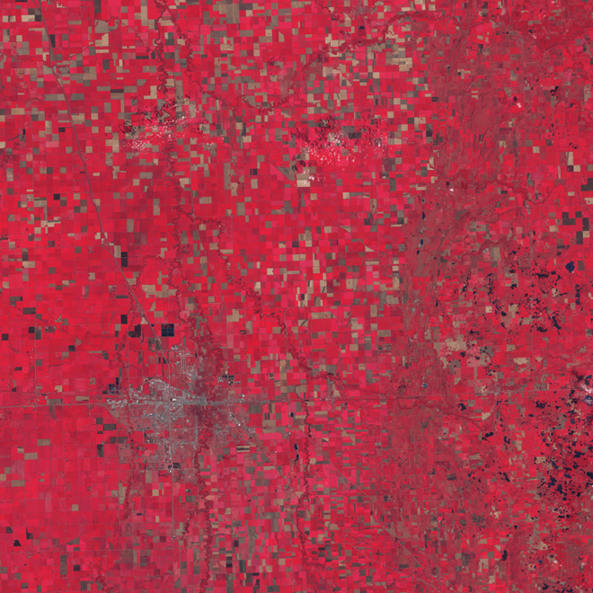
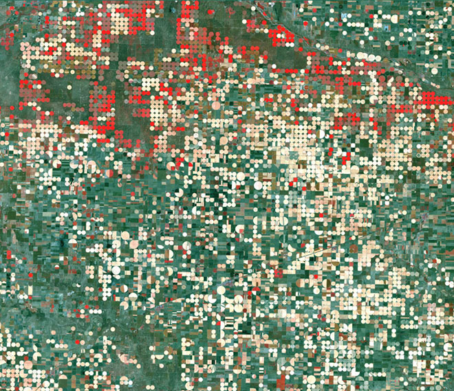
Loving the geometric patterns created by these crop fields from around the world. Also see Benny Chan’s Traffic series for more great aerial photography.
Via Wired.


A friend recently turned me on to Adreas Gursky’s photography. His work is absolutely breathtaking; the sort of vaguely distant quality of the images is really striking. Gursky has been working for many years but only started using computers to manipulate his photographs the ’90s. Apparently his prints range all the way up to 6 feet tall; I can’t even imagine how impressive the detail must be at that scale. You can find some more of his work at the Matthew Marks Gallery site or via Google Images. Truly inspiring.
Also, I really need to go to wherever that pool is. It looks like some sort of utopian society where they somehow put Barton Springs in the middle of Amstelpark.
Via Simon Smith
UPDATE: Thanks to WZT in the comments for sharing the location of the pool in the last photo. Check it out on Google Maps.

I do not know what to write. I am sitting here staring at the screen, running sentences in my head, and turning my music on and off. Earlier I went foraging for food (in hopes of sparking some magical words), but ended up getting distracted by Arrested Development for 20 minutes. This happens just about every time I sit down to do anything. I’ll probably go play the guitar between this paragraph and the next.
Of course this is a familiar situation. Often referred to as “writer’s block”, the concept of an inspiration rut is unfortunately very familiar to every creative in any field. Sometimes ideas just don’t show up to work. Given this, we all develop strategies to combat such a scenario. Not all are foolproof, but it’s safe to say that most creative people have some battle plan for dealing with the dreaded “blank page”.
Knowing this I decided to ask some of today’s most exciting artists and creators what they do when the ideas aren’t flowing. I left the question fairly open ended and asked, What do you do to inspire your creativity when you find yourself in a rut? As expected, I was presented with an array of strategies, ranging from listening to Boards of Canada in a forest alone, to cooking up a storm (recipe provided) and waiting for the mind to clear.
What follows are 25 strategies from these creatives to spark your inspiration; hopefully you’ll find something helpful in there. I encourage you to list your favorite strategies as well in the comments. We can never have to many of these…
Continue reading →


I only post one image by itself when I think it’s worth it. This one, advertising the Hvass&Hannibal show at the Kemistry Gallery, is such an image. I like the layout, sure, but the main reason I found this so captivating is the color combinations. Each little circle has a different (and often bizarre but terrific) color combination. Each could easily jump off this poster and onto whatever project you happen to be working on (assuming the word “fun” might describe your client…) Pink and green? Why not. Lime and red? Let’s do this. My favorite is 6th row down, 4th across. Reminds me of a Deth P Sun type palette.
Now I’m inclined to think that H&H had everything to do with the design of this poster, but I cannot find the credit information anywhere. It looks like something they would drum up, but if not, let me know and I’ll be sure to link out. If you’re in London, be sure to check out the exhibit! Here is the invitation.


Absolutely beautiful work from Beijing-based JOYN:VISCOM Workshop. Loving the die-cuts and texture, would love a notebook that looked like this.
Via the excellent Graphic Exchange


Michelle McCormick recently posted Dave Cuzner’s Grain Edit on her Inspiration Resource blog. If you’ve been to Grain Edit before, you’ll know what a great collection of classic design artifacts Dave has. Above are just a few small glimpses into that collection. Dave is a vintage bookseller out of Oakland, CA who I first met at an ADAC event in Sacramento. He had a booth there and I was pretty blown away by the books he brought out. I later met him again here in San Francisco where he showed me part of an amazing Czech stamp collection which he is working on. All very inspirational stuff indeed! Link