Porsche 917
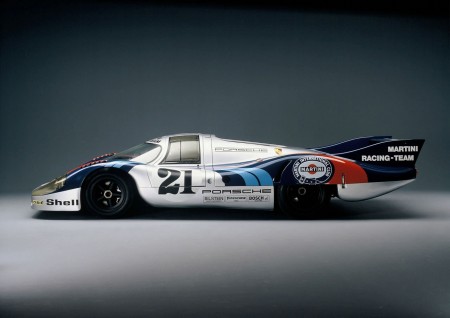
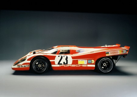
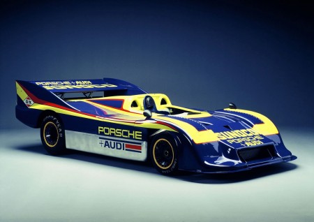
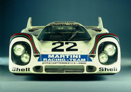
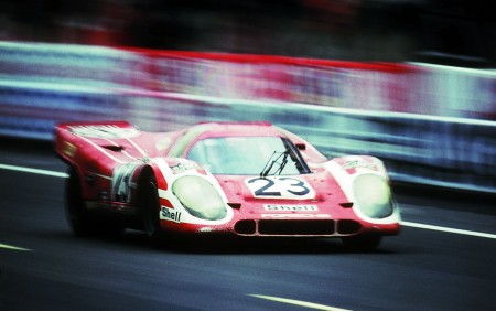
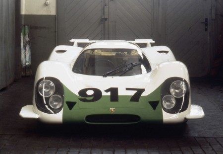
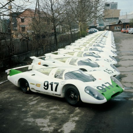
Clutch’d has a gallery of beautiful Porsche 917 photos up. The legendary racer celebrated it’s 40th anniversary last year. Such an amazing design, and always love the vintage racing graphics.


Clutch’d has a gallery of beautiful Porsche 917 photos up. The legendary racer celebrated it’s 40th anniversary last year. Such an amazing design, and always love the vintage racing graphics.
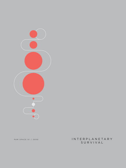
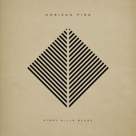



You may remember Paul Tebbott from this post a while back. I recently checked back in on his portfolio and was glad to see some beautiful new work up. He seems to have refined his style a bit, these compositions seem a little more restrained than the earlier stuff, if only a little. I really like what I’m seeing, his use of color is excellent. But I must admit, I kind miss type treatments like this. I’d like to see the bottom three mocked up with some type included.
You can check out more of Paul’s work at his portfolio
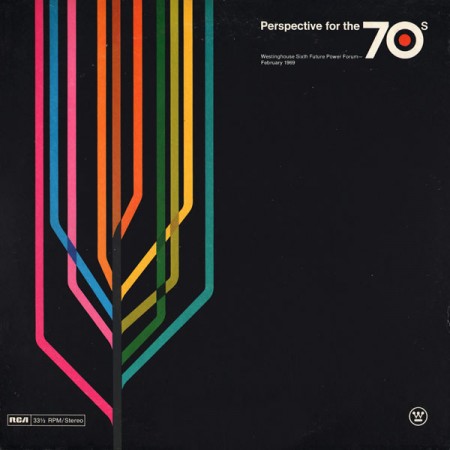
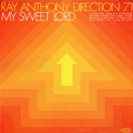
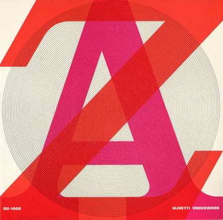
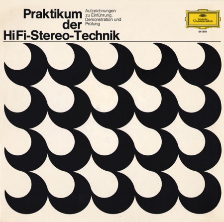
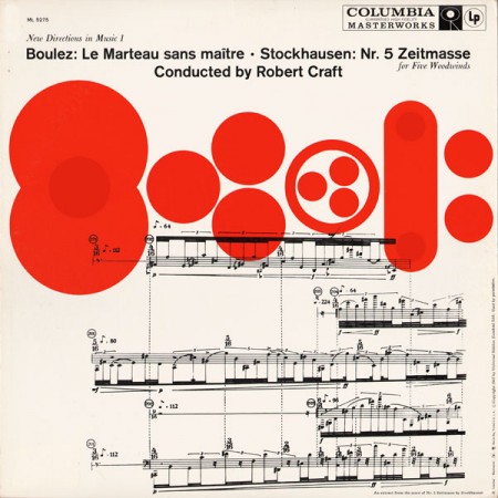
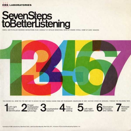
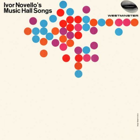
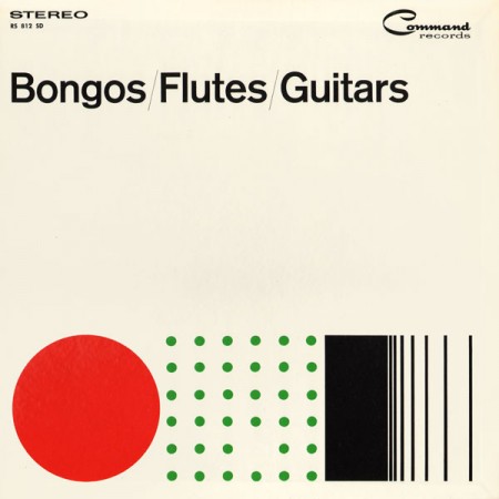
Project Thirty-Three has a great collection of vintage record sleeves up. This kind of minimalist approach to record jacket design is about as close as it gets to perfection for me. I’ve always loved the Blue Note style stuff but this is just a little more what I’m looking for. The simplicity is what really gets me, so much with so little. Wish I had prints of all these, but as a consolation, they make great iPhone backgrounds after a little editing.
Source Project Thirty-Three Via Wanken Blog
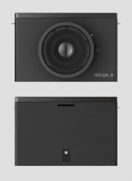
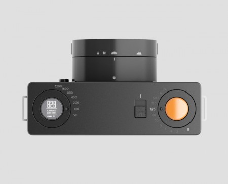
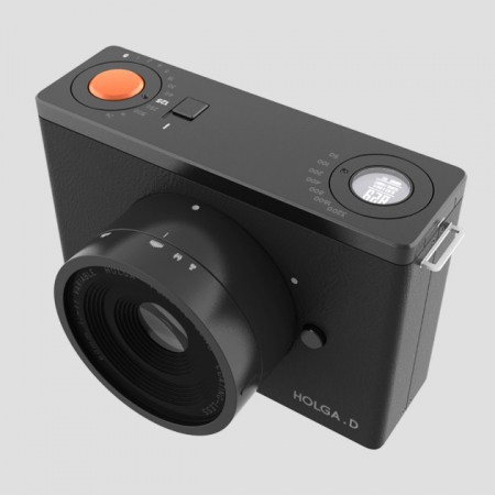
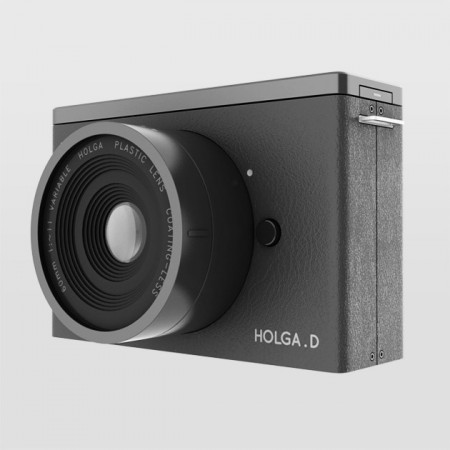
This has to be the best concept rendering I’ve ever seen. Saikat Biswas designed these mock-ups to illustrate his concept for an open-source camera platform based on the original Holga camera. But unlike the original, Saikat has applied some tried and true Rams/Braun-esque styling to the exterior that’s sure to inspire lust in the hearts of design geeks everywhere.
Check his full post and you’ll see he’s really thought the whole thing out. Apparently he’s received quite a bit of interest so hopefully this thing makes it to production someday. I’m not sure, but didn’t Lomography buy the rights to the Holga a while back? Saikat might have an easier time if he gave it a different name.
Via Minimalissimo

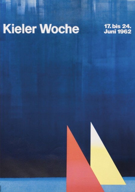
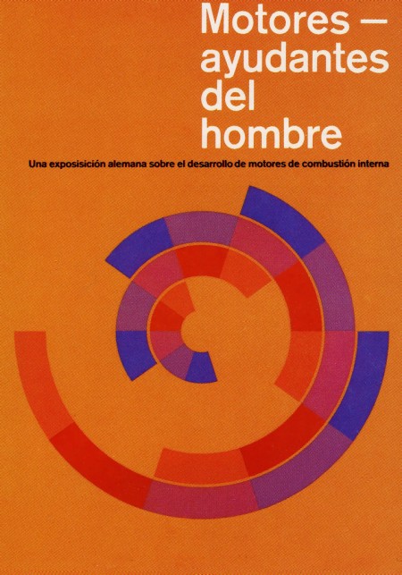

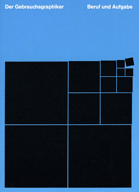
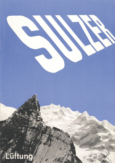
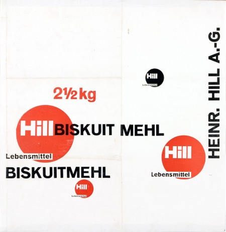
First off let me just say that it’s awesome to have come across this beautiful archive of work by German graphic designer, Anton Stankowski. The images in the archive are fairly large so the detail of the design becomes evident. In the first image of this post it looks to me like the background of the poster was painted with a brush then overlaid by the type. The process of how this was done would be refreshing to see.
The first thing about Stankowski’s work that pulled me in was the amount movement. Nearly every one of these pieces utilizes a visual system that controls your eyes across the graphic elements and to the typography. The system is very effective considering that I keep looking at these pieces every couple of minutes to see how my eyes move around.
The Sulzer poster and the Hill Briskuit Mehl packaging are undoubtedly my favorites. Even though both are very simple they still have a lot of motion in them. Also in the Sulzer piece, the transition of the mountain peak to the type sings composition to me and in the Briskuit packaging I really admire the grid and typography.

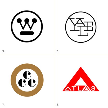
James White has posted a follow up to his excellent feature on Saul Bass’s branding work, this time focusing on logos by mid-century corporate logo extraordinaire Paul Rand. Very nice stuff, thanks for posting James! Link
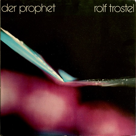
Another one from the Dream Chimney "Sleevery" archive. Loving the type, I would call that Avant Garde if it weren’t for the rotated ‘e’. Can anyone identify this or is it a custom job? Let us all know…
Not sure what’s going on in this photo, but it’s incredible and the colors are just about perfect. Wish I had some more background on this piece but perhaps someone can fill in the blanks.
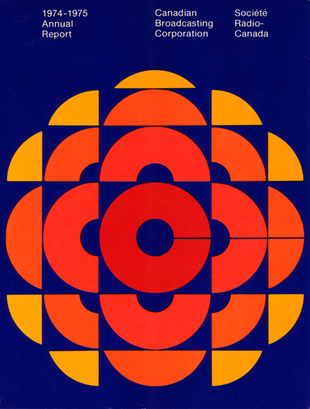
CBC Annual Report 74-75 graphic. The forms are incredible but the blue is a bit too royal-blue for my tastes. With a more muted color scheme and a shift of the blues into the aqua realm this would be on a whole other level. But I am assuming if you found a copy of this today, it would have faded just enough to look pretty amazing.