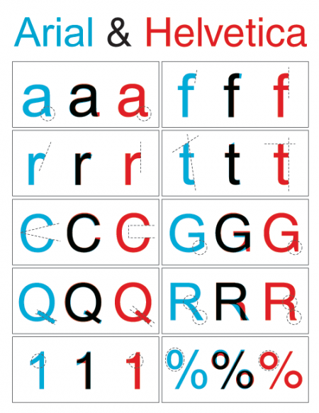
Nothing too involved here, just a simple diagram outlining the key differences between Arial and Helvetica. You can find the full alphabet overlayed here. Just in case you’re unfamiliar with the unique history these typefaces share, here’s an in-depth analysis. And here’s the battle mode.
Via Swissmiss, who’s workspace is way cleaner and more Helvetica-ish than mine:

Tina Roth Eisenberg of Swissmiss

Alex and I were discussing this a while back so it was nice to see the whole subject wrapped up in a nice post over at Shelby White’s blog. Now you can annoy the hell out of all your non-designer friends by constantly correcting them when they use “font” incorrectly. Be sure to start off with “Actually…..”, people love that. I liked Nick Sherman’s take the best:
“The way I relate the difference between typeface and font to my students is by comparing them to songs and MP3s, respectively (or songs and CDs, if you prefer a physical metaphor).”
– Nick Sherman
For a while I thought font was sort of a dirty word, like it really didn’t have any proper usage when talking about design. Typeface still sounds better but it’s nice to know that font does have it’s own place in the world.
Link | Additional Reading

I have 39,447 fonts on my computer. Or at least I did, up until about 30 minutes ago when I cleansed my machine of all the typographic nonsense that was polluting my list. I had thought about doing this font purge for some time, but hesitated, just in case I might one day need to design a document using the official Jedi Knight font, or something similarly ridiculous.
I remember hearing Massimo Vignelli say in the Helvetica documentary that he only uses about three typefaces. I was embarrassed at the time, thinking of my infinite list compiled over many years of dafont downloads and “BEST FONTS!!!” torrents. I guess I considered myself a typeface collector and I worked hard to “get them all”, even if I had no idea of what use some of them would ever be.
As I progressed through school, I noticed that just about everything I had ever designed used the same 5-10 typefaces. Every time I opened Illustrator I scrolled endlessly past hundreds of handwriting fonts, “distressed” fonts, you name it; always searching for the same go-to options. When I did deviate, the work usually suffered.
After much deliberation, I widdled my list down and trimmed the fat as it were. No longer will I be tempted to use weird knockoffs of Gotham or Helvetica clones. I consider myself much better off because of this — not just because it’s easier to manage a smaller list — but because the typefaces I kept are good typefaces. They’ve stood the test of time, and are the result of a tremendous amount of hard work and development by expert typographers. I know something about each one; who designed it, where it came from etc. In this way it’s a bit like my iTunes library; I probably have about 60,000 songs, but mainly listen to a few selected playlists. I have thousands of songs with a play count of “zero”. Why I keep them around I have no idea.
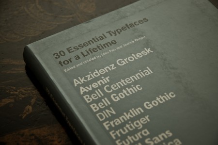
The book pictured above is 30 Essential Typefaces for a Lifetime by Imin Pao and Joshua Berger. It’s a good place to start if you are considering a font purge of your own. (Though I disagree in a few places; for example I would not include Trajan on my list). My final count is now about 50 typefaces; a much more manageable number I’d say. It’s not Massimo’s magic number — I don’t think I could survive on three alone — but scrolling through 50 sure beats scrolling through 39,447.
note: I, and and many designers I know, tend to use the terms “font” and “typeface” interchangeably. Technically this is incorrect as they are not the same thing. Both this and this article do a good job illustrating the difference. Old habits die hard for me; I didn’t actually know there was a difference until about a year ago, so it’s taken some time for me to change my language.
