New York Times Magazine Redesign

The New York Times Magazine is the reason I wake up early on Sunday morning. Excellent photography, fascinating articles, and sophisticated design fill its pages week to week. It was recommended to me when I started graduate school and I haven’t missed an issue since.
This week the Times rolled out a new, svelte version of the Magazine. Like everyone, they are cutting costs where they can, and it was determined that reducing the size of the magazine by 9% would save them millions in paper costs. To accommodate the smaller page real estate and squeeze in more words, they enlisted Lyon Text, a more condensed typeface than they were using before. It’s a very subtle switch, and as they say, “Perhaps if we hadn’t mentioned it, you would hardly know the difference.” Where the change is most obvious is with the two new display faces: Knockout (H&FJ) and Nyte (Dino dos Santos). Both work really well in the new layout; definitely my favorite part of the redesign. They have also reworked the table of contents, changed the section order a touch, and sprinkled a multitude of new design elements throughout.
I think Arem Duplessis and his team have done an incredible job. I loved the Magazine before, and was initially concerned they might mess with a winning formula, but I think they succeeded in turning budget induced page shrinkage into a successful and well-executed redesign. Intact is the nuanced and ultra refined look and feel that first caught my eye. The smaller size is actually more manageable (a la Rolling Stone), and afforded them the opportunity to make the exciting upgrades. I don’t think anyone will miss the extra millimeters.
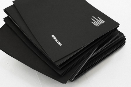
note: There were two covers that came out with the redesign. The one above, with a model by Thomas Doyle, was my favorite, but be sure to check out IC4Design’s version on the NYT website if you’re interested.