Khoi Vinh just posted an incredible piece about design criticism for his Subtraction blog entitled “Dear Designers, You Suck”. He calls for a new kind of design criticism, one that separates the designer from their work and attempts to imbue the field with more objective and honest criticism.
…are we really having the kinds of meaningful, constructive, critical discourses that we really should be having? Are we too quick to take offense at the opinions of our peers? Or are we pulling our punches too much when discussing the merits of the work that our peers turn out? To put a finer point on it: are we being honest with one another?
The answer is definitely no, we are not being honest with one another. As a student, I am very familiar with the problem he describes. As our school is critique based, we see this avoidance of real, honest criticism every day. When something truly awful gets laid in front of us, we hedge around what we really think with all sorts of meaningless qualifiers: “Well, um, I think…for me anyway, and maybe it’s just the light but…the colors aren’t working.. but uh.. in the best way possible.” I know I for one have never felt comfortable saying what I really think, and this is the problem. There is no way to really grow if you don’t get the critique you need, and getting past the discomfort of critiquing honestly is what desperately needs to happen, as awkward as it might seem at first.
The harsher teachers at our school tend to get a bad reputation for being blunt–which in my mind translates to a good reputation. I’ve always seen the most improvement with my own work when the first thing the teacher says is “this is really bad, and here’s why.” I want the teacher that makes people cry. I want to hear “this is terrible” when the work actually is. The worst thing someone can do is say they like something just to be polite.
Khoi’s article is a breath of fresh air, and I truly hope his words will be put to practice. I like to imagine what class would be like if everyone truly spoke their mind; how exciting! How much more we would learn! Maybe it won’t happen tomorrow, but it can start with reading this article. Well done Khoi for calling attention to a such a pervasive problem!
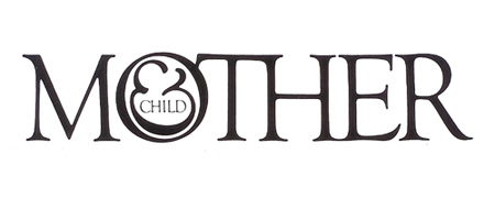
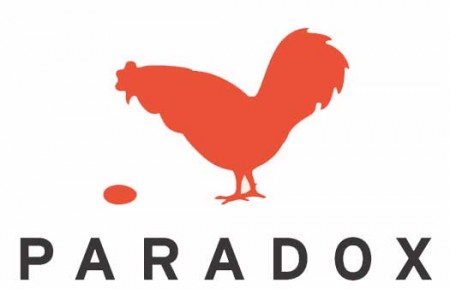
I am usually reluctant to list my favorites of anything. It’s hard to establish a consistent criteria with which to judge all items fairly, and even if you do, the list changes so frequently that it’s pointless to commit it to writing. My one exception has always been logo design, and Scott’s recent post got me thinking about it again. For as long as I’ve been interested in design I have always maintained the exact same favorite logos. They aren’t necessarily in any particular order, but the three pictured above are far and away my favorite marks of all time. I’ve never been satisfied with logos that gain their strength over time or with gradual brand association; for me, a successful mark works right away.
Mother and Child by Herb Lublin
The immediate cleverness of this one is probably what is most attractive to me. I remember staring at it for about five minutes the first time I saw it in the back of Area. I couldn’t believe how at once simple and wonderfully complicated it was. The ampersand has always been my favorite symbol, so to see it employed so unusually was also very exciting.
Paradox by Christopher Simmons
Another perfectly clever image. It needs no explanation and the “aha” moment occurs instantly. I’m still impressed how much wit was able to be squeezed into one tiny little mark. Like many great logos, it appears incredibly simple and seemingly obvious, but only after it’s come to fruition at the hand of another designer.
Modest Mouse by The Decoder Ring
What a perfect single image. This is one I can’t look at without feeling incredibly jealous for not thinking of it first. It encapsulates so many different feelings and emotions in one single mark, while still managing to be aesthetically pleasing at the same time (though I can’t stand the colors). The designer sums it up nicely: It’s an idea I came up with because it represents stasis — the balloon will never go up or down. It’s just a general feeling I have about everything: Every time we seem to cure or solve something, another problem pops up.
Of course there are many other wonderful logos out there, but this is a top 3 after all. List yours if you can think of them!
A few beautiful pieces by Buchanan-Smith, a New York City based design firm. I love their type sensibility, especially on the first image, and I find their image style very effective in its simplicity and subtleness. Much more work can be found on their site.
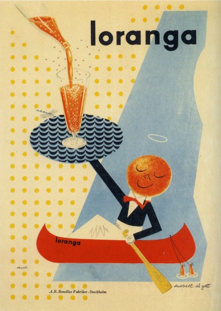
Assorted work by designer Olle Eksell to kick off your Tuesday right. What great typography! (It’s all late 40’s, early 50’s work.) All of the above are scanned from a book I picked up in Tokyo. I thought I had stumbled upon the secret of all secrets when I found it, but you can buy it on Amazon just as well.
Read Between the Leading is a design podcast started by SCAD students Aaron Heth and Matt McInerney. They release just about one show per week and discuss a diverse range of design topics; everything from the Tropicana fiasco to a new name for the @ symbol. They usually have one guest per show, and they’ve already had Mark Simonson, Antonio from AisleOne, and the Grain Edit team on so far. You can listen on their website or subscribe in iTunes.
I never listen to the radio, and have never been able to incorporate podcasts into my routine, but I’ve been trying to keep up with RBTL. I love geeking out over design, and I don’t find many opportunities to do so outside of school. I also continue to be fascinated by differences between design programs across the country, and it’s great to hear the perspectives of students from schools like SCAD. Aaron and Matt do a good job compiling relevant and interesting issues to talk about; their passion for design is definitely contagious. They are still working out some kinks, but I could see the show really blowing up as they hit their stride. Anyone else had a chance to listen? I’d be interested to hear what you all think of the show.
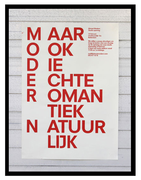
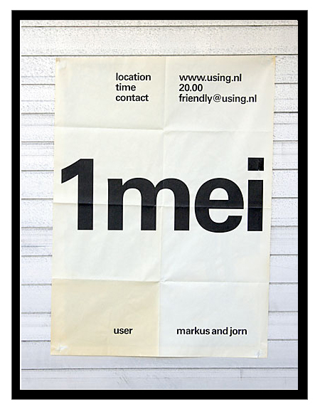
Just got turned onto Dutch studio Almost Modern this morning. I’m definitely a fan of their poster work; there are some misses here and there, but most of it is simple, minimal, and very effective design.
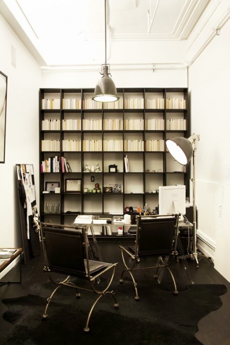
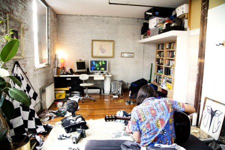
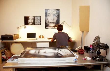
I’ve been considering a workspace overhaul for a couple months now. For inspiration, I’ve been browsing the photographs at The Selby, a blog dedicated to the workspaces of creatives. Each post includes photographs of artists in their homes and studios, and usually a little handwritten interview at the end. A majority of their subjects are from New York or LA, but I’m hoping they’ll make it out to San Francisco one of these days.
With my space, it’s amazing I’m able to get anything done; clothes are everywhere, bookshelves overflow onto the floor, and wires tangle their way into everything. It takes me at least five minutes to find just about anything. In all likelihood, it will stay this way forever, but I figure if I spend enough time looking at other people’s workspaces, I might actually get motivated to make mine picture worthy. Then again, as most of the pictures indicate (and Scott has suggested before), a pristine workspace isn’t a prerequisite for productivity.
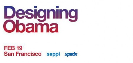
Sol Sender and Scott Thomas, the minds behind the Obama logo, will be in San Francisco in a couple weeks to talk about the process and development of the campaign. (Recall the Obama Logo Design videos that circulated a while back) I love hearing designers talk about their work, and even though I’ve heard just about everything possible regarding this logo, it should be interesting to hear them explain and answer questions about their process, in a live setting. The event is free. Register here.
Designing Obama
February 19th / 6-8:30pm
Morgan Auditorium
491 Post St at Mason
San Francisco, CA