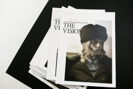
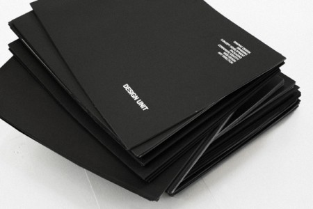
Assorted works by Designunit. One of my teachers at school likes to use the expression “swipeable” when describing cool/inspiring work. Our goal in class is to create something badass enough for people to want to “swipe” and use for inspiration. The above work by Designunit meets that criteria for me (and for people on Dropular just about every other day…). It’s been a mainstay in my inspiration folder for some time now.
My favorite medium of design is the magazine and I consistently look to them for inspiration when starting a new editorial project. They have a interesting approach to layout—grid based but still somewhat loose—and I find it to be very polished and refined. It manages to maintain a classic quality while still seeming hip and progressive. Designunit is based in Copenhagen and you can see the rest of their work on their site.
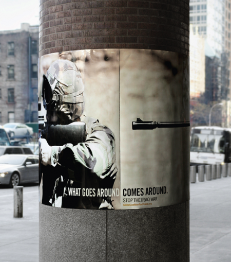
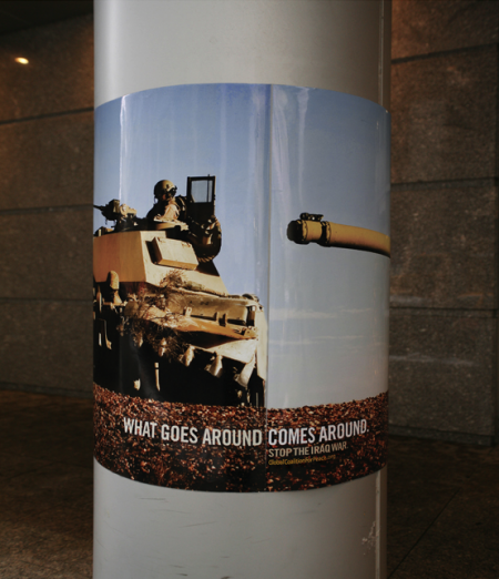
Big Ant International created these posters for the Global Coalition for Peace. The series has garnered significant recognition of late, including a Silver Pencil at the One Show Awards, and nominations for both the D&AD and CLIO Awards 2009. The posters are wrapped around street poles and achieve that ever so illusive “aha” moment when viewed in this circular manner.
I would imagine a poster series depicting soldiers essentially pointing guns at themselves is bound to be met with some controversy, but it seems clear to me that the “target” of the campaign is the US foreign policy and not the soldiers themselves. The metaphor is clear. Hopefully as the work competes for further acclaim, opinions about the message won’t get in the way of recognizing the work as a successful piece of graphic design. The series is a great example of a simple and brilliant concept executed very effectively.
I’ve been following Dan McPharlin’s work for a few years now, ever since his miniature synthesizer models started showing up on Matrixsynth. I fell in love with his perfectly crafted, perfectly photographed (seriously, the photography is almost cooler than the work itself) paper music machines. But after being introduced to his graphic/illustration work he quickly became one of my favorite artists. His illustrations are very reminiscent of another favorite of mine, Roger Dean, and are evocative of that prog-rock driven 70’s sci-fi art scene that, when done right, is just downright incredible.
So it’s been great to see Dan’s work start popping up all over the place, like here, here (Prefuse 73 cover), and here (Jakub, you really should have know better!). Beyond the visual beauty of his work, it’s just great to see someone being creative with such a novel medium. He brings the mind and eye of a designer to a world previously reserved for 60-somethings hiding out in their basements building model railroads. To see him wrap all this up and successfully translate that future-past-that-never-was aesthetic into commercial projects is a good thing indeed.
You can check out more of Dan’s work at his flickr.
On a side note, he’s posted some shots of his home/work-space here. Are you kidding? Amazing. My house looks like it was built of scraps from a 19th-century Troller Boat that ran aground in front of a hippie commune. Seriously, parts of a boat were used in the construction of this house, I am sure of it. Anyways, I am disorganized at best, slovenly at worst and I don’t think I have the skill set to keep such a meticulously minimalist situation like that up for any length of time. If I win the lottery I will get one of those modernist prefabs and put it in front of this house. I’ll then carefully place completely unusable angular furniture and German-designed objects all around it. Finally I will place a single synthesizer with wooden endbells and an analog sequencer on a white table with a molded plywood chair in front of it. When people come over I will tell them that’s where I get all my work done and then I will sit them down at a walnut coffee table with various important looking design books stacked neatly on top of it and expound on typography theory and then chastise them for not understanding the difference between kerning and leading. After they leave I will go back to my real house and eat a sandwich in my basement and watch Adult Swim and then not clean up the plate for a week or so.
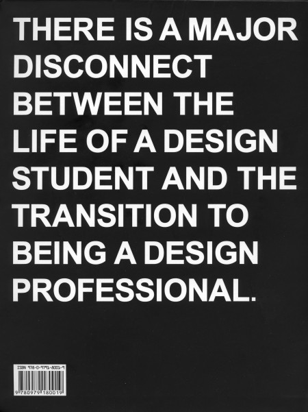
I just finished reading Never Sleep, the new book by Andre Adreev and Dan Covert of dress code. As a student, the back of the book (pictured) kind of freaked me out when I first saw it. My brief and occasional foray into the world of freelance has exposed me to some differences between school and the professional world of design, but I’ve always figured I’ll be in for a wake up call when I graduate regardless. I was psyched to see a book written about this exact process, and I spent last night (as the title suggested) reading the lot of it.
The book chronicles Andre and Dan’s transition from design school to the professional world. They describe, in-depth, just about every aspect of their journey; studying at CCA, working for MTV, and the eventual creation of their own studio in NYC. Along the way, they include examples of their own work from each stage of their career, as well as various essays by professors and professional designers (many of which are available on the site). The book describes just about everything that happened to Andre and Dan, even the occasional IM conversation, and this makes for a very engaging read. The third person narrative is just about as random as it is amusing, and is ultimately very accessible and insightful for the struggling design student (that’s me).
Dan is Ohio. Andre is Bulgaria. They is dress code. At the combined age of 50 their work has been recognized by shiny awards, appeared in lots of magazines, coffee table books, and 3 museums. They met while studying graphics designs at California College of the Arts. Then moved to New York and got jobs with MTV working in motion and print—before stupidly leaving their dream jobs to start a studio of their own. (Buy)
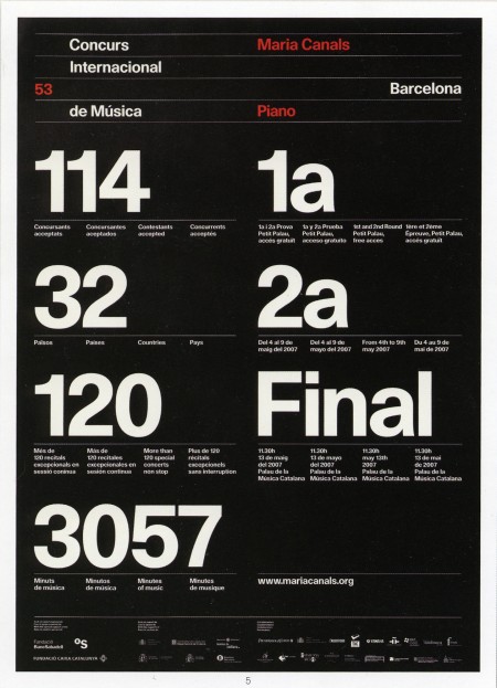
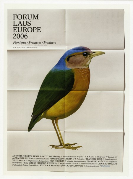
A couple pieces from the wonderful Astrid Stavro. The top image was the poster for Maria Canals International Piano Competition in 2007, and the bottom is from the Forum Laus Europe in 2006. I’ve seen some of her other work circulating on the blogs recently, but I prefer these older posters for their refined typography.
I also enjoyed this quote they have up on their website: “Small design companies produce good work, large ones produce shit work.” (Jonathan Barnbrook). Not sure if I agree completely (because I just don’t know, not because I have evidence to the contrary), but the work coming out of Astrid’s studio certainly validates the claim.
The above are from Mark Weaver’sMake Something Cool Everyday project. I’ve seen a number of these types of projects, especially on Behance, and Mark consistently has some of the more impressive results. The top image is my favorite by far; drastic big/small differences in type always appeal to me when done well.
I’ve never really put my daily “coolness generation” skills to the test; I usually make something cool over a period of weeks or months. Once I have a visual aesthetic defined, I can churn out work pretty quick, but the development of this always takes at least a week. Maybe I should start my own ‘everyday cool’ project to speed up my workflow…
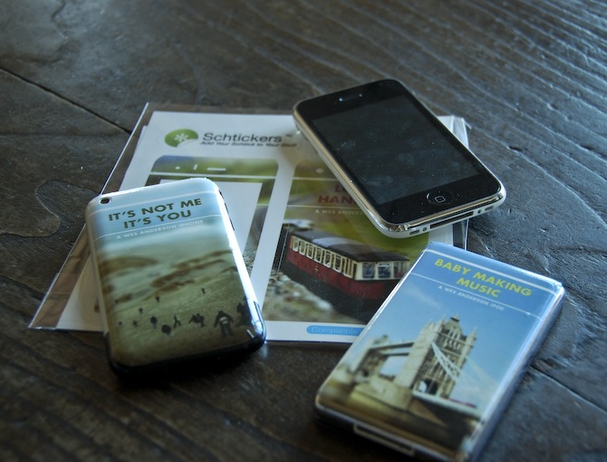
I’m still chipping away at the project I mentioned last week. One of the requirements is the creation of three products to complement the film festival we are creating and branding. The products can be pretty much anything, but one has to tie conceptually to our overall vision for the project. I have no idea what I’m going to do in this regard, and I figured I would knock out the other products first. I decided to try out Schtickers and get a few custom iPhone/iPod skins made. I can’t imagine ever actually wanting to ruin the impeccable design of either device with a sticker, but for a hypothetical film festival mock up, I figured it could at least be interesting. As I am also creating a website for the festival, I thought the iPhone/iPods would look good next to the laptop displaying the page on presentation day. The “electronic” portion of the festival brand fully fleshed out.
Overall, I would recommend Schtickers if you happen to find yourself in the market for some custom skins. I think they are most useful for in-class projects, or perhaps an unusual gift, but are definitely not a serious design option for professionals. Print quality is fairly good, but nothing close to what you’d get on paper. For my image style, it actually ends up looking dead on, but I can’t imagine many people appreciating the softer edges and slight blur you get with the vinyl print. The design/order process was very easy and smooth, and the stickers arrived within two days. Compared to some of the other vendors I am outsourcing to, this was amazing turnaround.
For the above sticker mock ups, two of the images come from agnusleonard and matstace. For the final versions, I will be using my own tilt-shift work like on the record cover. Next up should be the poster, which if all goes according to plan (when does that ever happen?), should be printed tomorrow.
Semi-related, Zweiphone will make your iPhone look like another, out of date phone. (via Subtraction)
Polish designer Jacek Utko on the impending doom of the printed newspaper, and how good design could turn things around. His statistics certainly are convincing, and I hope for the sake of my morning routine that he’s right. I would really hate to see the printed edition become extinct. Watch the TED version here.
He mentions it briefly, but when he says “this is the new role of the designer: to be in the process from the very beginning to the very end”, that is the biggest take away for me. The role of the designer is definitely changing, and our value now has a lot more to do with how we think than what we can do with a blank page.