Assorted posters by Dutch designer Hans Gremmen. I love posters — like the first one — that are just PACKED with all sorts of information and data. Really gives the designer a chance to show off their typographic skills and hierarchic sensibilities. I especially enjoy the tendency for the asymmetrically balanced composition; really makes for that much more of an interesting poster.
Also worth noting is Gremmen’s portfolio site which randomly generates a selection of eight of his works. An interesting approach to be sure; I like the concept of an ever-changing front page, though it was a little tough to find the specific work I was looking for.
Art & Copy is a film about advertising currently making its way around the country. The film is an in-depth look at some of the best and most creative minds in the business. As director Doug Pray states, “I felt it could be a more powerful statement to focus the film only on those rare few who actually moved and inspired our culture with their work. And that higher standard made me want to make a film that reflected the same kind of disciplined artistic approach that my subjects used.” It looks really interesting and I’m really excited to see it.
The frightening and most difficult thing about being what somebody calls a creative person is that you have absolutely no idea where any of your thoughts come from really — and especially you don’t have any idea where they are going to come from tomorrow. — Art & Copy
We’ve been watchingThe Persuaders in class over the last few weeks and, while it’s not specifically about graphic design per se, it’s easy to draw useful parallels between the two disciplines of advertising and design (as they are often one and the same anyway, whether you like it or not). If you are interested, you can watch all of The Persuaders on the website.
This winter is shaping up to be a pretty excellent time for designers as far as film is concerned. Art & Copy will be in San Francisco in early November, Objectified comes out on DVD on October 13th (so sad they had to push it two weeks due to a “manufacturing snafu”…how ironic), and Visual Acousticswill be here November 6th.
I think I am most excited for Visual Acoustics — I remember writing about it a while ago and have been surviving off of Shulman’s wonderful photography in the meantime. Also worth mentioning is The September Issue, the film chronicling the development and process behind the largest issue of Vogue Magazine. I saw this one recently and would recommend it, but it wasn’t quite as good as I was hoping. It’s exciting to see design related films making their way into the (almost) mainstream!
Side note: Art & Copy employs a beautiful ampersand in the logo for the film. Not sure what it is, but it’s very excellent looking.
Icelandic artist Siggi Odds is amazing. I think it’s great that he takes time to describe a little background for his projects — each description is perfectly concise and provides just enough context for a better understanding of his artistic choices. Not to mention the work is terrific. I would love to see what he’s been working on recently — if his older work is any indication, he is probably doing some pretty incredible design. Keep an eye out for updates on his site. Hopefully see something new soon!
As much as I love my Google Reader, I still prefer to get my design fix in printed form. In addition to providing the necessary dose of inspiration, magazines usually include insightful commentary and design criticism. I love this sort of writing on design and it seems like the best place to find it is still in the “unplugged” land of printed media. Additionally, with each one you get an actual piece of design to hold in your hand. It’s easy to forget how cool this is if you’re used to bouncing from blog to blog. After the jump, I’ve put together an overview of a the major players in the design magazine realm. Check out the list!
If you’re like me, you have piles and piles of notebooks filled with half-baked name ideas for firms, bands, and the like. When I was in college, I think I went through about 30 pages of (truly) terrible names before settling on something for my former band*. Basically I’ve never really perfected this technique. Whether it’s for a new band, new client, or my own (eventual) design studio, it is always a long and arduous process to think of the perfect name. (Herein lies the problem — looking for the “perfect” name is often the creativity killer for me.)
My process generally starts with a pencil, thesaurus, dictionary, and my iTunes playlist (pieces of song titles have served me well). It’s worked in the past, but for a recent project, I decided to try something new. I based my exploration off of Josh Levine’s useful chart that divides naming styles into six categories. You can see the chart above for examples and read the full descriptions here. I tried to go through the list three times, thinking of a potential name for each category on every rotation. What ended up happening was I thought of about 30 names in the metaphorical category, avoided the descriptive, and thought of one or two for each of the others. After about two hours I had my name, at the bottom of my metaphorical category list.
Of course, my normal process is not unlike this most recent one — but the added structure and formulaic approach really seemed to help me in this case. I just hope to be able to replicate it in the future. I would recommend giving this chart a try if you are looking for new brainstorming techniques. Just switching things up is really all you need to spark something cool. I’m sure everyone has their own strategies and I’d love to hear some if you’ve got them!
*Crazy story actually — the name I eventually decided on (Running Lights) was the same name my Mom had sent me in response to my plea for suggestions. We had thought of the exact same name, on the same day, without any direction or communication. I told this story to my band mates and that was that — how could we go with anything else!
Seriously impressed by the diverse portfolio of Danish designer Sebastian Gram (currently art director of Hello Monday). The first image (interactive design for fashion brand Revolution) made the FFFFound rounds a while back, but it wasn’t until recently that I explored his portfolio further and found the rest of his exceptional work. Each project, whether it’s a logo or full blown identity system, is considered down to the smallest detail. It’s also cool to see process shots along side the finished product; gives you a sense how much time and refinement went into it.
I was especially intrigued by the typeface for Vertica, developed by Gram and Creative United. My guess, based on progress images like the one above, is that it was designed as a custom face for Vertica and is not commercially available. Too bad, those are some sexy letterforms. Like much of Gram’s work, it manages to rock out with a rigid, corporate aesthetic, without being boring or common. I would love to see my name written in that font.
Film the Blanks is an ongoing design experiment that takes existing film posters and abstracts them down to their core elements. The project has garnered much press over the last few months, and I figured I’d post up some of my favorite pieces. I like the work because of the visuals, but there is also a strong participatory component that sets it apart. Each time a “blank” is uploaded to the site, users are invited to guess which film the abstraction represents. In some cases the solution is obvious, but it’s often remarkably difficult to discern which poster is hiding behind the blocks. Eventually clues are released and points are awarded to the successful guessers. It’s an exciting format for a design project; one that takes a strong concept, built around a fairly standard medium (poster), and twists it into something unique and engaging.
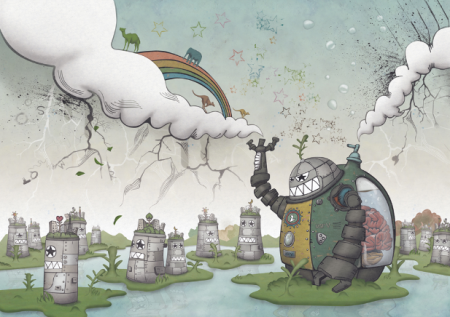
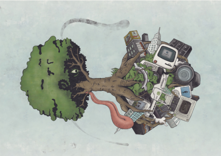
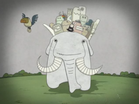
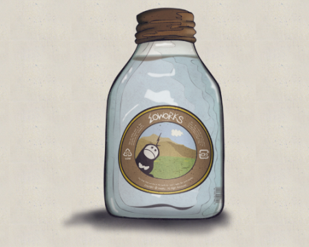
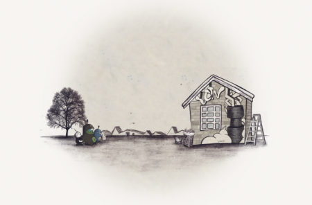
Loworks is a design company based in Japan. I’ve been on a wacky illustration kick recently, and it’s always fun to see what Loworks is up to. Their old site is one of my all time favorite website designs. It may not be the best design from an accessibility standpoint, but you can’t beat the creativity and absolute craziness at work. I wish it was still active, always made me happy. Computer Arts did a small feature on Loworks if you are interested.