Dallas Stars New Jersey / Logo
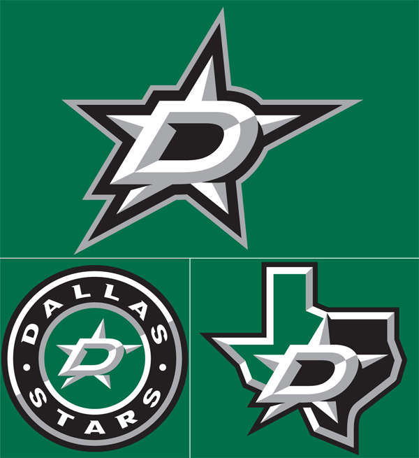
I love talking to you guys about sports logos and jerseys, so lets get to it on these Dallas ones for 2014. Let’s start with the state shaped logo- not bad, it’s about as literal as you can get, right? They went the minimal route; the shading is a bit over overkill along with the outlining and italic D. The circle one is junk, it looks like it was following some sort of 3 color rule in the center and the designer gave up.
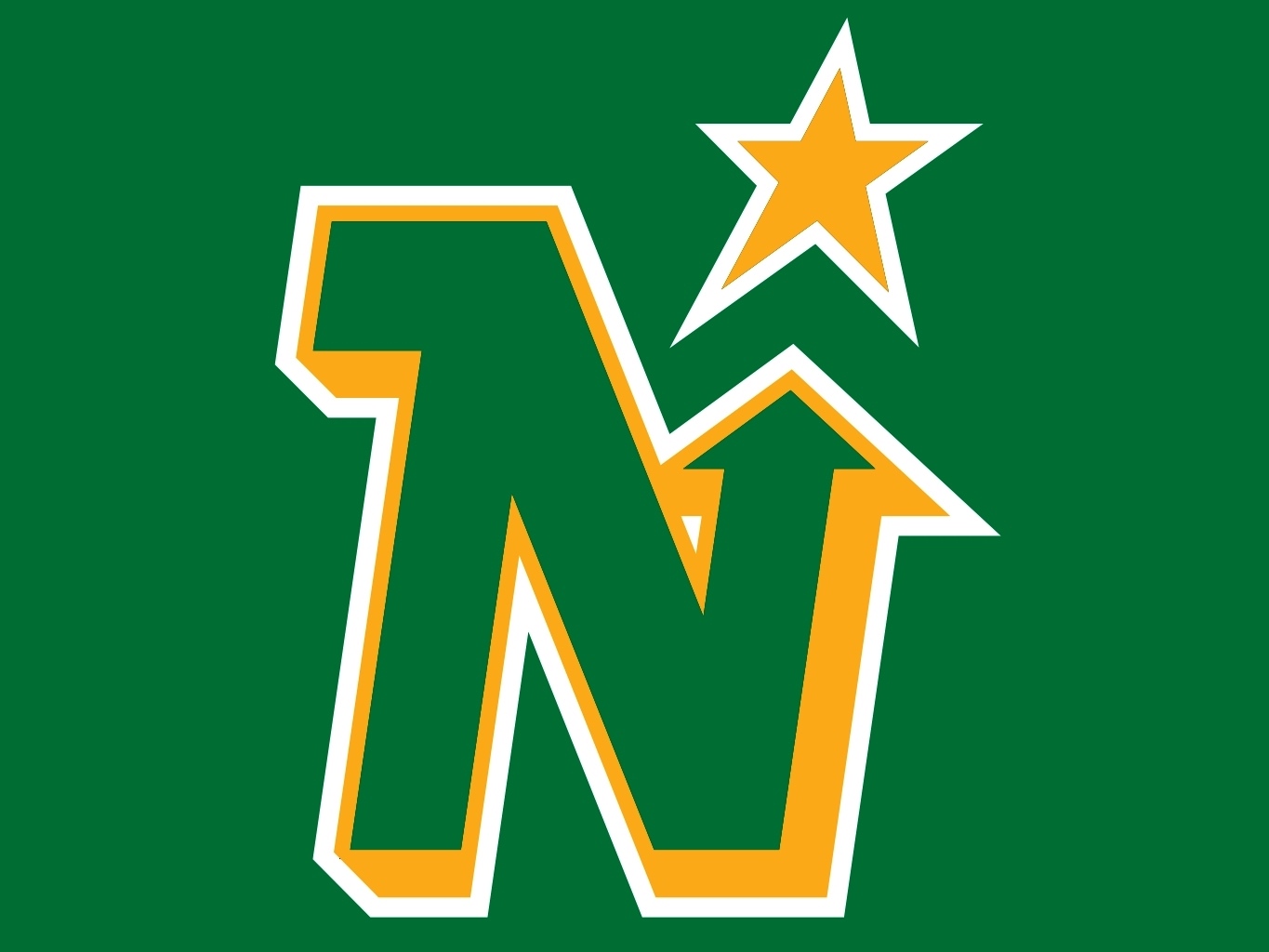
Now to the main logo, the D over the star… cooooome oooonn mannnnnnn. First off, let’s get some ideas going about why they even kept the Stars’ name when they moved from Minnesota to Dallas? I’m guessing a sheriff badge sort of thing right? Well, now it’s just losing soo much character, at least go with that literal over shaded state shaped logo. Also, the outline of the bottom left hand corner of the D and the whole bottom of the D looks screwy because of the use of italic. The black outline has all sorts of jacked up crap going on. This is a multi-million dollar professional team that just approved a hack job, who approved this? Could you imagine pitching an italic star to the Dallas Cowboys fans? Cows would be let loose into the streets.
Look… for the people that think I just want retro back, that’s not the case. I’ve seen beautiful and horrid line work from the 50s to the 80s, I’ve seen over worked and garbage through the 90s to now. I don’t even like the North Stars logo that much when you compare it to others during that time (i.e. Calgary, Hartford, Edmonton, etc. all gorgeous), but I do appreciate the creative effort. I understand the need of a redesign when your old logo is just the word and a star, but the reason it was maybe bothering the higher ups was because it probably wasn’t selling and because it was too plain for fans. This new logo is one whole level worse than a Heineken bottle cap and also with less colors.
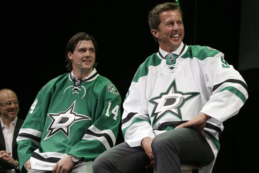
Going to end this on a positive note, if I had to wear the green jersey with a different logo on it, I’d proudly do it- it’s laid out nicely and riffing off classic jersey layouts that work with some nice class worked into it.