I dare you to watch this all the way through; I still haven’t made it. Is this a joke? If so, who’s in on it? I have to imagine that someone at WSJ, at some point between filming and uploading the video to Youtube, realized this man was completely insane but just decided to roll with it. Either that or Will.i.am has an incredible sense of humor and this is just the first in a series of hilarious lectures where he just fires off random thoughts from the top of his head about various topics ranging from foreign policy to automotive design.
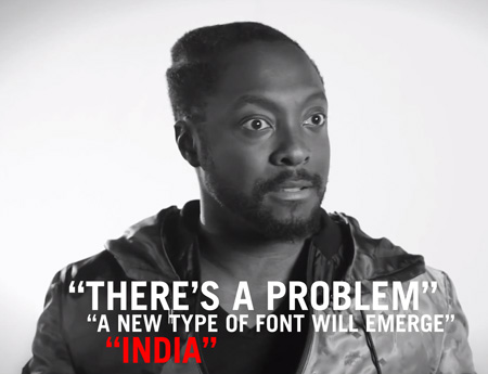
Who thought it would be a good idea to interview Will.i.am about logo design in the first place? What was that whole thing about India? So many questions…
To make it easier on you I’ve distilled the wisdom of this video down to some key concepts you need to be familiar with when developing a logo: “The New World”, “What India is going to do to the world”, “English, but with a different alphabet”, “Problems”, “Don’t use the word brand”, “New types of fonts”.
Matt Lehman is really good at logos, and illustrations. It’s been a long time since I’ve seen such a fun and well executed branding portfolio. There are some straight up classics in there, and that Warner Nashville one, wow. I’d love to see this guy get more into poster work, but simplified. I feel like some of his illustrations tend to get a little busy while minimalism seems to be his strong suit. The two included above are good examples of a nice balance of clean lines and texture.
Classic branding and packaging design by Barcelona-based firm Marnich Associtates. The stuff for Noguera & Vintro is incredible. Interestingly enough — and despite that excellent branding — they’re apparently the “exclusive distributor of Hello Kitty in Spain”. Good thing you have this incredible, minimalist branding, because we all know Hello Kitty retailers and very concerned with modernist graphic design.
All joking aside, this seems like a very strange choice of branding considering the product / market. It also just plain looks weird on the site with all that garish Hello Kitty stuff going on in the middle. Do you think the client asked for this seemingly incongruous style of branding or was it foisted upon them by an overzealous design shop? Judging from a lot of the playful work on Marnich’s site, I’d bet on the former as I could see them treating this right. Odd.
Mehmet Gozetlik decided to explore what would happen if he stripped down the packaging of iconic brands to the bare minimum. The results are fantastic and represent the kind of branding that always pulls me in. I’d love to see a real-world study on how effective these “minimal-ized” were on the general public (not just designers). Do you think they would do better?
My personal favorite results here have to be Jelly Belly, Nutella, and Guinness.
Creative Review has a great post on their favorite logos. Each logo was chosen by different designers and writers, each giving their reasons for the choice.
Last week I posted on the NASA logo and suggested that it might be the most iconic logo of our time. In the comments, Design+Conquer begged to differ and reminded me of an equally perfect logo. The CN logo was designed by Allan Fleming and James Valkus for the Canadian National Railway in 1960. Being an American I’ve had limited exposure to the mark, but every time I’ve come across it (usually on trains passing through when I lived in Sacramento) I’ve always been stricken by it’s minimal perfection.
An original Graphics Standards Manual from 1976 when NASA transitioned to the “worm logo” (more info). Love the car graphics, was waiting for something on The Shuttle but then realized it was just a concept when this manual was written. Maybe it’s just an American thing, but is this not the most iconic logo ever?
Switzerland’s current national airline (no, not that old one with the best branding possible) has undergone a rebrand and Brand New has all the details. A lot of people have been grumbling that the original “cube” logo was better — and I certainly agree — but judging this at face value, I have to say I’m into into it.