Welcome Aboard Info graphics
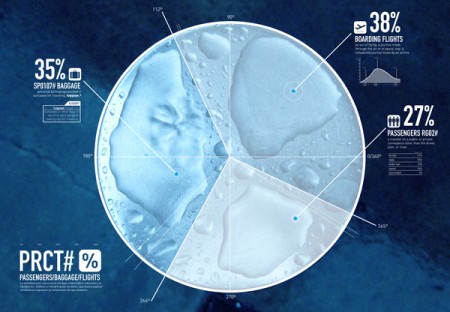
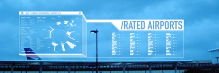

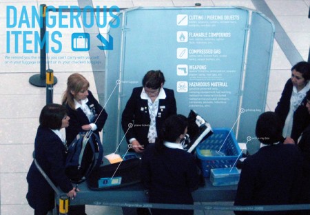
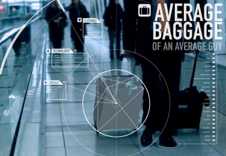
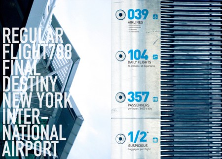
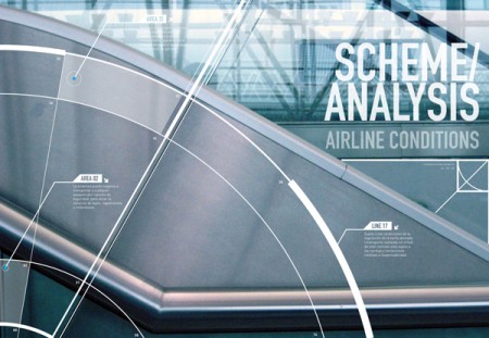
While this has been around the Behance block, I can’t help but admire this piece by Francisco Andriani. The use of typography in these pieces is gorgeous. The noisy photographs and large type along with a relaxed but secure color palette also really sets the mood of airports.
Seeing these info graphics makes me want to see this style implemented nicely in the terminal. Large monitors showing arrival and departure times with this style would be stunning. Especially if used on large installations like these. With a little collaboration I could see Tyler Thompson’s boarding passes and Francisco’s info graphics alongside one another in the near future in airports.
But part of me asks: how relevant would this style of design be to the traveler?
