We just got the 1976 red/blue on heathered grey hoodies in the shop, a nice classic layout on a comfortable hoodie at a low holiday price, get them before they’re gone at the ISO50 shop.
Also, we can hardly keep the Tycho Boulder Poster in stock, printed on a superfine eggshell white, this lithograph has been one of the most popular items on the shop, you can own one yourself or share it with a friend by stopping by our ISO50 shop.
And one last thing, Australia Tycho comes to you this month for the first time, head to tychomusic.com for more info.
Tycho Tour Dates
NOV 21 Hi-Fi Bar Melbourne, Australia
NOV 23 Strawberry Fields Festival Kawarren, Australia
NOV 24 Metro Theatre Sydney, Australia
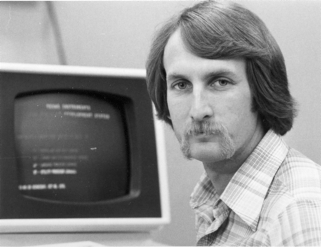
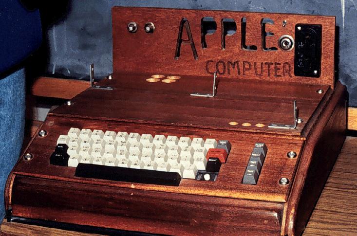
Ah, the 2012 Summer Games, now nothing more than the hazy recollection of infinite spoilers and borderline mental illness. While the overall visual presentation wasn’t quite as bad as a lot of people built it up to be (it was certainly better than this bullshit — but not this), London 2012 was an Olympics whose branding I seriously doubt designers will still be going on about 40 years after the fact. Perhaps it was just too advanced for our feeble 21st century minds to comprehend, so to ease us back into our stasis of perpetual nostalgia I present some more universally agreeable fare, from the simpler age of 1976, when everything happening in this picture was perfectly acceptable and also this crudely fashioned chunk of internet-free wood was your computer.
The 1976 Montreal Olympics branding sits right up there with Munich (my personal favorite) and Mexico on the pantheon of graphic design’s greatest achievements. I’m curious to see which of the more recent Olympics — if any — ends up being canonized by the design community in years to come. From the looks of things we shouldn’t hold our collective breath, it’s all been downhill since 1984.
It’s hot as hell but luckily the summer-friendly tri-blend edition 1976 Heather Blue shirt by ISO50 is back in stock! Get them while they last this time, it’s going to be a long summer… Link
With spring all but here (at least in San Francisco) I thought it would be a good time to whip up some new tees using American Apparel’s summer-friendly Tri-Blend Heather shirts (50% Polyester / 25% Cotton / 25% Rayon). The result is this new 1976 on American Apparel Tri-Blend Heather Blue. When I first designed the original version of the 1976 tee, I had this sort of vintage track tee vibe in mind. At the time, AA didn’t offer a Tri-Blend shirt in blue so I ended up going with the cotton baby blue — which I think has it’s own thing going on — but once I saw the new tri-blend blue I knew it would be perfect for a subtle remix.
Shirts have always been a fun design challenge for me. Unless you’re a pretty big company, you’re pretty limited in your color choices when it comes to blank shirts. Sure, American Apparel (one of the blank shirt manufacturers with the best cuts and colors) has a great selection of colors, but most are pretty straight-forward, bright colors. For most of my designs I envision washed out, faded colors and there really aren’t that many companies offering that kind of blank these days. AA’s tri-blends come very close and the fit and feel are incredible, so I usually end up going with that combo. But it can be a rather daunting task to balance your Pantone ink choices with the dye colors to try and reproduce the style and look you’re going for. You can always mock it up in Photoshop, but you really never know what it’s going to look like until you print one up and see the real thing.
After all that comes the task of trying to get photos of the shirts that accurately reproduce the color and texture, which can be even harder than designing the shirts in the first place. This time around I had a Gretag card and some color-correct CF lights so it went a little more smoothly. I shot in NEF format RAW on the Nikon and got some pretty usable output this time. The process of brining the RAW shots in is always a bit tedious, but it definitely yields more accurate and flexible results. I usually try to get one shot that’s as color accurate as possible (first shot above) for the storefront, and then another, more effected version (second image above) to give another perspective on the shirt. I’m still planning to rent a better lens for a day or so and see if that helps any, although after this most recent session I am feeling a little more confident with my D80. Also, a quick thanks to my little brother Kirk for modeling the shirt! I usually have to hold the remote while taking the shots of myself and it’s a lot harder to frame up shots and get the settings down that way.
At any rate, the ISO50 1976 Tri-Blend Heather Blue is now available for your enjoyment, get them while they last!


