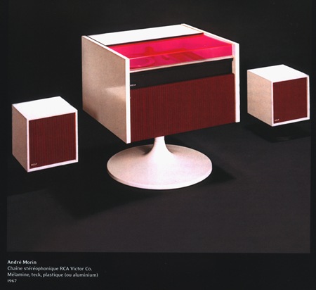
Andre Morin’s HiFi for RCA – 1967. Is that a Perspex lid? Image sent in by Element Kuuda. I couldn’t find it on the Ikea site, but I know I’ve seen something there that very closely resembled the center console of this system. It was some sort of cabinet and looked almost exactly like this. Anyone remember what I’m talking about?
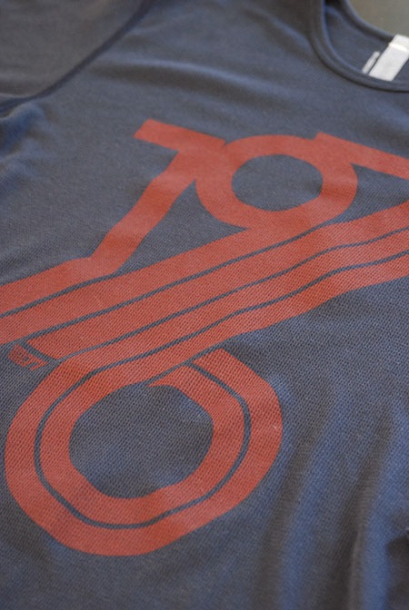
The 1976 Thermal is out now at the shop. It’s also 15% off, part of the Holiday sale that’s on now. This is the first long-sleeved shirt I’ve done, it’s on the American Apparel thermal which I absolutely love. It’s got a nice texture and it’s not too weighty. They’re moving fast so check them out!
Finally back home for a bit, feels good to have some time to focus. After a long stretch in the design trenches got the next month slated for music. Going to get back to work on the new album which is coming along well, just a lot of the dirty work yet to do. The first track from the forthcoming album will be available as a single on December 11th (iTunes Exclusive at first, all retailers later). Keep an eye here and tychomusic.com for more updates.
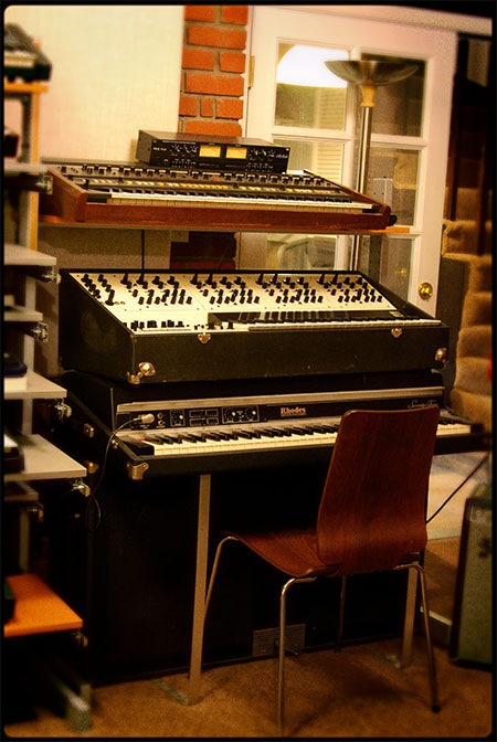
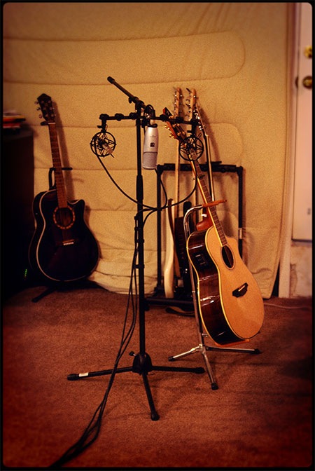
On a design related note, I treated the above pics of the studio using some of the concepts we were discussing back in this post. Took Christian’s advice and applied a lens blur to the vignette, getting closer to digital Lomo! Finally been getting my head around this Nikon D80 I got a while back to replace my broken 8800. Really been enjoying the results, especially at the higher ISO’s, even at ISO1000 the output is still clean and the noise is actually rather pleasing, not the sort of digital junk I’ve come to expect from high speed exposure’s with non-SLR digicams.
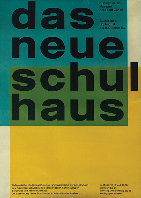
I’m pretty sure it doesn’t get any better than this. By Swiss Designer Carlo Vivarelli who also did the "Flums" Poster.
"997. 1953 poster, advertisement for The New School House, C.L. Vivarelli, Zurich Art Business Museum, marked Vivarelli, printed by Bollmann, dated 1953, linen backed, 36"x 50", 500-700"
Via the Treadway/Toomey Gallery
Seeing great design like this, by designers who are no longer with us, always makes me wonder what our generation’s legacy will be. in 60 years I wonder what artifacts young designers will look back on in awe. The pessimist in me wonders if we are doing anything quite as groundbreaking and forward thinking as this in the print medium. Print seems to have been relegated to a sort of suspended animation while mediums like video and interactive jump leaps and bounds every year. I don’t know if this is a function of the age of the print medium, i.e. everything new and innovative has been done, of if there just aren’t enough people pursuing print design as an art form anymore. Or perhaps I’m just stuck in the past and for some reason only design like this affects me in any meaningful way. Either way, there is no denying the greatness of this image.
Can any of you design scholars out there name the style or period that informed this design? I want to say Bauhaus, but I am sure someone can explain why that is wrong.
UPDATE: Via Eric in the comments:
"This design is definitely a product of the international typographic style developed in Basel switzerland, during the 1950s…This style is is clearly influenced by the bauhaus, but they took it to the next level. beautiful example."
Carsten also wrote a great comment explaining the "Reformed-School" in Germany and how it relates to this poster.
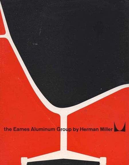
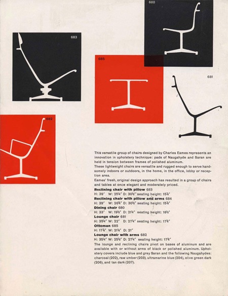
My good friend Jorge Calleja sent me this Eames Catalogue. The cover seems ripe for recreating as a one-off poster for my living room. More info at Herman Miller
By the way, Jorge’s not just good at sourcing vintage furniture ads, he’s also an incredibly talented graphic designer who’s currently with Wieden & Kennedy Amsterdam. Be sure to check out his portfolio.
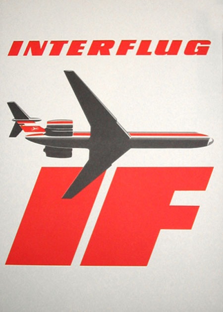
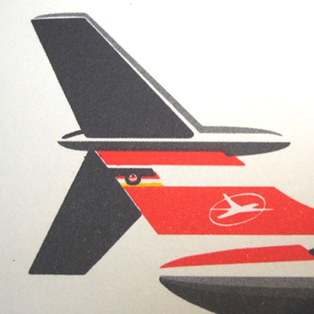
These images sent in by Anthony Mark.
"Interflug was the former state airline of the German Democratic Republic (GDR, "East Germany") from 1963 until 1991, when it ceased operations following German reunification." - Interflug on Wikipedia
Recently did an interview for the Veerle design blog. Check it out here.
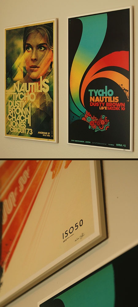
Select ISO50 prints are now available in a mounted option at the ISO50 Shop. The limited prints are hand signed and laminate sealed to a wood backing. More info here >


