Alphanumeric has a great set of Otl Aicher work including these artifacts from the 1972 Munich Olympics. As much as I love the posters from Munich, there’s something about the official stuff (tickets, badges, etc.) that might be even more fun to look at. I love how they combine form with function and you can never go wrong with serial numbers. It’s amazing to think that people defiled that beautiful luggage tag with their names and addresses. I guess that’s what makes these all the more interesting, the fact that most were destroyed by being used for their intended purpose.
Clark comes off to me as someone thats passionate and confident every time I put one of his songs on. To be able to turn something in like this to Warp Records and asking them to put it out and it being so drastic and harsh at times is its own thing but making it sound this good on this other level is another.
Simon Ratcliffe of Basement Jaxx destroys this remix of Throbbing Gristle in the best way possible, such epic theatrical moments that remind me of the movie Bloodsport with Jean-Claude Van Damme when he’s fighting in the Kumite lol or this should of been the music to play along to when those drummers from the Chinese Olympics played in the opening ceremony, either or.
Avey Tare of Animal Collective put out solo project in 2007 and I found this piano experimental piece pretty enjoyable to say the least.
If I could be on a european label it would hands down be Smallville, its just a quality boutique label run by some of the guys from Dial Records. Smallville always puts out those songs that make me think what am I doing listening to anything else and thats usually just fueled purely on nostalgia of what got me hooked to deep melodic music.
Clark – Talis
[audio:talis.mp3]
Throbbing Gristle – Hot On The Heels Of Love (Ratcliffe Remix)
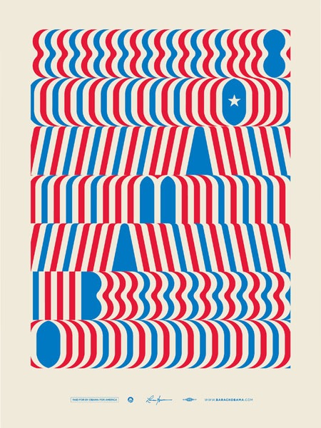
The latest limited edition “Artist’s For Obama” poster is by none other than Lance Wyman. Wyman, as you may recall, is the branding genius behind the 1968 Mexico Olympic logo as well as countless other brilliant marks. It’s really great to see someone still practicing successful design after all these years and obviously having fun doing it. I always wonder if design is one of the few art forms in which one can remain relevant throughout most of their lifetime; it seems that many other artistic pursuits (music, painting, etc.) are typically characterized by brief periods of genius followed by a sharp decline in output whereas the measured application of a practical, systematic approach to design can be extended into the decades. Maybe it’s that we tend to stick to coffee as opposed to heroin.
And please, save the politicking for some other blog’s comments. I am simply pointing out the fact that Lance Wyman has created new work, no one’s trying to start a huge discussion about who’s voting for whom. If, on the other hand, anyone has anything to say about the effectiveness of the design in question, please don’t hesitate to speak up.
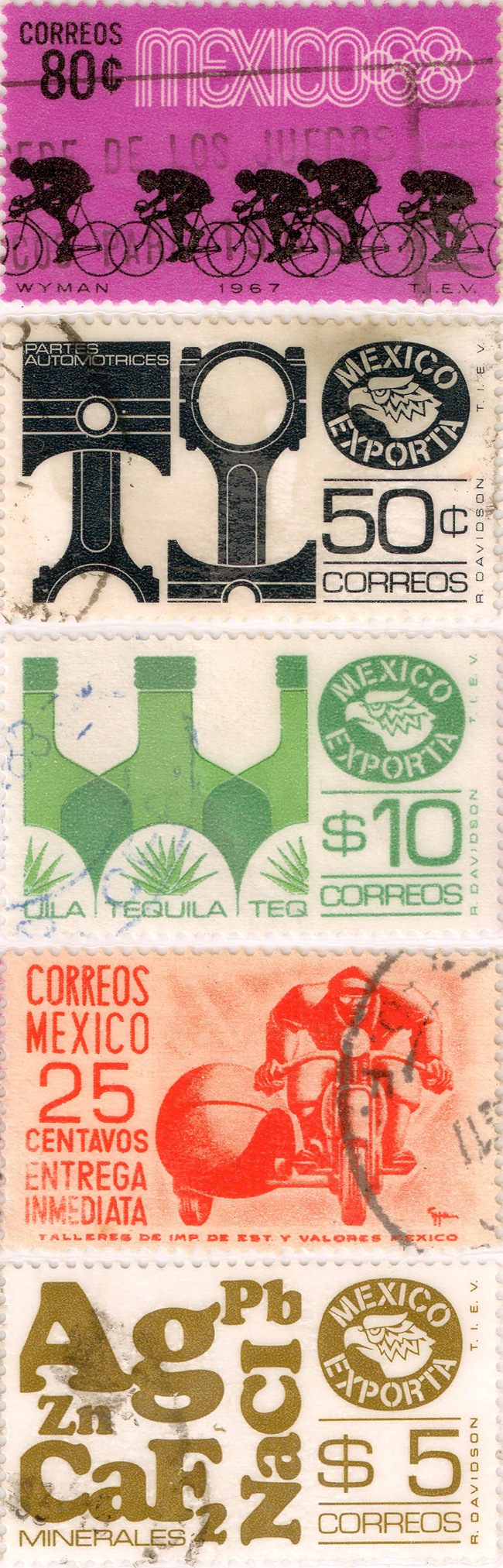
Blog contributor Forrest sent in these Mexican stamps his girlfriend found at an antiques store. They all look to be 60’s era and at some point were laminated and turned into a bookmark. The Mexico 68 example is the standout, of course. I think it’s interesting that Lance Wyman’s name is mentioned right there on the stamp, pretty nice touch and great typography. Thanks Forrest!
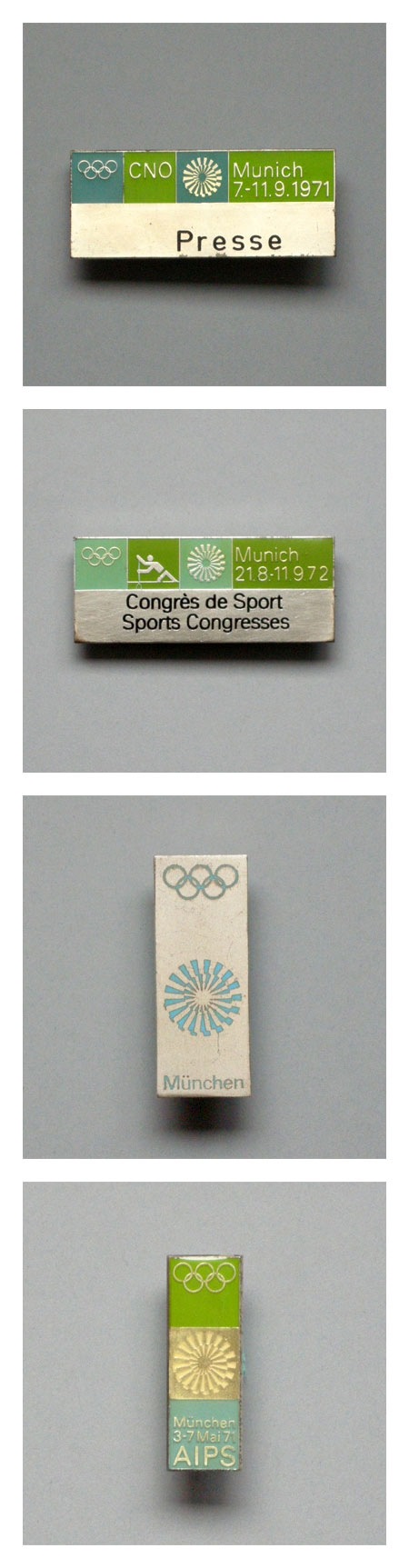
Some Otl Aicher 1972 Munich Olympics pins. There is nothing better than green with that deep aqua-marine (top pin in particular). If I had these I would wear a different one every day on a short sleeved white button up shirt with horn rim glasses. Speaking of the ’72 Olympics, Spitz is still the champ in my book based on stylealone.
Ryan Fitzgerald who is half of Broker/Dealer, has some wonderful overhead shot photography and i think most of them are in and around San Francisco, I was grabbed in by his shot of that crow. Here at Ryan’s site eyewitnessphoto where you can view the the photos larger.
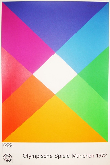
This Otl Aicher-designed Olympic poster is from Blanka. I see them linked on FFFFOUND all the time but I really don’t know what they’re all about. At first I thought they were an agency but now I think they’re just some sort of design shop with all sorts of cool stuff that is never in stock. At any rate, it’s fun to look at the pictures; they have an extensive archive of vintage poster prints.
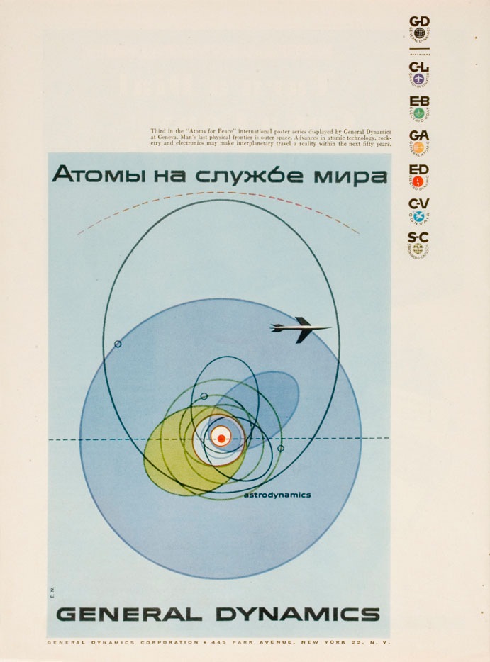
I was having a conversation the other night with some designer friends and we were trying to come up with a name to encapsulate this style (example by Erik Nitsche). I have heard it generally referred to as "modernism" but we wanted something a bit more specific. In particular it should refer to this sort of subject matter; mid-century technical manuals, industry literature, signage, World’s Fair campaigns, Olympics campaigns; basically any design commissioned by an institution or by a company, like General Dyanmics, who doesn’t market directly to the public. I suggested "Institutional Modernism" and I think "Industrial Modernism" was thrown around.
So is there an established term for this sort of design? This seemed like a very unique time in history when a large amount of money and talent were directed at projects which weren’t corporate ad campaigns directly targeted at the general public. I think this fact alone shaped the output and resulted in some of the best graphic design the world may ever see. Whatever the case may be it’s designs like these, more than anything else, that have influenced and informed my own application of typography. It seems that no one has done it better before or since.
FYI: As Vytis quickly pointed out, the headline reads "Atomy na sluzhbi myra" – Translated: “Atoms – serving the world” In a servant-master way…"