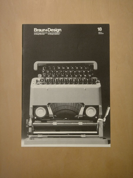
“Omron 86R & Braun 4 776 calculators. Interesting similarities and differences, especially layout, letter forms, color and shapes. The Braun’s 12.5mm total thickness versus the Omron’s 25mm is a clear sign of the 10 year age difference between the two designs.
Omron 86R & Braun 4 776 calculators. The Braun’s font is clearly Akzidenz Grotesk, but the closest I can find for the Omron’s font is Univers 53 Extended. Any better ideas? “
Dieter always wins out, but that Omron still has it’s own thing going.
Tom Croose is one half of the Brooklyn DJ duo Worst Friends who recently put this mix together that is debuting here on ISO50. I thought I should share it here since it’s a really diverse sounding mix and most of the songs picked for the mix are pretty new to me. If you want more from Tom Croose he just released a 7 inch vinyl limited to 300 or download it here from us. The partial photo above is courtesy of Alex/HeadUp (who you may see once in a while on the blog) shot with his Holga.
Tracklist:
1 – Nelson Angelo E Joyce – Comunhao
2 – Flying Lotus – Auntie’s Lock
3 – Slum Village – Fall n Love
4 – Slum Village – Fall n Love (Dilla remix)
5 – Max Berlin – Elle & Moi (Cicada remix)
6 – Trus’me – Drilling
7 – Ost & Kjex – Have You Seen The Moon In Dallas?
8 – Mark E & Dragon – Good Times (Prins Thomas remix)
9 – Jorge Ben – Oe Oe
10 – Dolle Jolle – Balearic Incarnation
11 – Wally Badarou – Endless Race
12 – Todd Terje – Glittertind
13 – Osborne – Wait A Minute
14 – k.i.d. – Hupendi Muziki Wangu?!
15 – Magnus International – Kosmetisk
16 – John Tejada – Turning Point
17 – Bostro Pesopeo – Falls (Hercules & Love Affair remix)
18 – Robag Wruhme – k.t.b. (Ruhig Brauner remix)
19 – Matias Aguayo – Minimal (Dj Koze remix)
20 – Spoon – Don’t You Evah (Matthew Dear remix)
21 – Beach House – Gila
Etón’s Porsche-designed P’9120 clock radio is a must for any self respecting minimalist / design aficionado with a schedule to keep. I’m loving the knob / speaker combo, so efficient and a great interaction metaphor to boot. This thing could sit comfortably beside some the the jewels of Braun modernism and Porsche even kept it old school with the remote. My only gripe with the design is the sore thumb Etón logo that breaks up the clean lines of the face. It feels misplaced and cheapens the aesthetics; it also clashes badly with the wonderful typography of the Porsche Design logo. I guess that’s what Sharpies are for though. Now if DWR would just make a matching Herman Miller walnut pedestal I’d be set. Unfortunately, at $600 it’s prohibitively expensive; but then again, dedicated design geeks wouldn’t let half a grand stand between them and waking up to such a specimen of functional art.
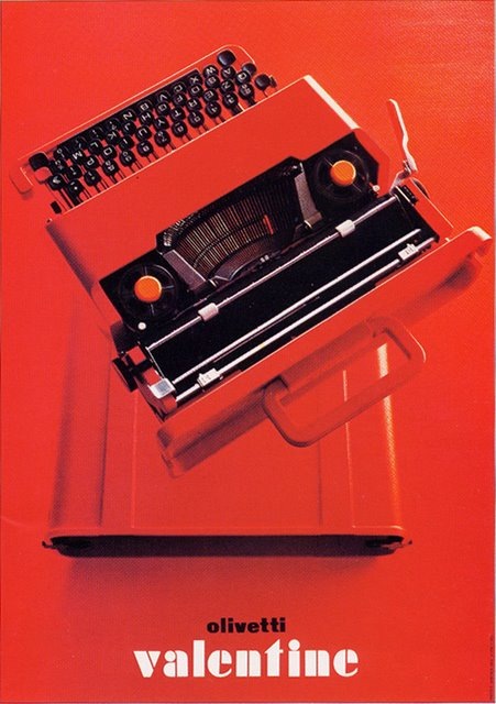
Olivetti Valentine Typewriter (c.1969) "Sottsass designed the Valentine typewriter (with Perry A. King) for Olivetti in 1969 to be an "anti-machine machine," for use "anyplace but an office. Undoubtedly one of the great design classics, the Valentine expresses the mood of its time: goodbye to the bulky cast-iron housings of old typewriters, hello to the new mobility of a light, modern, plastic casing made from ABS. The Valentine typewriter is a very collectible portable in spite of the fact that it is relatively of recent vintage. " Via mytypewriter.com
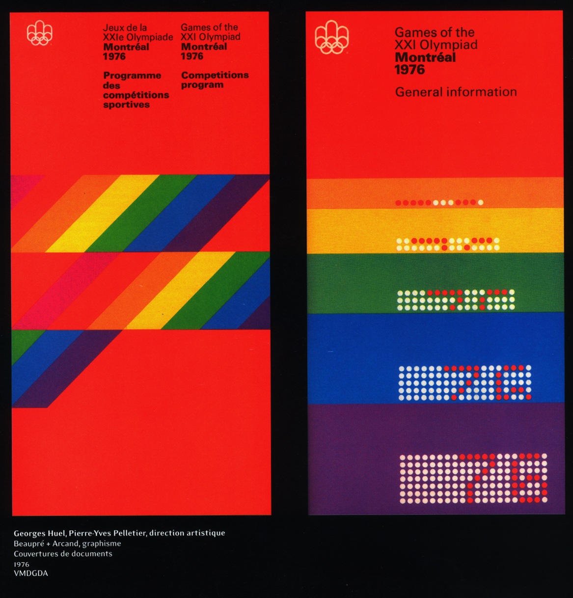
When will it end? Apparently never. I think it’s time I just give in and nominate the Canadians as completely owning the mid-late 70’s. The more I look at this sort of design, the more I realize how much it has influenced my own style. It’s funny because I don’t remember really being aware of design when I was younger and I certainly wasn’t fortunate enough to be alive (much less conscious) during the ’76 games. I guess these sorts of things just kind of seep in to your consciousness over the years through random, passing exposure without you completely realizing or understanding it’s impact.
At any rate, I envision my dream space as a large, concrete floored, open room with 3 story ceilings, all white, with these printed massive banner size hanging all along one side. I think the other side would be wood paneled in a light walnut with a flush installed Bang & Olufsen circa 1976 Beo system right in the center. Sprinkle in a healthy dose of vintage Hermann Miller, some Dieter Rams-designed Braun appliances here and there and things would be starting to look right. Maybe a wax figurine of Jakub in his ATMSPHR promo photo get-up and Jarvis Cocker glasses would be encased in a Perspex cylinder somewhere, perhaps animatronics would be involved, budget permitting.